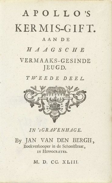
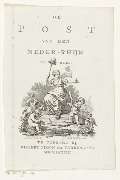
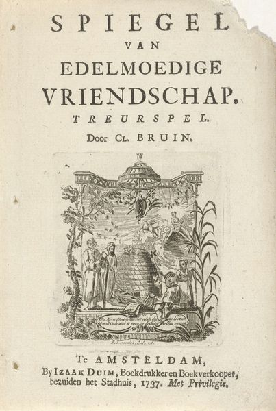
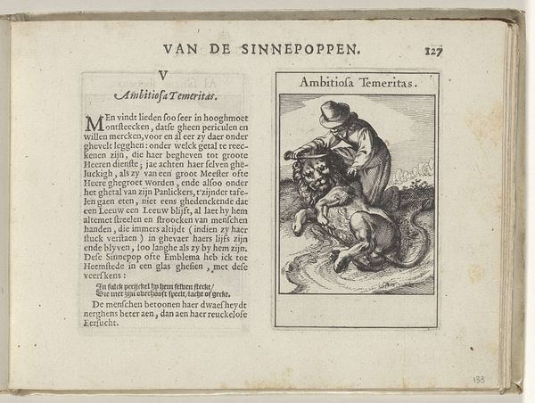
print, typography, engraving
#
aged paper
#
baroque
# print
#
old engraving style
#
hand drawn type
#
typography
#
hand-written
#
hand-drawn typeface
#
stylized text
#
thick font
#
history-painting
#
handwritten font
#
engraving
#
historical font
#
columned text
#
calligraphy
Dimensions: height 62 mm, width 74 mm, height 154 mm, width 94 mm
Copyright: Rijks Museum: Open Domain
Curator: I find the balanced symmetry in this print by Adrianus van der Hoeven quite striking. Look at the figures flanking the open book, each mirroring the other in pose yet differentiated by the symbols they hold. Editor: My eye is immediately drawn to the aging of the paper. You can almost smell the history emanating from it – the inks, the textures, the marks left behind by human hands in 1732. I am really wondering what was happening in that print shop. Curator: Indeed. The print, a "Drukkersmerk," or printer's mark, features two allegorical figures. On one side, a woman holding a sun; on the other, one holding an orb. The scales of justice rest on the book, beneath which reads "D. Waarheid," meaning "The Truth." Semiotically, it speaks volumes about the printer's values and the power of knowledge. Editor: Consider the materiality. It's an engraving. Think of the labor involved: the slow, deliberate process of carving into the metal plate, inking, and pressing. Each impression carries the imprint of Van der Hoeven's world: ink, paper, even the physical demands of running the press, everything points back to that print shop! Curator: I see the book itself as a focal point—its open pages symbolizing the accessibility of knowledge, while the flanking figures suggest equilibrium and enlightenment. It is about visual harmony and a certain intellectual idealism. Editor: How many impressions did Van der Hoeven hope to produce? Was this craft celebrated, or seen as just labor? These images would have shaped how ideas were shared but that labor story needs uncovering too. Curator: Ultimately, it’s a carefully constructed emblem, advertising Van der Hoeven’s press while subtly suggesting the intellectual quality of its publications. The positioning of its symbols offers a framework for interpreting its overall message of balance, truth, and knowledge. Editor: Knowing that this mark would be appended to printed material gives me pause; the circulation of objects and printed matter changed European life so profoundly. This mark isn't just beautiful, it signals a real shift in material culture.
Comments
No comments
Be the first to comment and join the conversation on the ultimate creative platform.
More like this