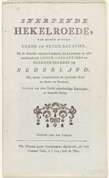
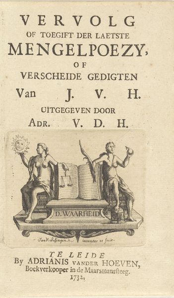
graphic-art, print, typography, engraving
#
graphic-art
#
dutch-golden-age
# print
#
typography
#
engraving
Dimensions: height 320 mm, width 218 mm
Copyright: Rijks Museum: Open Domain
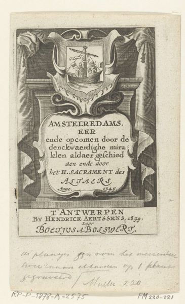
Curator: Here we have "Wapen van Amsterdam," a print created in 1693. I am struck by the crispness of the engraving, especially given its age. Editor: Yes, it’s very detailed. It's fascinating how typography can be so artistic. What exactly stands out to you about this piece? Curator: Consider how the differing typefaces create a hierarchy. The large, bold "AMSTERDAM" anchors the design. The smaller, more delicate type then acts as counterpoint, enriching the textural complexity of the work. It creates a very strong formal structure. Editor: So, you’re focused on how the words and images are arranged as design elements? Curator: Precisely! Notice how the coat of arms functions. It is not merely representational. Its symmetrical form and careful positioning balances the heavier text at the top, leading the eye smoothly down the page. Editor: That’s interesting, I never considered the balance. I was drawn to the lions but didn't consider their placement. Are the letterforms of a particular style or reflect the era it was printed? Curator: That’s a question one might consider, yet, within the constraints of this copperplate engraving, the objective is structural rather than expressive. Every element serves to enhance the unified field of vision. We can examine how those particular choices create the composition's particular strengths and weaknesses, focusing strictly on formal terms. Editor: I see, the focus is on the purely visual. Thank you! That gives me a lot to consider. Curator: Indeed. Reflecting on the artist's use of space and line in isolation highlights aspects one might otherwise overlook, revealing deliberate artistry.
Comments
No comments
Be the first to comment and join the conversation on the ultimate creative platform.
More like this