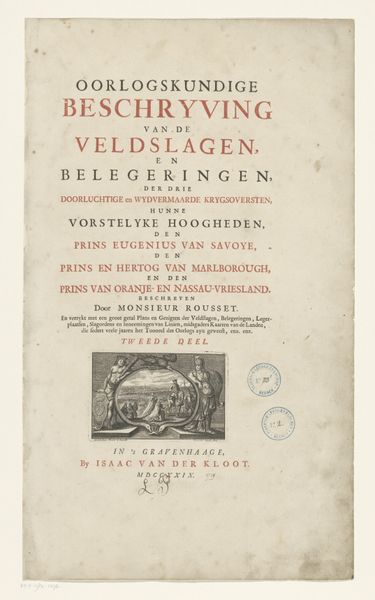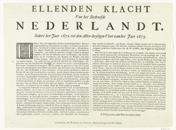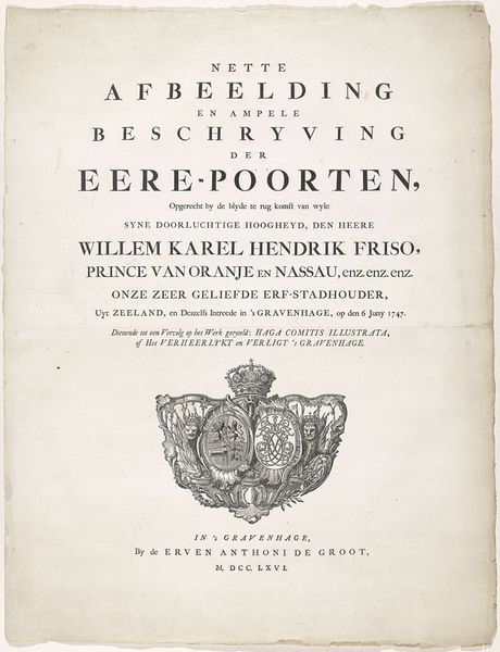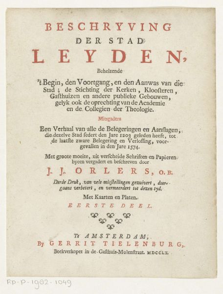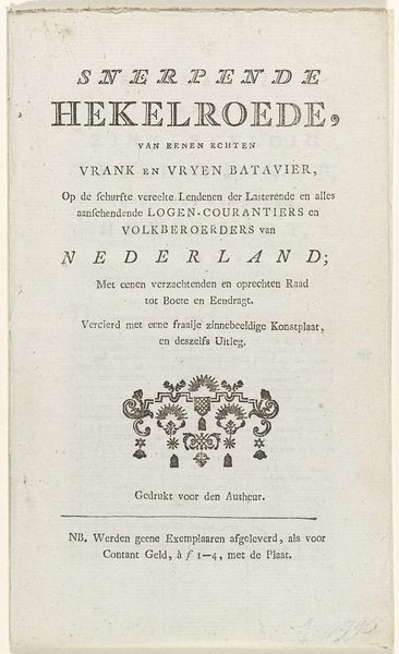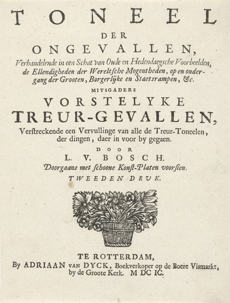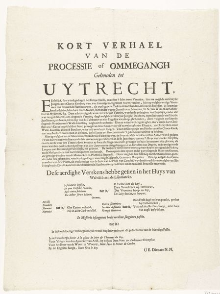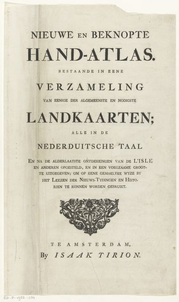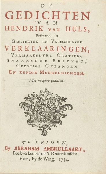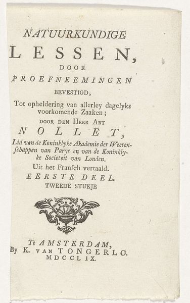
Titelpagina voor: S.n., Het Verheerlijkt Nederland, eerste deel, 1745 1745
print, typography
aged paper
baroque
parchment
old engraving style
typography
fading type
stylized text
thick font
handwritten font
golden font
historical font
columned text
Dimensions: height 213 mm, width 166 mm
Copyright: Rijks Museum: Open Domain
Editor: We're looking at the title page for "Het Verheerlykt Nederland," from 1745. It’s a print with typography, created by Isaak Tirion. I’m immediately drawn to the stylized text, that almost feels like it wants to tell a story on its own, outside of the content within. How do you interpret the symbolic meaning embedded within this page? Curator: This title page acts as a portal. It’s not merely descriptive; it's an invitation into a specific way of seeing the Netherlands. Note how the typography itself, with its thick, almost columned structure, evokes a sense of established order and permanence, the way classical architecture might represent power and stability. What does that selection of font, the visual language itself, tell us about the intended audience and their expectations of "Verheerlykt," glorified, Netherlands? Editor: That’s a good question. The font choice, being so formal and almost imposing, makes me think this was meant for a more educated or affluent audience? People who understood the weight of such pronouncements. Curator: Precisely! And consider the phrase "Hedendaagsche Gezigten" – contemporary views. It’s not just about showing the Netherlands, but about framing a specific contemporary *vision* of it. Think about the symbolic importance of cityscapes as assertions of national identity and civic pride. This isn't just a geography lesson; it’s about cultural memory and projecting a particular image forward. How does the inclusion of "Steden, Dorpen, Sloten..." construct a unified yet diverse national picture? Editor: It paints a picture of a nation encompassing everything, from cities to humble villages. It's carefully constructing a complete image. Curator: Indeed. By meticulously listing the components of Dutch society, the print suggests a harmonious whole. This piece reveals much about the self-image the Dutch sought to project during this period. Editor: I never considered how much information could be embedded in just a title page! Now I see it as a microcosm of national identity in the 18th century. Curator: Exactly, seeing isn't always believing. Sometimes you have to dive beneath the surface to see a work for its impact and what it's actually representing.
Comments
No comments
Be the first to comment and join the conversation on the ultimate creative platform.
