Vier toelichtingen bij voorstellingen over de gelijkenissen van Christus 1653 - 1654
0:00
0:00
janphilipszschabaelje
Rijksmuseum
drawing, print, textile, paper, engraving
#
drawing
# print
#
textile
#
paper
#
11_renaissance
#
engraving
#
watercolor
Dimensions: height 295 mm, width 370 mm
Copyright: Rijks Museum: Open Domain
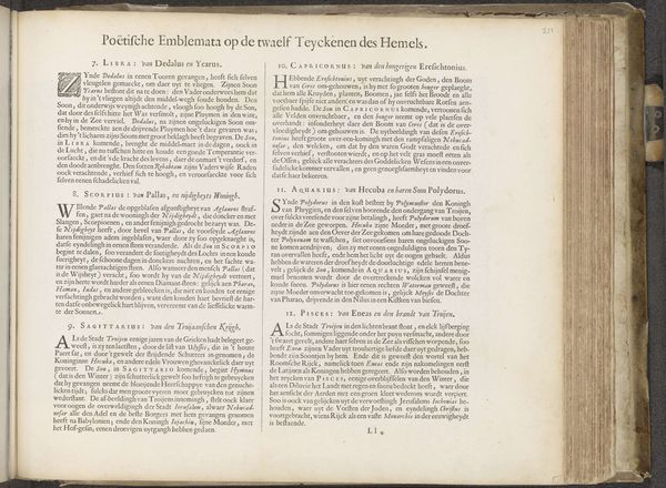
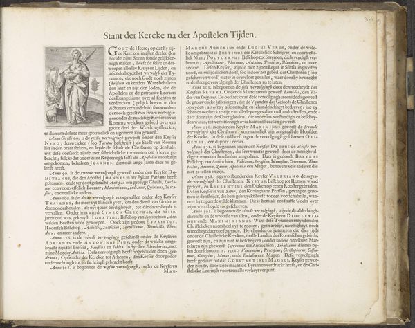
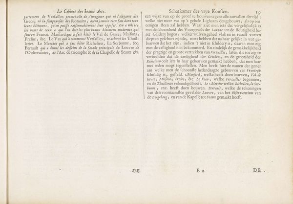
This is a page from Vier toelichtingen bij voorstellingen over de gelijkenissen van Christus, made by Jan Philipsz Schabaelje, sometime before 1656. The overall impression of the page is that it is structured and organized, yet teeming with detailed information. The crisp black ink contrasts vividly against the warm, aged paper, creating a strong visual hierarchy. The density of text and the even lines reflect a concerted effort to manage and distribute knowledge systematically. The intricate initial letter on the left page hints at illumination techniques typically found in medieval manuscripts. By drawing upon familiar symbolic systems – the black letter type, the biblical subject, and the emblematic initial – the print conveys a sense of cultural and intellectual continuity. This continuity reinforces the importance of religious teachings during the 17th century while subtly inviting the reader to re-interpret these teachings in a new social context. The meticulous texture of the print and the way it is laid out across the page encourage a practice of close reading. This formal quality underscores the dual nature of art as both an aesthetic object and a vehicle for communicating complex ideas.
Comments
No comments
Be the first to comment and join the conversation on the ultimate creative platform.
More like this