Acht toelichtingen bij voorstellingen over het leven van David 1653 - 1654
0:00
0:00
janphilipszschabaelje
Rijksmuseum
print, paper, typography
#
dutch-golden-age
# print
#
paper
#
typography
#
coloured pencil
Dimensions: height 295 mm, width 370 mm
Copyright: Rijks Museum: Open Domain
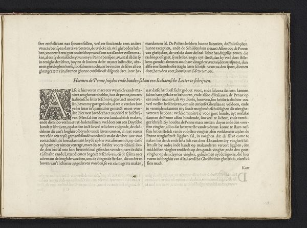
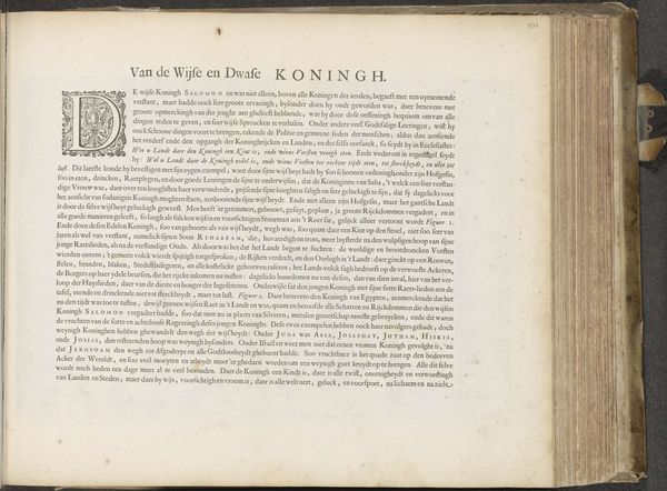
This page from ‘Acht toelichtingen bij voorstellingen over het leven van David’ by Jan Philipsz Schabaelje, made around the mid-17th century, presents a dense field of black letter text, sharply contrasting with the off-white paper. The rigid columns create a structured, almost architectural form, characteristic of early printed books. The initial letters of each section are enlarged and decorated, adding a touch of visual flourish. The artwork invites us to consider how the formal arrangement of text can shape our reading experience. In structuralist terms, the fixed grid of the print acts as a framework through which the narrative is conveyed. The uniformity and repetition of the letterforms establish a systematic order, a 'grammar' of sorts, guiding the reader through the text's content. The inherent contrast between text and negative space is essential here; the interplay highlights a tension between conveying the divine word and the aesthetic possibilities of printed matter. This page exemplifies how meaning is constructed through both textual and visual components.
Comments
No comments
Be the first to comment and join the conversation on the ultimate creative platform.
More like this