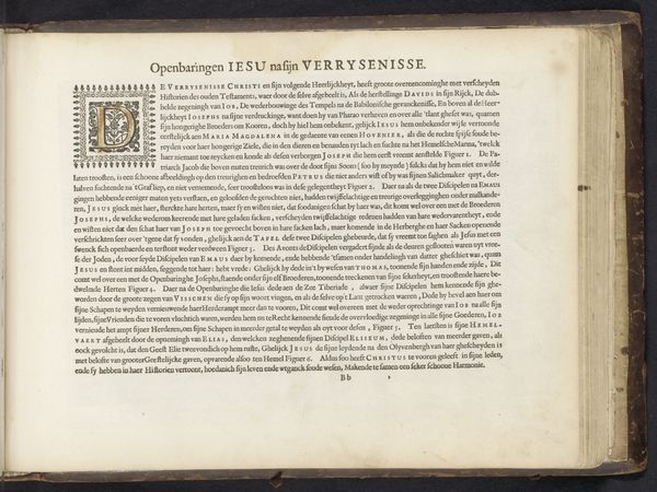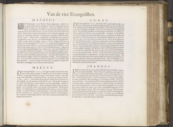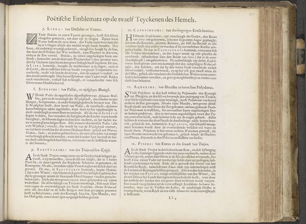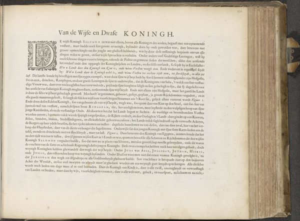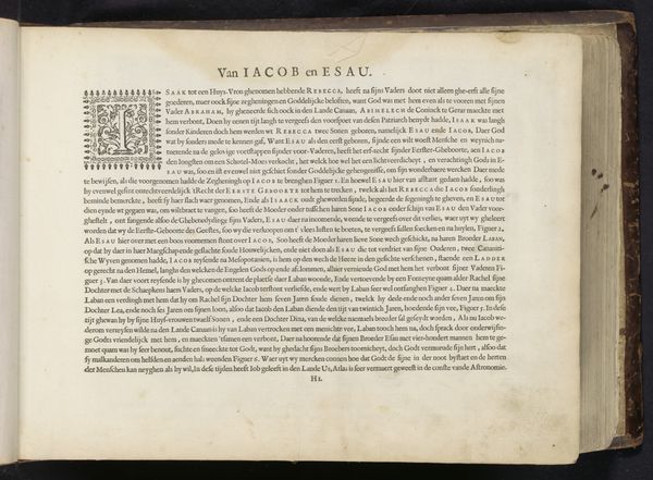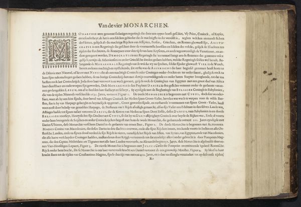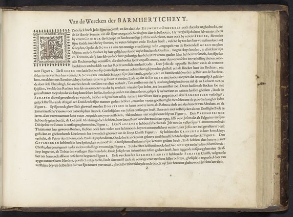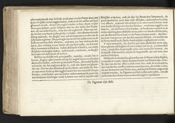
Vier toelichtingen bij voorstellingen over het Koninkrijk Israël 1653 - 1654
0:00
0:00
print, textile, paper, typography
# print
#
textile
#
paper
#
typography
#
coloured pencil
#
history-painting
Dimensions: height 295 mm, width 370 mm
Copyright: Rijks Museum: Open Domain
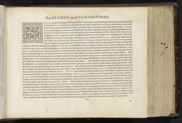
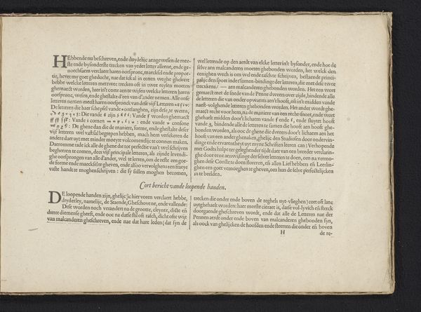
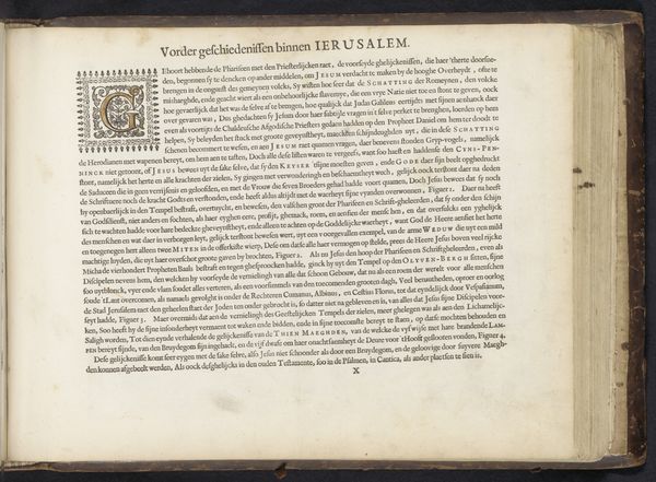
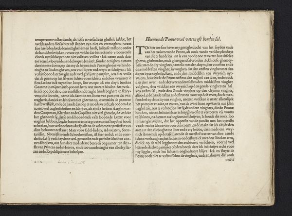
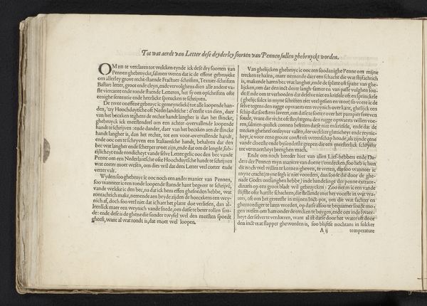
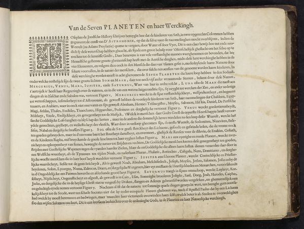
Editor: Here we have "Vier toelichtingen bij voorstellingen over het Koninkrijk Israël", or "Four explanations of scenes from the Kingdom of Israel," made around 1653 or 1654 by Hendrick Jansen van Barrefelt. It's a print on paper and textile, filled with typography. What I immediately notice is the density of the text and the almost overwhelming detail in the typography. What catches your eye? Curator: Precisely, the interplay between text and image creates a dynamic visual structure. The formal arrangement is carefully constructed: notice how each section is clearly delineated, utilizing distinct typefaces and ornamental initials to signal a shift in narrative. Semiotically, the text becomes not just a carrier of information but an aesthetic object in itself. Do you see how the varying fonts and layout influence the viewer’s experience and understanding of the text's content? Editor: I do, it feels very intentional, guiding my eye in a specific order. But beyond the formal elements, does the content play a role in how we interpret it? It's historical after all. Curator: The historical context is integral but the form is essential to how that content reaches us. The artist utilizes printmaking traditions, employing contrast and balance to draw the reader into deeper textual engagement. Note how each element serves a structural purpose: leading us from introduction, to historical anecdote, to theological application. Are there other structural relationships or semiotic patterns you recognize? Editor: Now that you mention it, the organization into numbered sections gives a clear sense of structure. It reminds me of a chapter in a book, and I notice recurring themes in each section. I also note the page number indicating the order in the series. Thank you. Curator: I appreciate you making the connection of visual literacy in print with the larger culture and art production and that this also shows the intent to control the viewer and readers encounter with this text.
Comments
No comments
Be the first to comment and join the conversation on the ultimate creative platform.
