print, paper, typography
#
hand-lettering
# print
#
hand lettering
#
paper
#
typography
Dimensions: height 215 mm, width 135 mm
Copyright: Rijks Museum: Open Domain
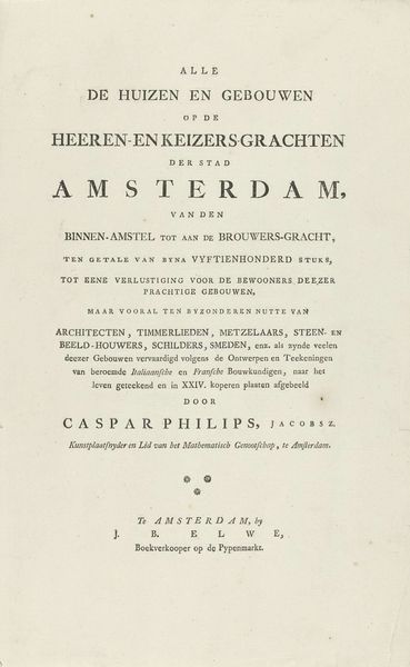
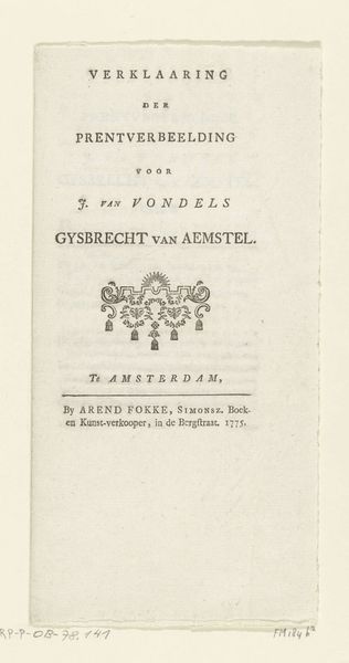
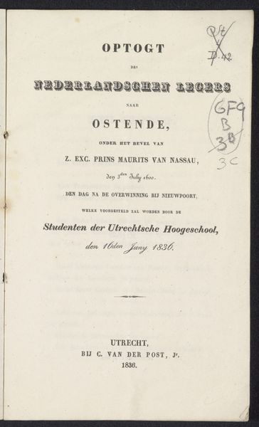
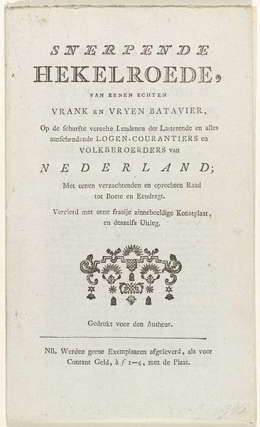
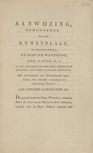
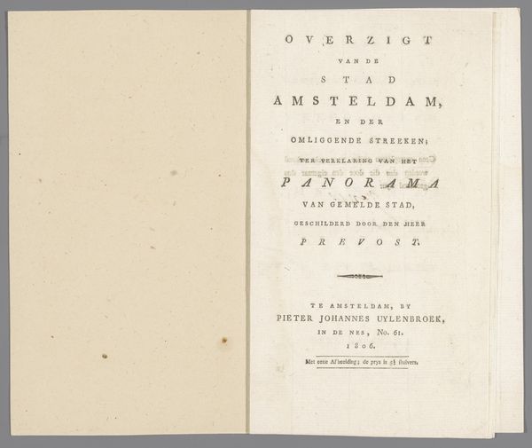
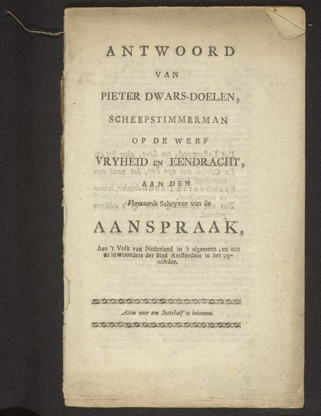
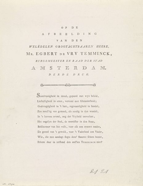
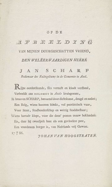
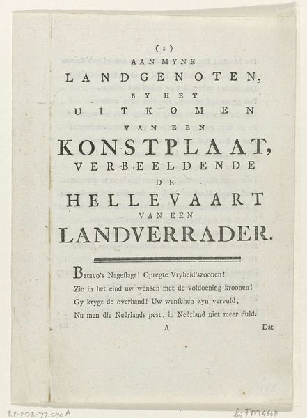
Curator: Here we have “Vers op de nieuwe Psalmberijming, 1774,” a print on paper by Theodorus van Schelluynen. Editor: That's right. At first glance, it just looks like a title page from a book, but the lettering itself seems almost like art. How should we interpret this work? Curator: It is vital to consider the conditions of its production. What paper was used? Who was the intended consumer, and how was it distributed? Understanding this reveals social networks tied to religious texts. Editor: That makes sense. The "Hervormde Nederduitsche Gemeente te Amsterdam," must have been a patron, of sorts, of this piece. Curator: Precisely. The very act of printing made the scripture accessible, a deliberate intervention in the religious lives of the people. Each typeface choice would have signaled status or importance. Note also the reference to an elder preacher from the community! How does that impact the meaning? Editor: So the *way* it's printed and who it was for matters just as much as the literal words? The materiality highlights labor and audience reception. Curator: Exactly! It prompts questions about the resources used, the skilled labour involved, and the access different social classes would have had. This makes it a tool not just of spiritual instruction, but social construction. Editor: Thinking about the paper, the ink, the printing process itself, all as conveyors of meaning, is a great reminder to look beyond the surface of things. Thank you. Curator: My pleasure! Remembering the art is always linked to human labor is fundamental to understanding its impact.
Comments
No comments
Be the first to comment and join the conversation on the ultimate creative platform.
