Verklaring der prentverbeelding voor J. van Vondels Gysbrecht van Aemstel 1775
0:00
0:00
arendfokkesimonsz
Rijksmuseum
print, paper, typography, engraving
# print
#
paper
#
text
#
typography
#
engraving
Dimensions: height 220 mm, width 110 mm
Copyright: Rijks Museum: Open Domain
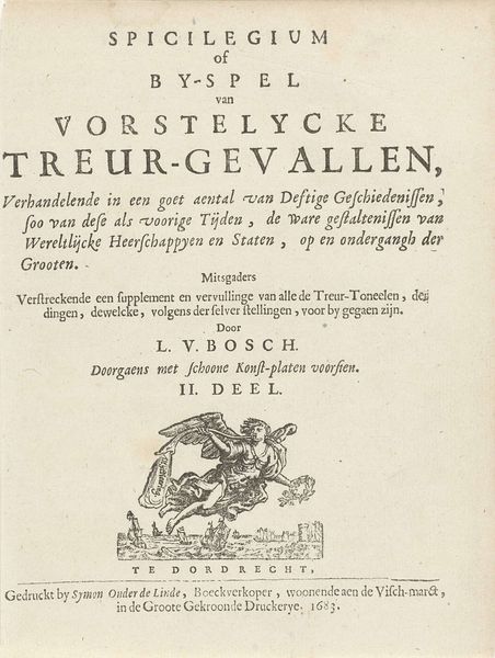
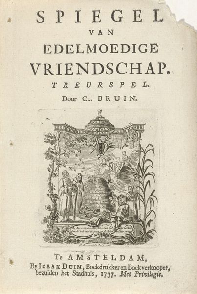
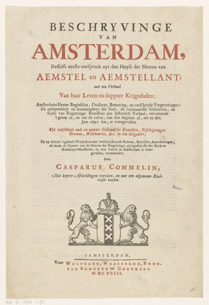
This title page for an illustrated edition of J. van Vondel's "Gysbrecht van Aemstel" was created in 1775 by Arend Fokke Simonsz. The arrangement of text is distinctly hierarchical, moving from the broad declaration at the top to the specifics of author and title, and finally to the printer’s mark. Notice how the typography utilizes varying sizes and weights of font to create visual order, guiding the viewer’s eye down the page. An ornamental cartouche, centered above the imprint, offers a brief respite of organic form amidst the rigidity of the text. However, the overall effect is one of classical restraint, reflecting the structured, formal qualities valued in the literature and art of the period. The page functions less as an expressive artwork and more as a carefully designed system of information, where each element plays a part in the clear communication of content. It reflects the Enlightenment's emphasis on reason and order.
Comments
No comments
Be the first to comment and join the conversation on the ultimate creative platform.
More like this