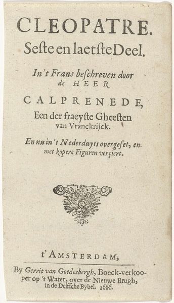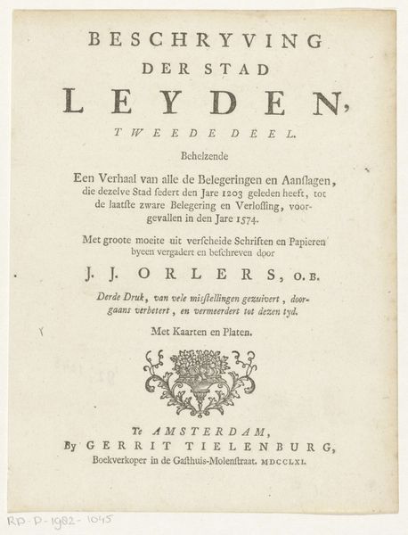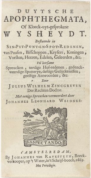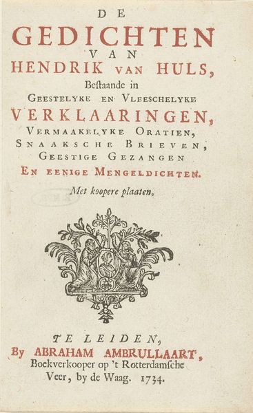
Titelpagina voor: Henricus Hofsnider, Kronyk van Groningen ende Ommelanden, 1743 1743
0:00
0:00
graphic-art, print, typography, engraving
#
graphic-art
#
baroque
# print
#
typography
#
engraving
Dimensions: height 211 mm, width 124 mm
Copyright: Rijks Museum: Open Domain
Curator: Let's consider this title page from Hendrik Hofsnider's 1743 "Kronyk van Groningen ende Ommelanden." It's an engraving, so a print, and exemplifies Baroque sensibilities. What strikes you when you first look at it? Editor: Honestly? All that dense text feels very intimidating. Visually, it’s giving me serious Old World librarian vibes, like hidden dusty books and whispered secrets in cavernous libraries. The font's elegant, sure, but there's just so much of it. It's offset by this very charming vignette at the bottom, which softens the mood. Curator: Right, the typography here communicates authority, appealing to a learned readership deeply invested in regional history. Look at how Hofsnider positions Groningen’s history— "wars, destruction, internal strife"—as foundational narratives. This aligns with a broader 18th-century preoccupation with chronicling local identities against centralized powers. The historical account isn’t merely descriptive; it’s constructing a particular sense of regional self-awareness. Editor: Okay, context is key. But back to the cute little image for a sec: it has a romantic, peaceful vibe at odds with what you're saying. It almost seems like a tranquil counterpoint to all those internal conflicts and wars mentioned in the text, almost a way to entice the reader with something softer. Like, "Yes, history is messy, but look at this lovely landscape!" Curator: That contrast is important, it reflects a period grappling with rapid social and political shifts. The visual element becomes almost a promise—an idealized representation of what is at stake in this meticulous recounting of the region’s past. It speaks to issues around land ownership, community identity, and the very idea of 'Heeren huizen' and 'Adelyke gebouwen'—power structures, let’s be honest. Editor: It feels very… curated. Like, here are all the key moments— the dramatic foundations of a place! Even today, local histories hold sway. This one speaks of the weight of tradition but the little illustration gives an unexpected touch of lightness. Almost mischievous, don't you think? Curator: Mischevious! That is definitely one way to consider its lasting power. It calls into play nostalgia and pride and, most importantly, perhaps a challenge to contemporary conditions and political power.
Comments
No comments
Be the first to comment and join the conversation on the ultimate creative platform.
