#
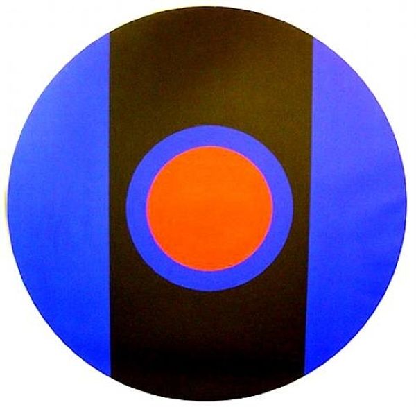
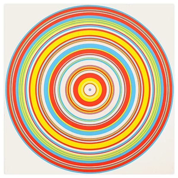
pop art-esque
#
colourful
#
two toned
#
bold colours
#
circle
#
op art
#
pop art
#
solid block colours
#
pop art-influence
#
artificial colours
#
high in contrast
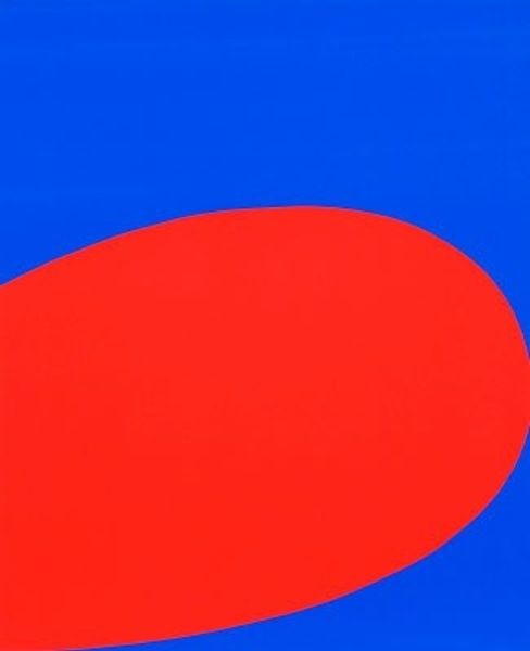
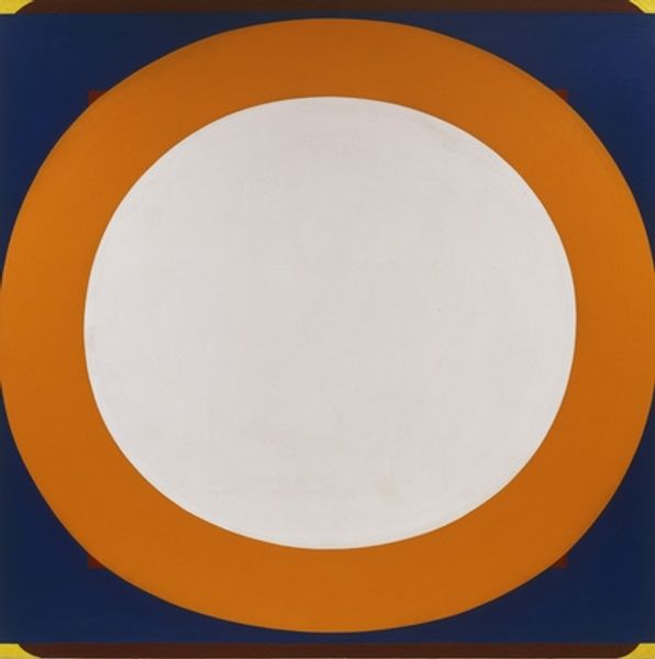
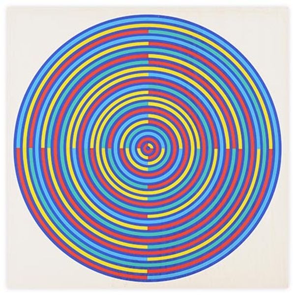
Copyright: Tadasky,Fair Use
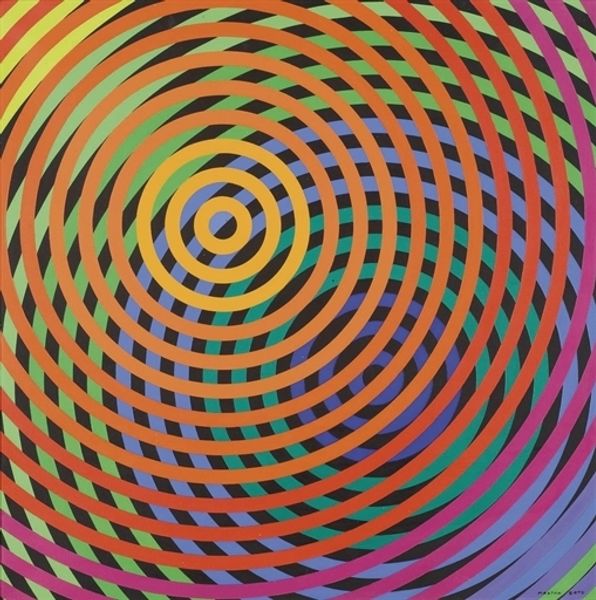
Curator: Looking at "A 2" from 1962, by Tadasky, one immediately confronts a stark geometry: a blue circle dominating a yellow square field. What springs to your mind? Editor: Immediately? Bees. Blue bees trapped in a very sunny, yellow room. It's quite a simple construction, but there's a sort of playful tension to the contrast of those two very saturated colors. It almost vibrates. Curator: The piece epitomizes principles prevalent in Op Art of that era: strong, bold colors, high contrast. It manipulates the viewer's perception. Note how the disc doesn’t quite sit still, seemingly advancing or receding from the surface. Editor: That's exactly the magic of it. Like an optical illusion but done so elegantly. It's static yet somehow suggests infinite motion. I like that. Makes you think, maybe we're the ones spinning around *it*. Curator: And the effect, though bold, remains rigorously controlled, doesn’t it? This isn't just vibrant color for the sake of it. There’s that quiet echo, for instance, of circular lines within the larger blue shape, suggesting unseen depths or movement...it directs the eye inexorably. Editor: Almost hypnotic, really. It’s like staring at a perfect full moon on a summer night. Though I bet Tadasky was thinking more about the mechanics of vision, the sensation it gives is much older. Deeper somehow. Curator: Undoubtedly. He taps into primal perceptions and reduces them to their essence, a move characteristic of hard-edge abstraction that resonated powerfully in the 1960s and has lost little of its potency even now. Editor: So, "A 2"—a simple equation. Yellow and blue make… not green, but buzz. An unexpected buzz that I feel just looking at this; thank you, Tadasky, for bringing some sunshine into art. Curator: An insightful reflection, perhaps reminding us how fundamental geometric forms, married with such vibrant chromatic interplay, offer both structured clarity and unexpected emotional resonances.
Comments
No comments
Be the first to comment and join the conversation on the ultimate creative platform.
More like this