painting, acrylic-paint
abstract-expressionism
painting
pop art
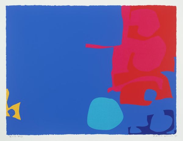
colour-field-painting
acrylic-paint
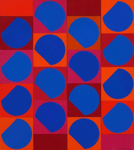
geometric
new-york-school
abstraction
pop-art
line
modernism
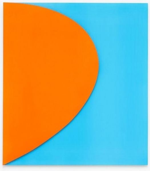
hard-edge-painting
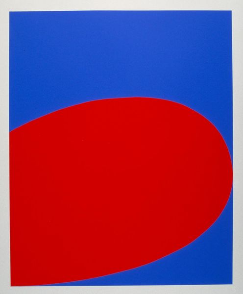
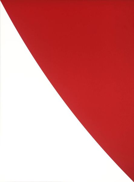
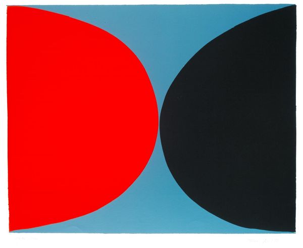
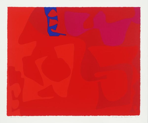
Copyright: (c) Ellsworth Kelly, all rights reserved
Editor: So, this is Ellsworth Kelly's "Red/Blue," created in 1964. It's strikingly simple, just these two blocks of pure colour. I find it quite bold, but almost... calming? How do you interpret this work? Curator: Those potent blocks of colour – the vibrant red and serene blue – speak to us on a very primal level. Consider the weight these hues carry in our collective consciousness. Blue, historically, has symbolized the celestial, the spiritual, the infinite. Red is the colour of passion, of lifeblood, of revolution. How do these associations resonate for you as you view this piece? Editor: I can see that. The red definitely feels like it's pushing forward, full of energy, while the blue recedes. Is that contrast deliberate, do you think? Curator: Absolutely. Kelly masterfully uses this tension to create a dynamic equilibrium. These shapes, almost totemic in their simplicity, invite a psychological projection. What personal meanings arise as you contemplate their interaction? Do they perhaps represent opposing forces in your own life, seeking balance? Editor: That's fascinating! I hadn't thought of it that way. It makes the piece feel much more personal than I initially expected. So it’s not just shapes and colours, but also, like, echoes of deeper feelings? Curator: Precisely. Art often acts as a mirror, reflecting back our own internal landscapes through shared symbolic language. Exploring art such as this reminds us that the symbols used evolve, though some continue as foundations within humanity. Editor: That’s given me a completely new perspective on abstract art. Thank you. Curator: My pleasure. It is inspiring to trace the threads of human experience within the simplest of forms.
Comments
No comments
Be the first to comment and join the conversation on the ultimate creative platform.