acrylic-paint, paper
#
minimalism
#
pattern
#
pop art
#
acrylic-paint
#
paper
#
geometric
#
geometric-abstraction
#
line
#
modernism
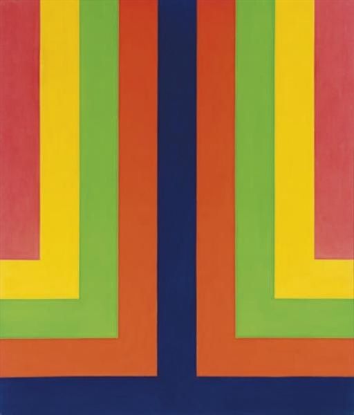
Copyright: Max Bill,Fair Use
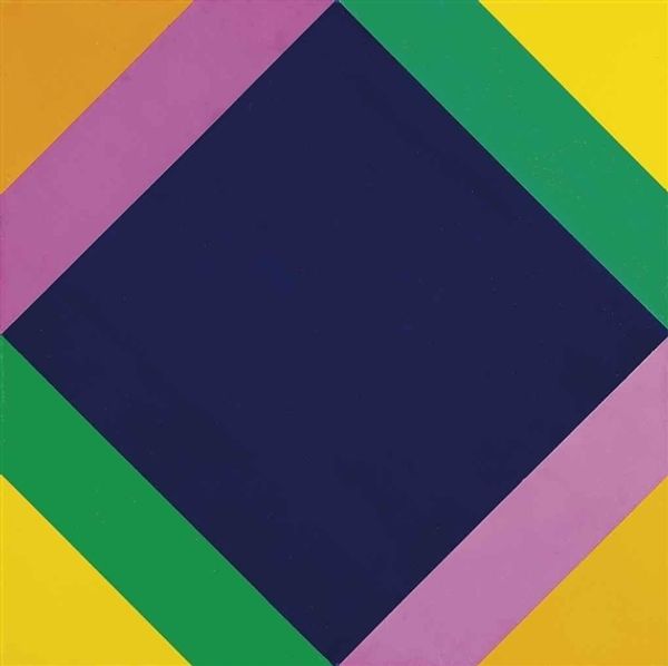
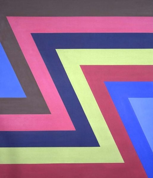
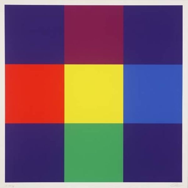
Curator: Max Bill's "Komposition," created in 1974 using acrylic on paper, is a compelling piece. What are your initial thoughts? Editor: Stark. Very formal and rigid. The intense dark blue rhombus centered within those hard-edged color bands… it feels almost oppressive, doesn’t it? Curator: Perhaps, but consider the colors—yellow, lavender, green. They're almost playful. These hues were highly resonant in the era's pop art sensibility. We can find parallels in the design trends of the time. Editor: True, but their geometry here seems less about playful liberation and more about controlling the viewing experience. Look how the composition locks your eye, never allowing it to wander from the central form. Curator: Precisely! Bill aimed for a universal visual language. The square tilted at an angle symbolizes dynamic tension and perfect balance, which evokes deeper philosophical themes. Editor: But isn't it overly simplistic? It is so clearly structured and relies heavily on elementary shapes to convey… what, exactly? Pure form for its own sake? Curator: Partly. For Bill, those basic shapes were loaded signifiers. They refer back to ideas of utopian order. The limited palette, and the acrylic application are carefully controlled to project his philosophical interests through the visual realm. Editor: Still, it borders on sterile. All those sharp edges feel unforgiving, although I grant you there is a certain intensity in how that dark void dominates. Curator: I appreciate that acknowledgement of the dark void, because within this void, the forms and hues outside its confines become illuminated, and gain context to create tension, balance, and unity. Editor: So, ultimately, is "Komposition" simply a highly structured visual argument? A carefully calibrated exercise in… persuasion through geometric austerity? Curator: I would say that it provides fertile ground for exploration regarding color and balance—with an implicit reflection of the modern utopian impulses that resonate even today. Editor: Indeed, it is still speaking, even, or perhaps especially, to a postmodern sensibility weary of grand narratives.
Comments
No comments
Be the first to comment and join the conversation on the ultimate creative platform.
More like this