About this artwork
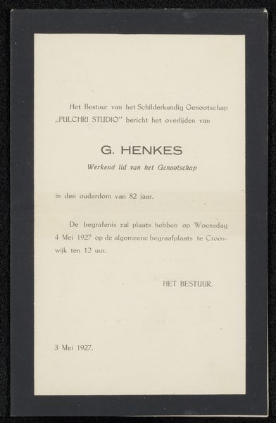
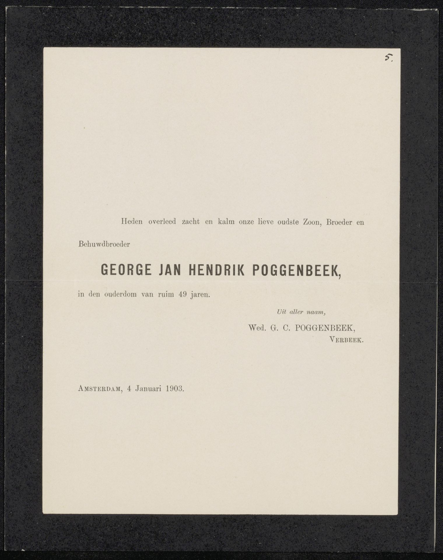
This announcement was made in Amsterdam on January 4th, 1903 for Nico van Harpen. It's a really beautiful example of typography. The black ink is thick enough to feel almost like a physical presence on the paper. The arrangement of text, the way the words are spaced, feels intentional, like the setting of shapes within a frame. I think of it like a dark, minimalist painting, like the paintings of Ad Reinhardt, whose black squares are never just black, but a study in the subtle modulations of tone. Look at the way the title, "GEORGE JAN HENDRIK POGGENBEEK," is slightly bolder, drawing your eye in. It's the anchor of the piece, and then your eye moves around to take in the rest of the information. The paper is creamy, providing a soft ground for the stark black lettering. It reminds me of the care Agnes Martin took in choosing the right shade of white for her grids, because every little shift matters. It’s like a poem, really, an elegy in ink on paper, and it makes you consider how art can be found in the most unexpected places, even in an announcement of death.
Artwork details
- Medium
- graphic-art, print, paper, typography
- Copyright
- Rijks Museum: Open Domain
Tags
graphic-art
type repetition
aged paper
white palette
paper
printed format
typography
folded paper
thick font
letter paper
paper medium
historical font
columned text
Comments
Be the first to share your thoughts about this work.
About this artwork
This announcement was made in Amsterdam on January 4th, 1903 for Nico van Harpen. It's a really beautiful example of typography. The black ink is thick enough to feel almost like a physical presence on the paper. The arrangement of text, the way the words are spaced, feels intentional, like the setting of shapes within a frame. I think of it like a dark, minimalist painting, like the paintings of Ad Reinhardt, whose black squares are never just black, but a study in the subtle modulations of tone. Look at the way the title, "GEORGE JAN HENDRIK POGGENBEEK," is slightly bolder, drawing your eye in. It's the anchor of the piece, and then your eye moves around to take in the rest of the information. The paper is creamy, providing a soft ground for the stark black lettering. It reminds me of the care Agnes Martin took in choosing the right shade of white for her grids, because every little shift matters. It’s like a poem, really, an elegy in ink on paper, and it makes you consider how art can be found in the most unexpected places, even in an announcement of death.
Comments
Be the first to share your thoughts about this work.