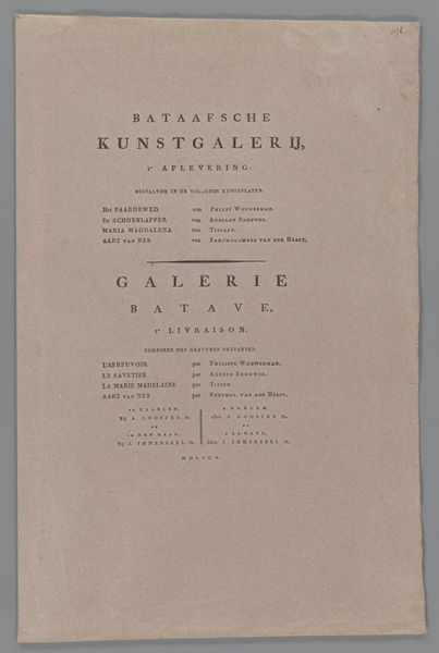
Tekstblad met opdracht aan Rutger Jan Schimmelpenninck 1805
0:00
0:00
adriaanpieterszloosjes
Rijksmuseum
graphic-art, print, paper, typography
#
graphic-art
#
type repetition
#
aged paper
#
homemade paper
#
script typography
#
neoclassicism
# print
#
hand drawn type
#
personal journal design
#
paper
#
personal sketchbook
#
typography
#
fading type
#
stylized text
#
thick font
Dimensions: height 492 mm, width 305 mm, width 608 mm
Copyright: Rijks Museum: Open Domain
Editor: Here we have Adriaan Pietersz. Loosjes’s “Tekstblad met opdracht aan Rutger Jan Schimmelpenninck,” a typographic print from 1805. The old paper has a delicate feel to it. It gives off a feeling of admiration. What can you tell us about its deeper significance? Curator: This text sheet isn't just information; it's a carefully constructed message embedded in symbolism. Consider the use of typography, not just as words but as visual elements, and then think about how this relates to cultural memory and continuity. Editor: Cultural memory? Could you elaborate? Curator: In the Netherlands at this time, what does it mean to inscribe Rutger Jan Schimmelpenninck's name in such prominent, classical lettering? Notice the text: “Friend and protector of the fine arts.” Is this merely a description, or an intentional statement, meant to imbue him with authority? Editor: It almost sounds like a strategic act. Curator: Indeed. Think about how visual symbols act upon the psyche. The dedication, the artistic styling of the script… what sort of emotions or affiliations would these details likely inspire? The intent behind presenting it as a work of art itself tells you how seriously the public viewed artistic patronage. Editor: So it’s communicating more than just gratitude; it’s crafting an image. I didn't quite catch that before! Curator: Precisely. We can see how those choices reveal cultural values, both explicitly and subtly. These aren't just letters, they're carriers of cultural and political identity. Editor: I’ll definitely look at typography differently from now on. It seems obvious, but also so hidden.
Comments
No comments
Be the first to comment and join the conversation on the ultimate creative platform.
More like this