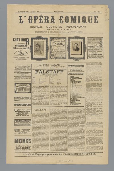
graphic-art, print, typography, poster
#
graphic-art
#
art-nouveau
# print
#
typography
#
poster
Dimensions: height 622 mm, width 396 mm, thickness 2 mm
Copyright: Rijks Museum: Open Domain
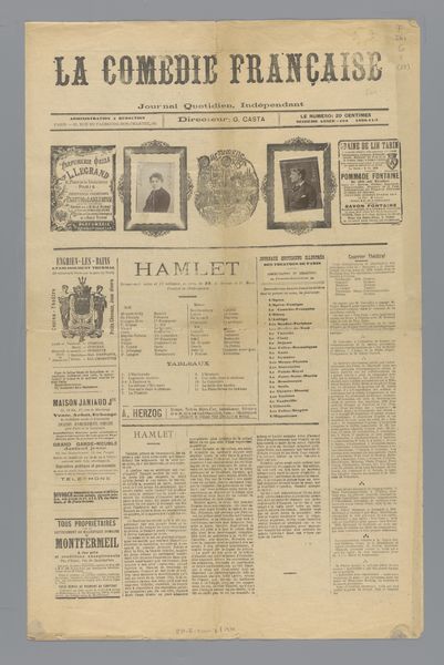
Curator: What strikes me first is the sheer density of information packed into this print. It feels like a sensory overload, very characteristic of that period. Editor: Precisely. This is "L'Opéra," a print poster from 1894, created under the direction of G. Casta. It’s a fascinating document, showcasing the convergence of Art Nouveau aesthetics with the burgeoning mass media of the time. We can see graphic art, typography, even hints of the burgeoning advertising industry. Curator: Advertising yes. The Chat Noir reference jumps out immediately. These symbols served as a very modern way of connecting social life with visual art at the time. The product advertisements woven in seem like an early version of branded content, don’t they? Editor: Absolutely. The opera and music performances listed tell a compelling story about entertainment culture in late 19th-century Paris. But the visual language—the stylized fonts, the intricate borders—speaks volumes about Art Nouveau’s attempt to elevate commercial design to the level of high art. How do you see these intertwined influences in the piece? Curator: Well, the constant tension between artistic expression and commercial imperative is evident. We have the artistic ambitions on the one hand—with a kind of refined, decadent look to some sections. And a need to be loud, appealing, and practical on the other—we need you, the audience, to know the performances. A clear push and pull is clear here. The graphic weight of everything. Editor: I agree, the symbolism here can be understood in a number of ways. But looking at this from an institutional perspective, publications like this had a critical public role. They were shaping opinion, disseminating cultural values, and mediating experiences for a mass audience—all wrapped up in the guise of a simple poster. This particular one really draws on a wide range of social activities, which serves a testament to how relevant the newspaper actually was. Curator: I hadn’t considered that dimension! Editor: The opera of this piece is about more than music. This kind of typography reveals how everyday life was seen by those making media at the time. The cultural continuity speaks to both our shared obsession with music, and how the advertising industry became what we know today. Curator: A visual history contained on a page. Very profound, and with this overview, I'm more engaged than when I first saw it. Editor: Exactly. This kind of artifact can be both dense and rich when placed into its moment.
Comments
No comments
Be the first to comment and join the conversation on the ultimate creative platform.
More like this