#
script typeface
#
type repetition
#
sand serif
#
aged paper
#
stylized text
#
thick font
#
handwritten font
#
word imagery
#
historical font
#
columned text
Copyright: Rijks Museum: Open Domain
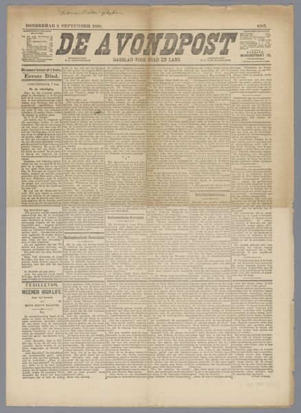
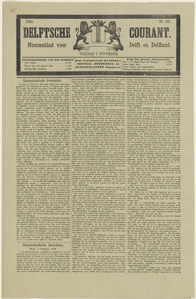
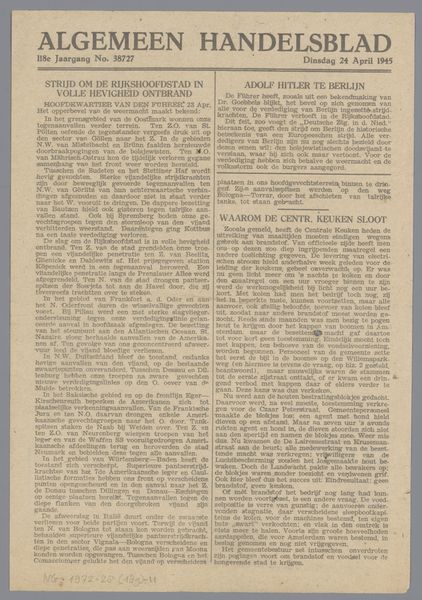
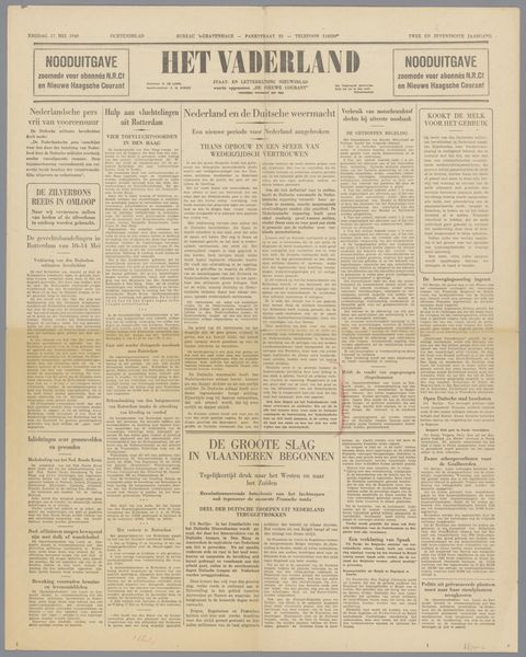
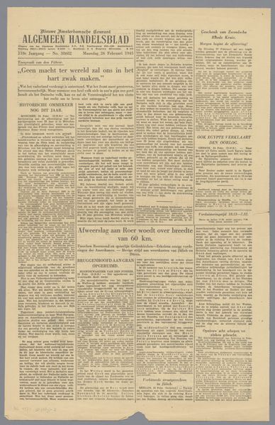
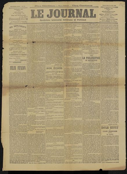
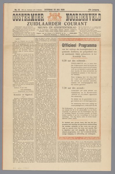
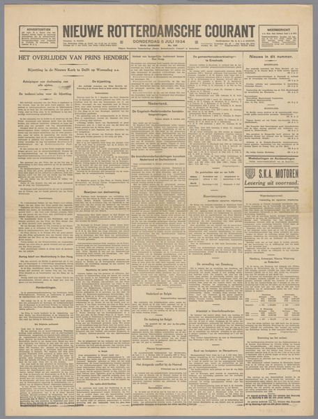
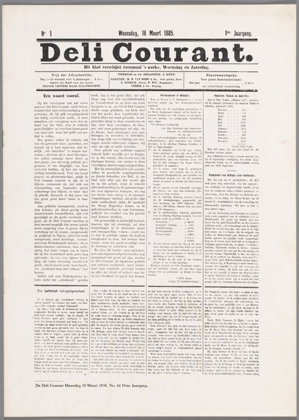
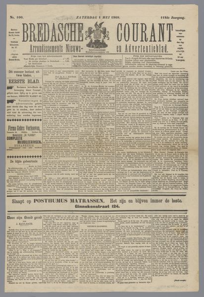
Curator: Here we have an interesting relic: a newspaper clipping titled "Krantenknipsel uit archief Philip Zilcken," possibly from 1909. What strikes you first? Editor: It exudes age. The yellowed paper, the cramped columns of text, even the slight tear on the left—they all whisper of a bygone era. A powerful sense of faded urgency, wouldn’t you agree? Curator: Yes, certainly the materiality and aged quality of the physical object contributes greatly. Let's delve deeper. Note the striking typography – the mix of serif and sans-serif fonts, the density of the text block. Consider the layout, almost aggressively columned, prioritizing information. The texture derived solely from type. Editor: Absolutely, but the social context screams out! "De Amsterdammer," a weekly magazine, suggests a burgeoning national identity solidifying amidst complex social issues and challenges around the turn of the century. And who was Zilcken, I wonder, and why did he preserve this? Curator: Indeed. Zilcken was an artist and critic so most likely the typography and layout appealed to his aesthetic. There's a formal elegance. Observe the way the titles interrupt the block text. Notice how the handwritten and script typeface in the advertisement sections stand out. The strategic interplay and variations of visual elements. Editor: Precisely. The visual variations underscore a socio-political climate: Dutch society at a turning point. We see how literacy, class, and nationalism are represented in this particular medium and preserved for perhaps political reasons. Curator: You’ve successfully shifted us from aesthetics to interpretation, but let’s give the object credit. Without that strong composition, the semiotic value will go unnoticed. It’s important not to lose sight of those compositional structures. Editor: It's a tension that drives meaningful reflection; both formal analysis and an examination into the social issues are imperative. Understanding them helps bring meaning to a historic piece. Curator: Agreed, this clipping offers a beautiful crossroads. A perfect encapsulation of form and meaning of the era, each elevating the other. Editor: A material and textual time capsule. Fascinating to reflect how seemingly innocuous, every day material reveals deep truths.
Comments
No comments
Be the first to comment and join the conversation on the ultimate creative platform.
More like this