collage, print, textile, paper, typography
#
yellowing
#
type repetition
#
aged paper
#
collage
#
newspaper
# print
#
appropriation
#
textile
#
paper
#
block of text
#
typography
#
journal
#
fading type
#
newspaper layout
#
stylized text
#
columned text
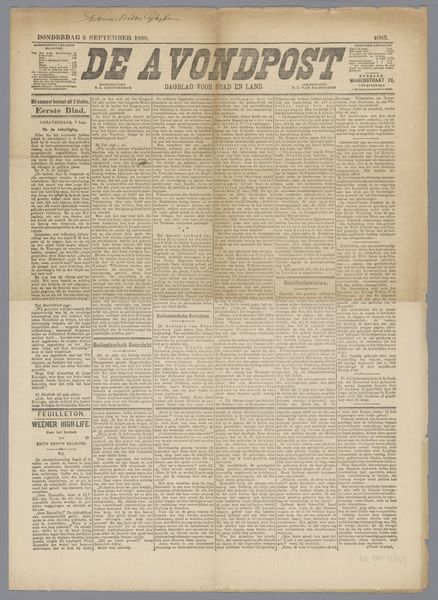
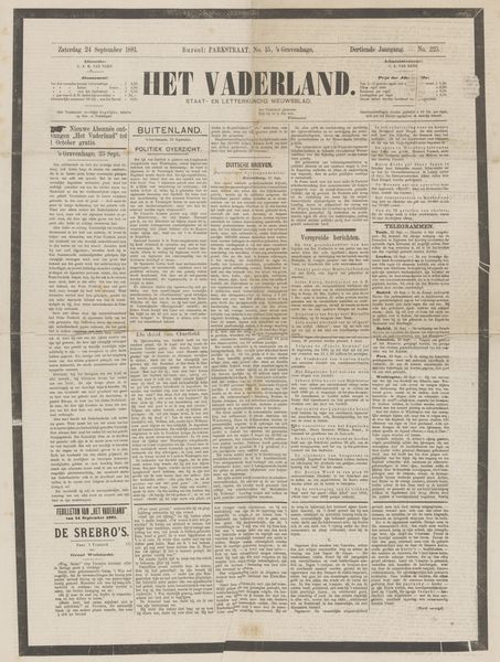
Dimensions: height 55.2 cm, width 36.5 cm
Copyright: Rijks Museum: Open Domain
This is the Bredasche Courant newspaper, printed in 1909, probably with some kind of printing press, which is kind of like a big mark-making machine. The whole page is filled with a tight grid of text. The texture comes from the density of all these tiny letterforms, all pressed together. Even though it's just ink on paper, you can almost feel the weight and pressure of the printing process. I find myself focusing in on the big lettering of the title, BREDASCHE COURANT. It’s set in this bold, blocky font that feels so solid and confident. It reminds me of some of the shapes I use in my own paintings. There's a connection to abstract art in this piece, as the grid structure is similar to Agnes Martin's paintings. But unlike Martin, this is less about pure form and more about the messy, everyday stuff of life: news, announcements, ads. It’s a reminder that art, in all its forms, is always embedded in the world around us.
Comments
No comments
Be the first to comment and join the conversation on the ultimate creative platform.
More like this