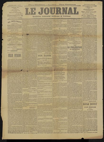
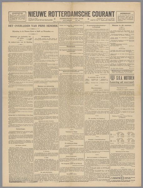
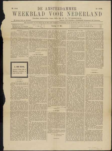
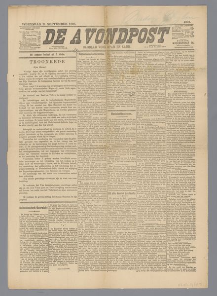
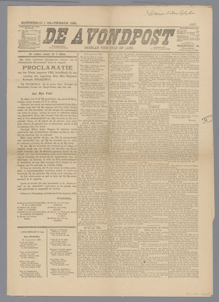
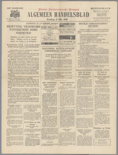
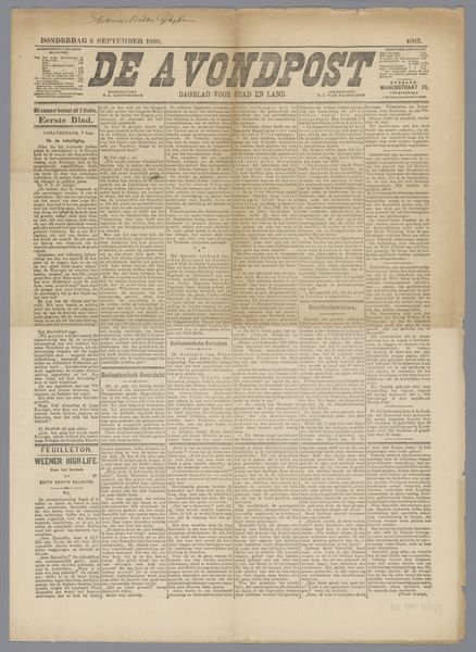
graphic-art, print, paper, typography, poster
#
yellowing
#
graphic-art
#
type repetition
#
aged paper
#
newspaper
# print
#
paper
#
text
#
typography
#
fading type
#
newspaper layout
#
stylized text
#
thick font
#
poster
#
modernism
#
historical font
#
columned text
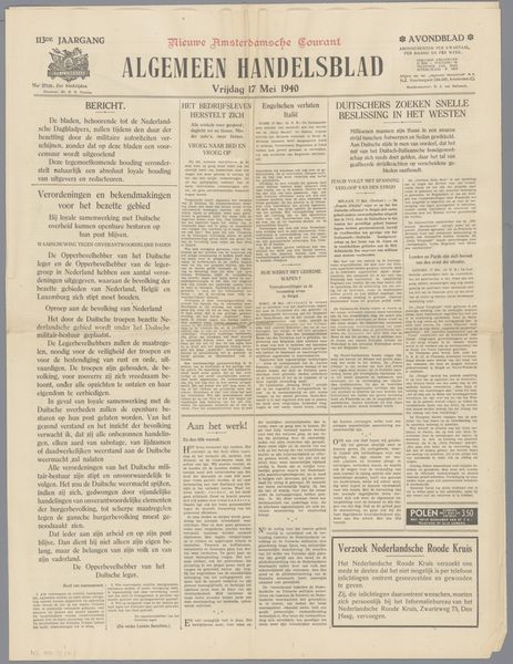
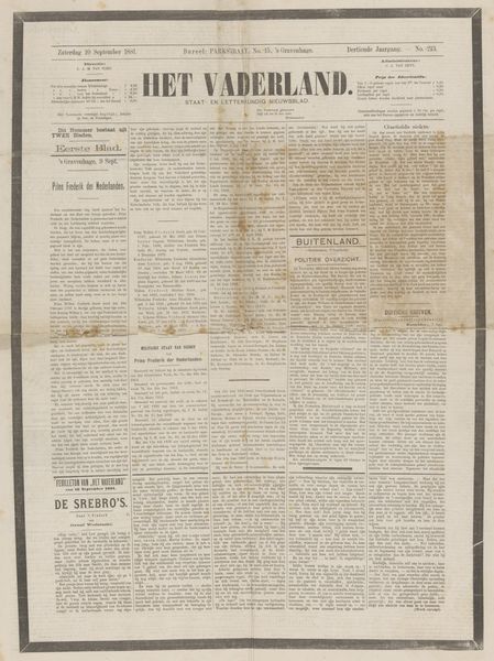
Dimensions: height 57.7 cm, width 45.7 cm
Copyright: Rijks Museum: Open Domain
Curator: We're looking at a print titled "Het Vaderland," or "The Fatherland," believed to date from the period of 1940 to 1945. It resides here in the Rijksmuseum. Editor: The overwhelming sense I get is one of immediacy, even chaos. It's a wall of tightly-packed text on aged, yellowing paper, immediately calling to mind a sense of urgency and perhaps even constraint. Curator: "Het Vaderland" was a Dutch newspaper, and during the Nazi occupation, it faced increasing pressure and censorship. This particular print is likely an "emergency edition," marked by that urgent "Nooduitgave" at the top. Consider the social climate; communication was weaponized, news a commodity and tool of control. Editor: Absolutely. The sheer density of text reinforces that. Each column feels overloaded with information. The bold, somewhat stylized typeface used for the main title - a rather thick font I might add - and the various headings scream "attention." The title itself is heavily symbolic; what does "fatherland" represent under occupation? Curator: Precisely! That invocation of national identity is loaded. The content speaks of aid for refugees and of a new period of mutual trust, and of course references the German armed forces. Each phrase becomes a battleground of meaning, designed either to bolster morale or enforce compliance. Editor: I notice recurring images that suggest a desperate state of affairs. The 'emergency edition' is repeated on both sides. Even the mentions of silver certificates feel like desperate measures. Is this type of layout designed to invoke a certain mood on purpose, or to subconsciously prime the populace to certain actions? Curator: It's both. Remember, information – and misinformation – were key tools of the occupation. Every element, from font choice to article placement, would be scrutinized and deployed for maximum effect. The yellowing of the paper adds a patina of history and scarcity, doesn't it? Editor: Yes, that aging truly enhances the mood. This wasn’t intended as something to be carefully preserved but was consumed and then became history itself. Reflecting on the text and images is also a process of reflecting on a nation's past itself. Curator: Indeed, it reveals so much about a turbulent period of Dutch history and media control. Editor: For me, seeing this piece makes me reflect on how even seemingly mundane visual choices contribute to shaping powerful symbolic narratives during crises.
Comments
No comments
Be the first to comment and join the conversation on the ultimate creative platform.
More like this