drawing, paper, ink, pen
#
drawing
#
ink paper printed
#
paper
#
personal sketchbook
#
ink
#
pen work
#
sketchbook drawing
#
pen
#
sketchbook art
#
watercolor
Copyright: Rijks Museum: Open Domain
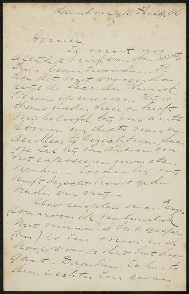
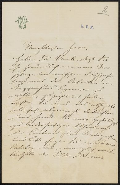
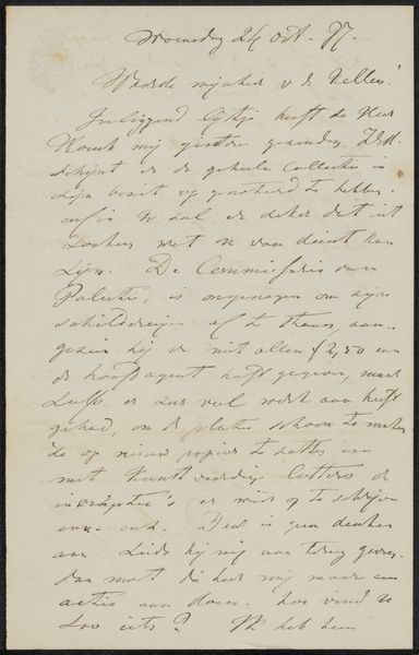
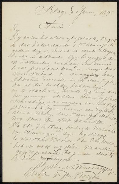
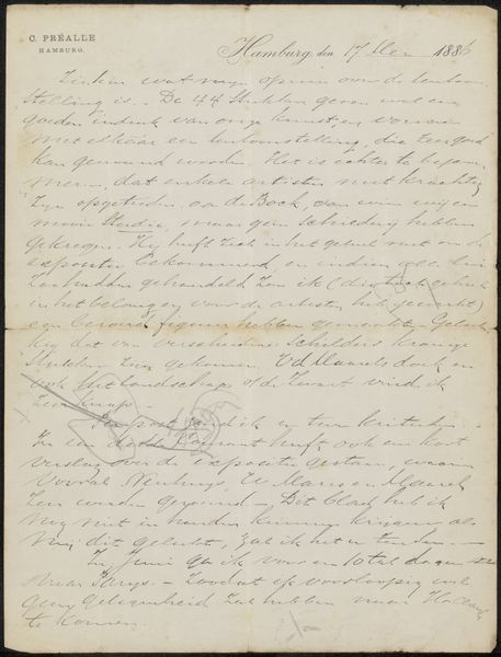
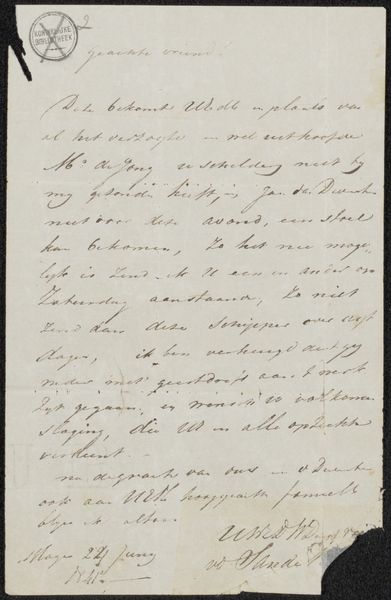
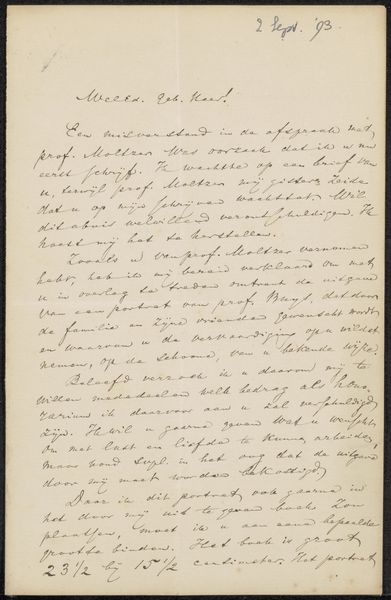
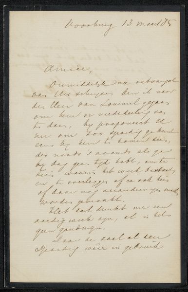
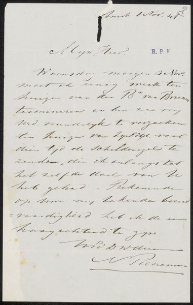
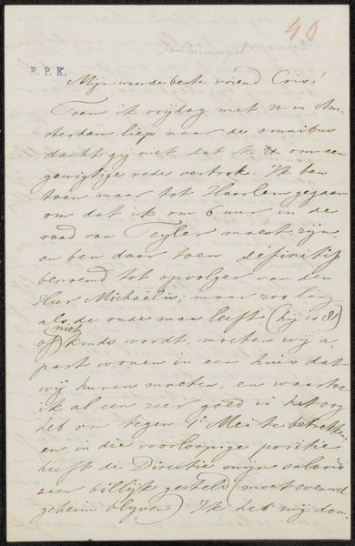
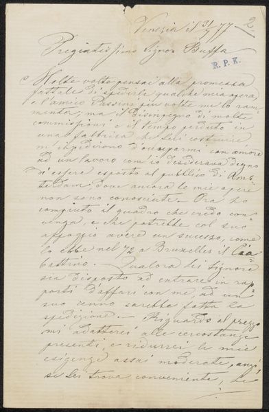
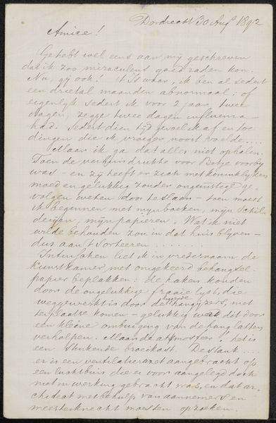
Curator: We’re looking at "Brief aan Philip Zilcken" by Arij Prins, possibly created between 1886 and 1888. It’s a drawing, a letter, really, using ink on paper. Editor: It has a very personal feel to it. Intimate even. It's dominated by lines, but somehow has the feel of watercolor due to the tones in the paper and ink. It gives me a sense of peering into a private world. Curator: It is a personal document. You notice how dense and interwoven the pen work is. See how the application is consistent across the sheet? Prins uses that careful script to visually condense the note. Editor: Yes, and placing the letter in context, correspondence during this period often reflects power dynamics. Who is writing to whom, and about what? That calligraphic script speaks of status, while the content certainly unveils interpersonal dynamics within artistic circles. Curator: Precisely, Prins is creating this work of penmanship in a very traditional form. Think about what constitutes a drawing—Prins elevates this practical format through craft. Look how he achieves value changes solely with line density. Editor: The intersection between the personal and the presentational is what I'm taking away. This letter has made its way from sender to receiver, from private hand to a public collection. So, there’s something intrinsically compelling about this supposed fragment being seen as a piece of art today. Curator: I'd suggest its appeal rests on our appreciation for well-wrought lines and design on a page. I agree; it definitely compels us to consider those contrasts between private creation and eventual public view. Editor: Right, making us really look at these small gestures of reaching out across distance and time.
Comments
No comments
Be the first to comment and join the conversation on the ultimate creative platform.
More like this