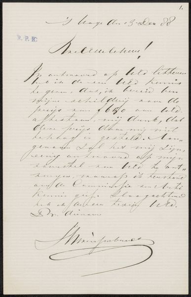
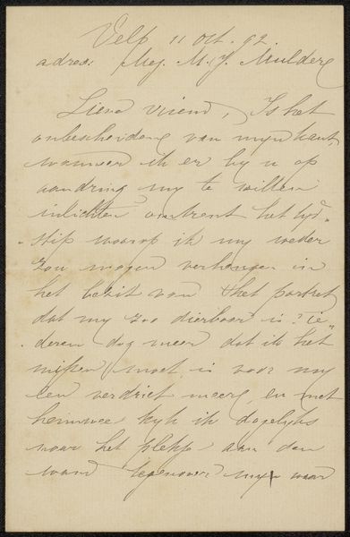
drawing, paper, ink
#
drawing
#
paper
#
ink
#
calligraphy
Copyright: Rijks Museum: Open Domain
Curator: We are viewing "Brief aan Frans Buffa en Zonen," which translates to "Letter to Frans Buffa and Sons." It's attributed to William Unger and believed to have been created sometime between 1873 and 1879. The piece you are observing showcases ink on paper and is a beautiful instance of calligraphy. Artist: Oh, look at that cursive! It feels… almost romantic, doesn’t it? Like a secret whispered across time. It's making me want to pull out a quill and write something important myself! Curator: Notice how Unger employs varying stroke weights in the script to create visual texture. This textural element enhances the legibility while imbuing the lettering with a distinct rhythmic quality. The top-left insignia is equally remarkable. Artist: It really does look like music on paper! I wonder what the message actually says? I can't read it, but you can almost feel the mood in the way the letters swell and taper. Is it urgent, you think? Or maybe just friendly business? Curator: Determining the precise contents of the message will require transcription and translation, naturally. Semiotically, however, the handwritten format signals a degree of intimacy and direct engagement absent in typeset correspondence. Consider the spatial relationships: Unger’s management of the page through line spacing and the strategic placement of textual blocks provides insight into the organizational structure of his thoughts. Artist: Wow, organizational structure! I just thought it looked balanced. But yeah, you're right—there's definitely a flow to it, like a carefully arranged dance across the page. It makes you think about the human connection too; someone took their time crafting this, really cared about making it clear and perhaps even elegant. Curator: A vital consideration is the inherent materiality: The absorbency of the paper dictates ink spread, influencing line definition, whilst subtle shifts in ink saturation reflect varying pen pressures. Such details yield valuable insights into Unger's artistic process. Artist: I guess, beyond the words, we see someone trying to make a connection. That intention is quite special. Curator: Indeed. An exquisite reminder of a bygone era when communication possessed a tactile, deeply personal quality. Artist: Exactly! It has inspired me to make my hand-written postcards again.
Comments
No comments
Be the first to comment and join the conversation on the ultimate creative platform.
More like this