drawing, paper, ink, pen
#
drawing
#
ink paper printed
#
hand drawn type
#
paper
#
personal sketchbook
#
ink
#
hand-drawn typeface
#
ink drawing experimentation
#
intimism
#
pen-ink sketch
#
ink colored
#
pen work
#
sketchbook drawing
#
pen
#
sketchbook art
#
calligraphy
Copyright: Rijks Museum: Open Domain
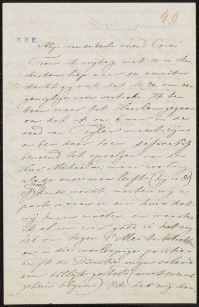
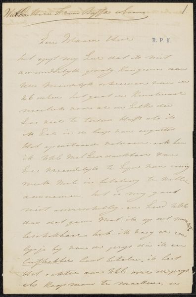
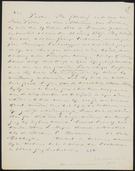
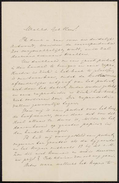
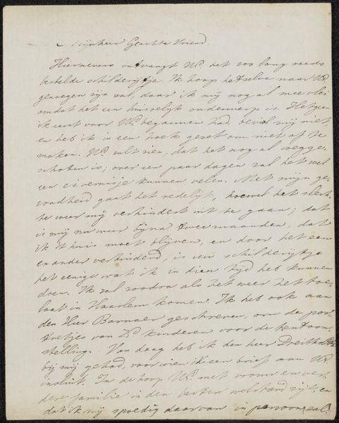
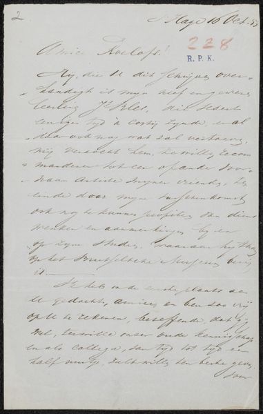
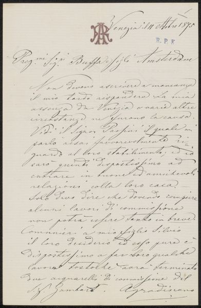
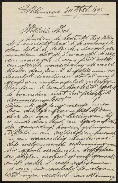
Curator: Here we have "Brief aan Frans Buffa," which translates to "Letter to Frans Buffa," possibly penned around 1877 by Antonio Rotta. It’s ink on paper, seemingly a personal note. Editor: It has a certain visual density. The script dominates the space and creates almost a textile effect. It’s difficult to separate the visual from the textual here, isn’t it? The paper, in effect, functions more as surface. Curator: Absolutely. The tight script reveals Rotta’s calligraphic skill, typical of artists during that era when correspondence was elevated almost to an art form. You can observe in the handwritten typeface how he plays with variations in pressure and the shape of strokes. Editor: How did the act of writing a letter relate to other, perhaps larger-scale works that Rotta was creating? Was this kind of "sketchbook art" typical for him or for artists more broadly at the time? Curator: This drawing allows insights into Rotta’s intimate world. Given the likely date, Rotta was possibly at the height of his artistic power in Venice. His attention to detail, which we see reflected on his larger works is quite prominent here. As for this "intimism," letters such as these are really unique. They give insight to more public roles and commissionings during his life. Editor: There’s also an economic reality imbedded, right? In terms of materials. Choosing paper and ink speaks to more than just his preferences, it's about accessibility of different kinds of medium. The content of the letter makes it seem like Buffa was someone whose patronage he sought. It is fascinating, how the social, material and technical contexts of making art during that time are concentrated here in a single piece of paper. Curator: Yes, seeing such everyday media also reminds us that even established figures navigate resource availability, a point that ties the formal considerations to its production. Editor: Looking closely at it made me realise there’s something deeply revealing about seeing the texture and process, and something equally revealing of that creative-economic time in Venice.
Comments
No comments
Be the first to comment and join the conversation on the ultimate creative platform.
More like this