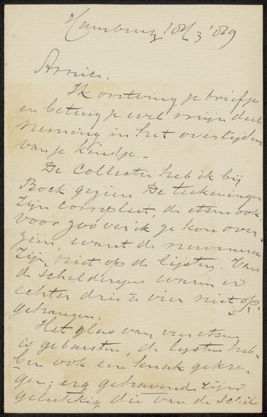
drawing, paper, ink, pen
#
drawing
#
paper
#
ink
#
pen
Copyright: Rijks Museum: Open Domain
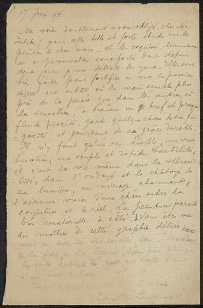
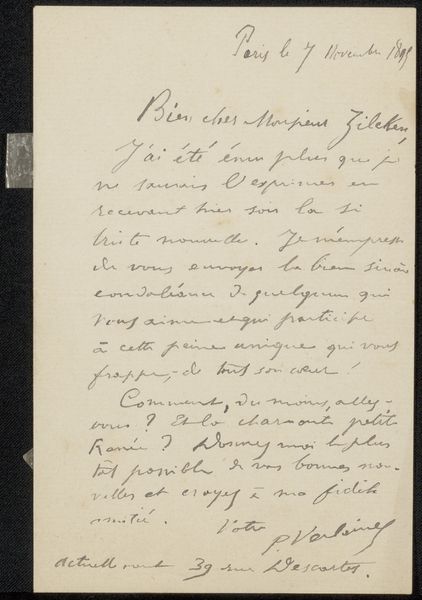
Curator: Today, we're looking at "Brief aan Philip Zilcken," a drawing possibly from 1892, created by Cornelis Willem Hendrik Verster van Wulverhorst, rendered with pen and ink on paper. Editor: It feels very immediate, like a fleeting thought captured on paper. How would you interpret the visual elements of this piece? Curator: I observe a focus less on mimetic representation and more on the graphic qualities inherent in the artist's choices of line and form. Consider the calligraphic variations: are they simply a functional transcription, or is there an evident aesthetic decision-making process occurring within the arrangement of letterforms and spatial organization on the page? Editor: That’s interesting. So you’re suggesting that the act of writing itself, the visual quality of the handwriting, is what we should be paying attention to. Curator: Precisely. Notice the tonal variations within the ink itself and how it impacts the page’s perceived depth of field. Further analyze how Verster's deployment of positive and negative spaces influences compositional equilibrium; does his layout offer structured harmony or, contrarily, create deliberately intended disjunction within that optical framework? Editor: It's a fresh way of engaging with what seems like a document at first glance. Now I see the textures and the interplay of light created just by the ink itself. Curator: By moving beyond simply deciphering the text, we are better equipped to interpret its purely visual aesthetic value. Editor: It's interesting how shifting our focus to formal elements allows us to unearth details and find beauty in something we could easily have passed over.
Comments
No comments
Be the first to comment and join the conversation on the ultimate creative platform.
More like this