acrylic-paint
#
op-art
#
op art
#
colour-field-painting
#
acrylic-paint
#
geometric pattern
#
geometric
#
geometric-abstraction
#
abstraction
#
line
#
modernism
#
hard-edge-painting
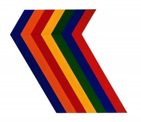
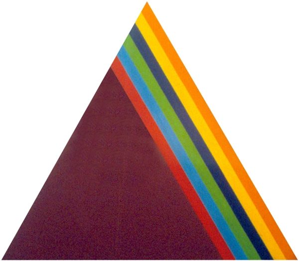
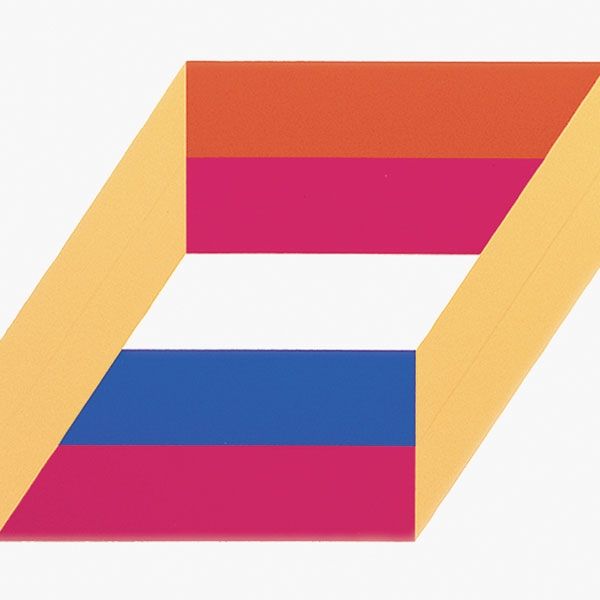
Copyright: Thomas Downing,Fair Use
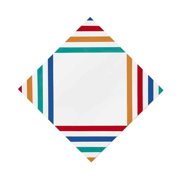
Curator: Here we have Thomas Downing’s "Troll (Series #5)," created in 1967. Acrylic on canvas. Quite a statement, isn’t it? Editor: Absolutely. Immediate impression? Bold! And…deceptive. Those sharp lines suggest precision, but I can sense the human hand, the give-and-take with the materials. What’s intriguing is the relationship between those flat, vibrant colour planes. Like…are they interlocking, competing, or collaborating to fool my eyes? Curator: Yes, I feel that sense of play. It’s less about rigid geometry and more about visual sensation. The hard-edge, Colour Field aesthetic aims to engage the viewer directly, without the filter of representation. It reminds me of music, a melody transcribed into shapes. The 'Troll' title amuses me – I imagine these zigzag lines lurking in a mythic landscape, maybe hiding under a bridge. Editor: 'Troll', right! Perhaps referring to the trick of perception involved? Because look, the stripes—maroon, green, blue, orange, turquoise—they each have a constant width, a definite boundary traced in white, right? And painted in acrylics – I bet a good few layers went on that canvas. Tell me, I wonder how the market influences his decision to adopt colour fields, rather than Pop Art? Curator: I can certainly see how those even lines might make some wonder at the commercial considerations – after all, colour field painting exploded around the mid-20th century with patrons keen for artwork which rejected the messier style of abstract expressionism. Still, the choices seem honest enough to me. He probably did several trial runs for this. But honestly, I can look at it, zone out and enter my dream world; perhaps it reflects the world of production lines? Editor: Hmmm... I agree there's a kind of meditative rhythm happening, yet I think all that bold choice speaks of deliberate consumption habits. This to me feels like an exercise in consumer culture: what does mass production produce, and does that bear repeating across the arts. It speaks of an intersection between social class, economy and value... Curator: Yes, certainly Downing acknowledges commercial production of consumer materials, though it might also just speak to the visual appeal he seeks. His series could go in numerous aesthetic and material directions. It is that inherent ambiguity I treasure – you see material and industrial reflections; I drift off to magical worlds and find something healing about order itself. Editor: Well said. Makes me want to reconsider the piece! Curator: Maybe we can both meet halfway, under that chromatic bridge, ready for our own type of enchantment, however material.
Comments
No comments
Be the first to comment and join the conversation on the ultimate creative platform.
More like this