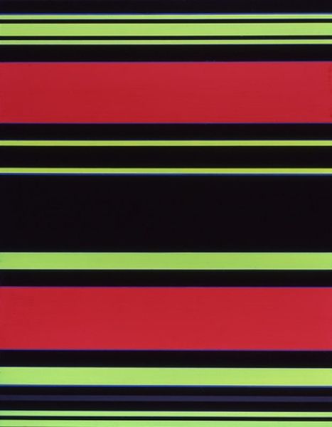
Copyright: Camille Graeser,Fair Use
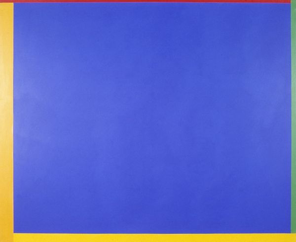
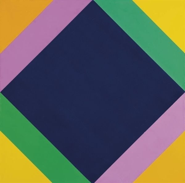
This is Camille Graeser's Komplementäres Spannungsfeld, but I'm not sure when he made it or what it's made of. This piece is so controlled. Look at those lines and shapes; they have a geometric clarity. You just know that the artmaking was a process of careful planning and execution! Now, think about the colors - blue, yellow, green, and red. The way Graeser has used such flat colour gives the piece an appealing sense of the concrete, the real. Each color feels solid, like a block. Notice where the red and green meet, they don’t mix or blend, there’s no messing about. And those perfectly straight yellow lines, acting as borders; so clean! This reminds me a little of Josef Albers, another artist playing with color and form, though Graeser has his own distinctive voice. It’s this ongoing dialogue between artists that makes art so endlessly fascinating, don't you think?
Comments
No comments
Be the first to comment and join the conversation on the ultimate creative platform.
More like this