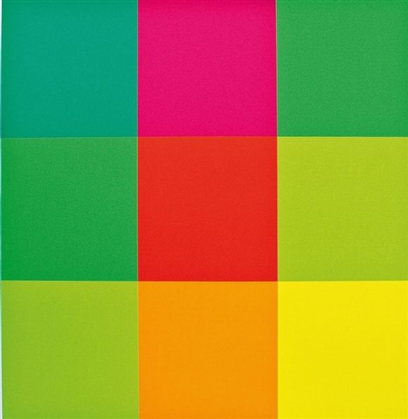
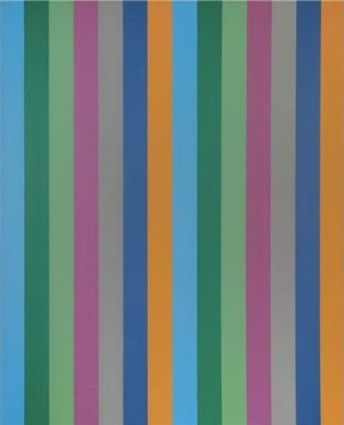
oil-paint
#
contemporary
#
oil-paint
#
colour-field-painting
#
geometric
#
geometric-abstraction
#
abstraction
#
line
#
modernism
#
hard-edge-painting
#
orange
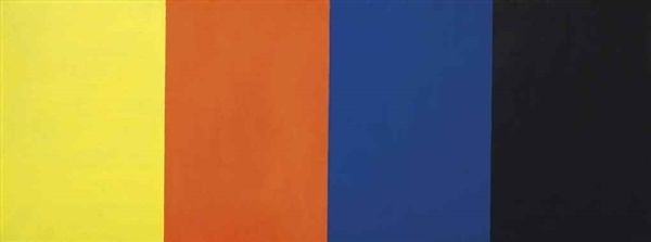
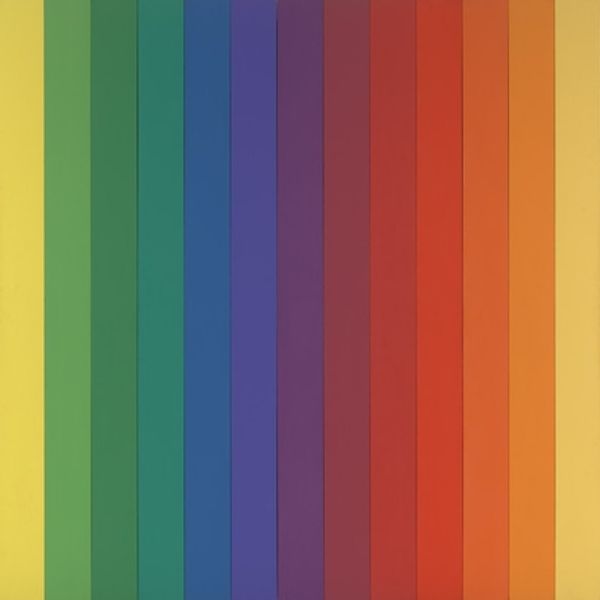
Copyright: (c) Ellsworth Kelly, all rights reserved
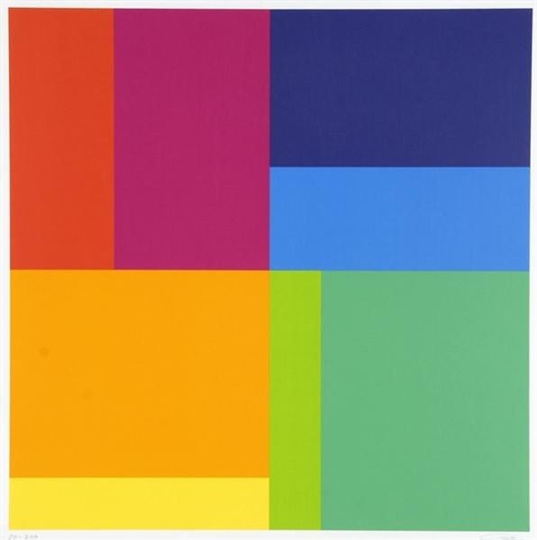
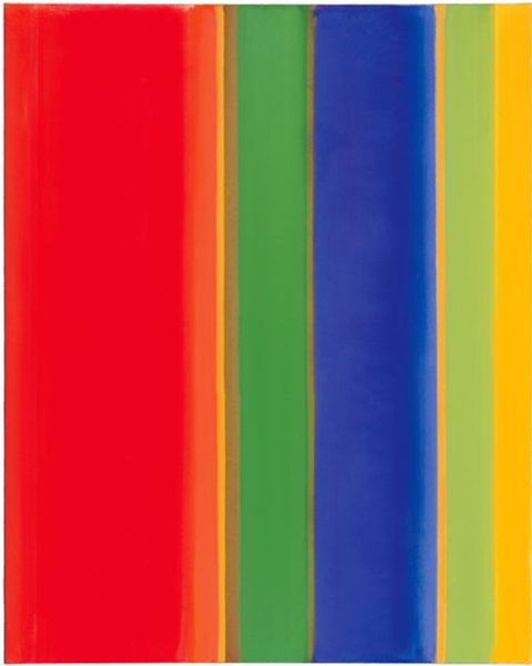
Editor: Here we have Ellsworth Kelly’s “Red Orange White Green Blue,” created in 1968 using oil paint. I'm struck by the intensity of the colors – they’re so vibrant and yet so rigidly separated. It's almost unsettling! What’s your interpretation of this stark simplicity? Curator: Unsettling is a good word. For me, this painting vibrates. Kelly invites us into a dialogue about perception itself, you see? He pushes colour to its very edge, examining not only how individual colours affect us but also the optical relationships *between* them. It’s almost… a challenge to find harmony. Do you sense that tension too? Editor: I do. It feels almost like an experiment, playing with how the colors push and pull against each other. But I keep wondering what’s *beyond* the color. Curator: That’s the heart of Kelly, isn't it? He was less concerned with narrative and more fascinated by the pure visual experience. He once said he wasn’t interested in symbolism, just in the "dumb thing" that is painting itself. Yet, ironically, such elemental simplicity triggers so many complex emotions. Don’t you think? Editor: I absolutely see that. It makes me rethink what art *can* be. Not everything has to tell a story. Sometimes, it can just *be*. Curator: Exactly! It's about finding beauty, or at least interest, in pure form and color. Something almost primal. So, has your unsettling feeling shifted? Editor: Maybe a little. I appreciate the boldness and directness more now. It's… almost refreshing in its honesty. Curator: Yes! Like a clear, bright chord struck out of nowhere. Kelly makes us really *look*, and perhaps that’s enough.
Comments
No comments
Be the first to comment and join the conversation on the ultimate creative platform.
More like this