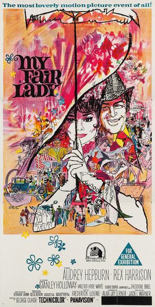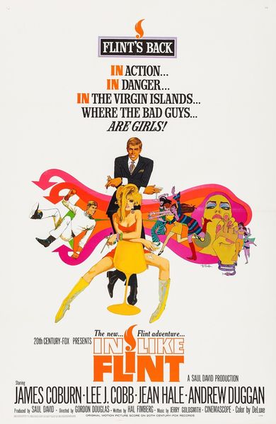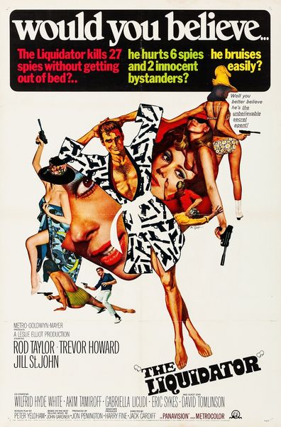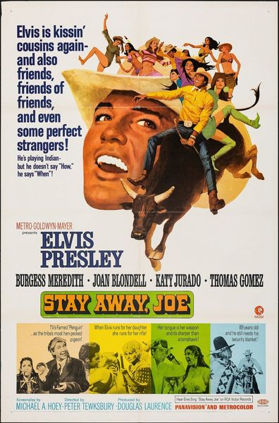
acrylic-paint, poster
magazine cover layout
magazine cover
acrylic-paint
figuration
pop-art
cityscape
poster
Copyright: Public Domain: Artvee
Curator: Wow, look at this, a poster by Robert Peak from 1961 advertising the movie *West Side Story.* It looks like it's primarily done with acrylic paint. My first thought is, it's got this real vintage vibe, right? All those sunny yellows and hectic street signs… Editor: Yes, and situates this love story smack in the middle of urban tension. Peak does such a masterful job layering visual languages: the loose brushstrokes evoking both the grit and the kinetic energy of the city, all competing against clean pop art sensibilities. Curator: Absolutely. The almost chaotic backdrop contrasts with the central figures, Maria and Tony, caught in this joyful embrace. Though I keep circling back to the street signs and fractured cityscape—there’s something unsettling about it, isn't there? Almost as if the environment is working against their romance. Editor: Exactly. We must remember the historical context of *West Side Story*: loosely based on Shakespeare's Romeo and Juliet but set against a backdrop of racial and social unrest in New York City. The fractured cityscapes and clashing colours foreshadow the tensions and divisions that ultimately lead to tragedy. Curator: That's a heavy layer, really weighing down the image! It feels more desperate, perhaps even tragic now. I get that tension. I almost wish he leaned into the figures more. Maybe highlighted their isolation, and gave a glimmer of beauty. It’s such a great pop piece, but you’re right: it needs that bite. Editor: The layering is precisely what creates that complexity. Look at the visual language of Broadway musicals being synthesized, made both larger than life, yet very consciously placed in a web of complex sociological implications and urban decay. Robert Peak encourages us to reconcile that tension. Curator: That changes things. Makes it deeper than a magazine cover or ad campaign. What strikes me is how ahead of the game Peak really was. What did people think when they first saw this? A new kind of modern art? Editor: I believe so. This isn’t just Pop Art decoration. He captures something crucial. The American Dream juxtaposed against the lived realities of its most marginalized. Curator: True. Food for thought, and I can’t wait to see what our listeners take away from that. Editor: Absolutely. It's a constant and crucial discussion, one the artwork beautifully embodies, prompting further consideration and deeper awareness.
Comments
No comments
Be the first to comment and join the conversation on the ultimate creative platform.
