Copyright: Modern Artists: Artvee
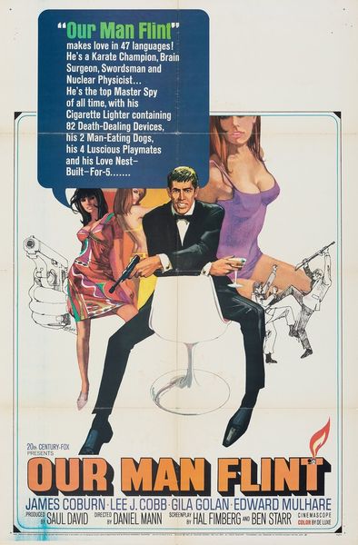
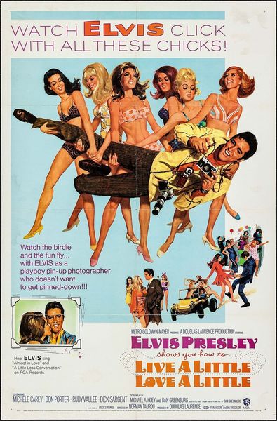
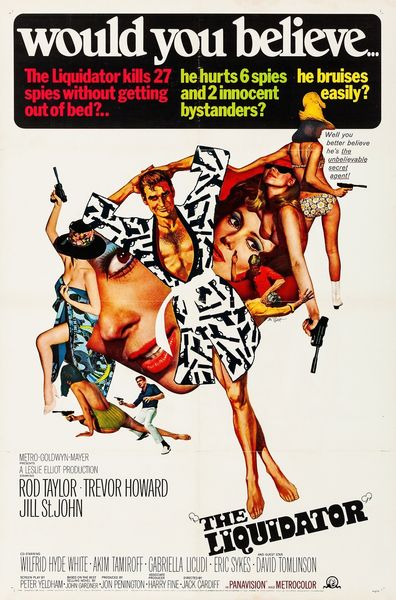
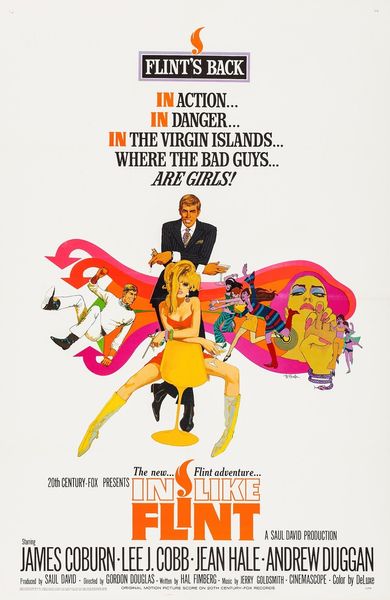
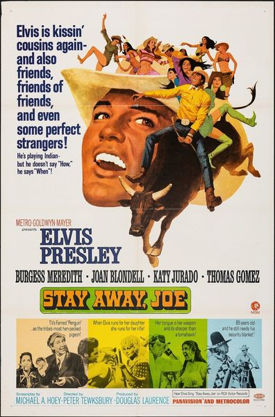
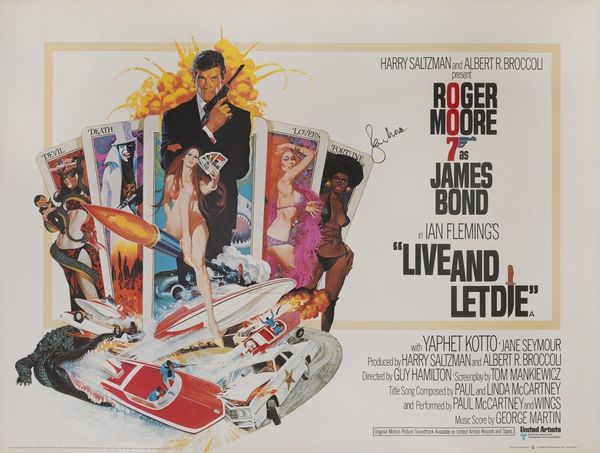
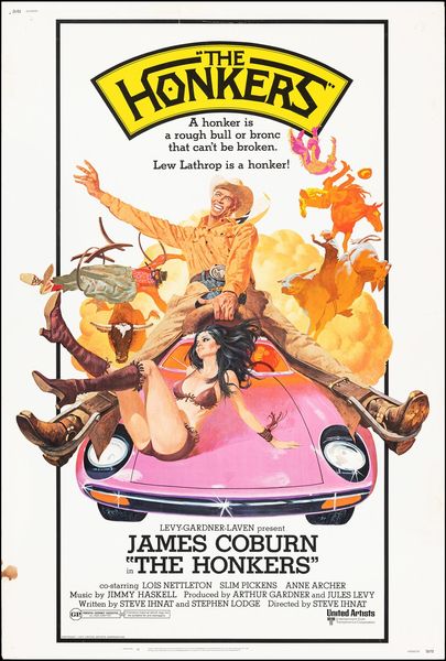
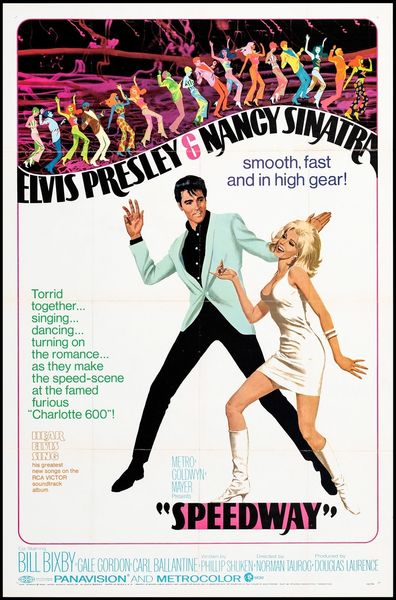
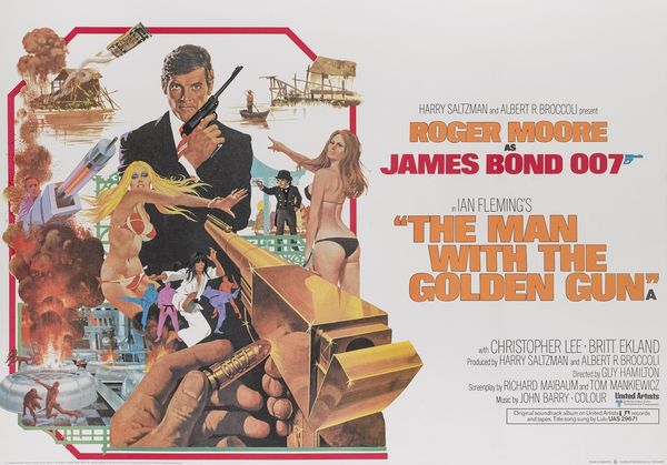
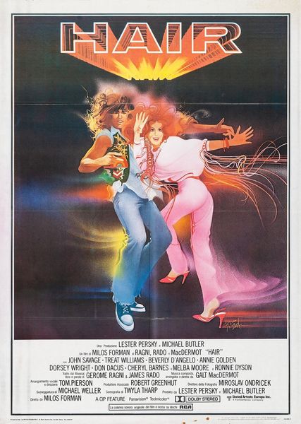
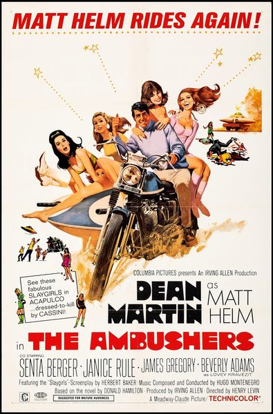
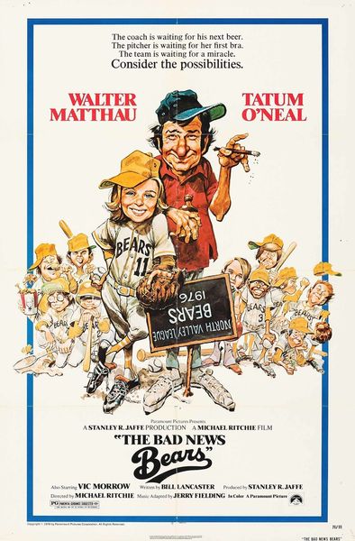
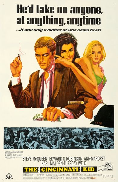
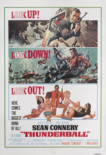
Robert McGinnis made this poster for "Norman...Is That You?" and he’s really working that 70's thing: peach, tan, baby blue, and a whole host of other light colours. It's funny, this feels really photographic but it isn't, it's all paint - how cool is that? McGinnis has created this whole scene which is just so busy, and yet the painting and application of the paint is so thin, it almost doesn't exist. Look at that man's face in the centre, all you see is a collection of marks and lines. He is using the bare minimum to produce the maximum, I love that! The odd thing is, the end result looks so conventional. I mean, I guess you would expect that from a movie poster, but I just want to see McGinnis go wild! I wonder if someone like Alex Katz looked at this piece? There's certainly a shared love of colour and application, but I reckon Katz might think this is all a little bit too crazy.
Comments
No comments
Be the first to comment and join the conversation on the ultimate creative platform.
