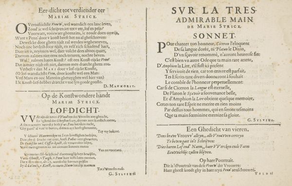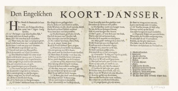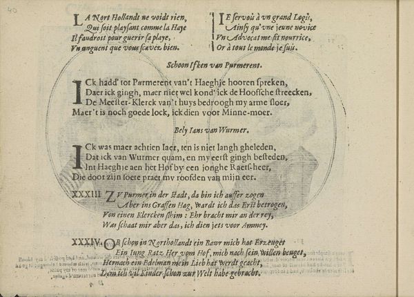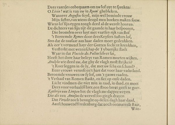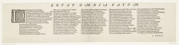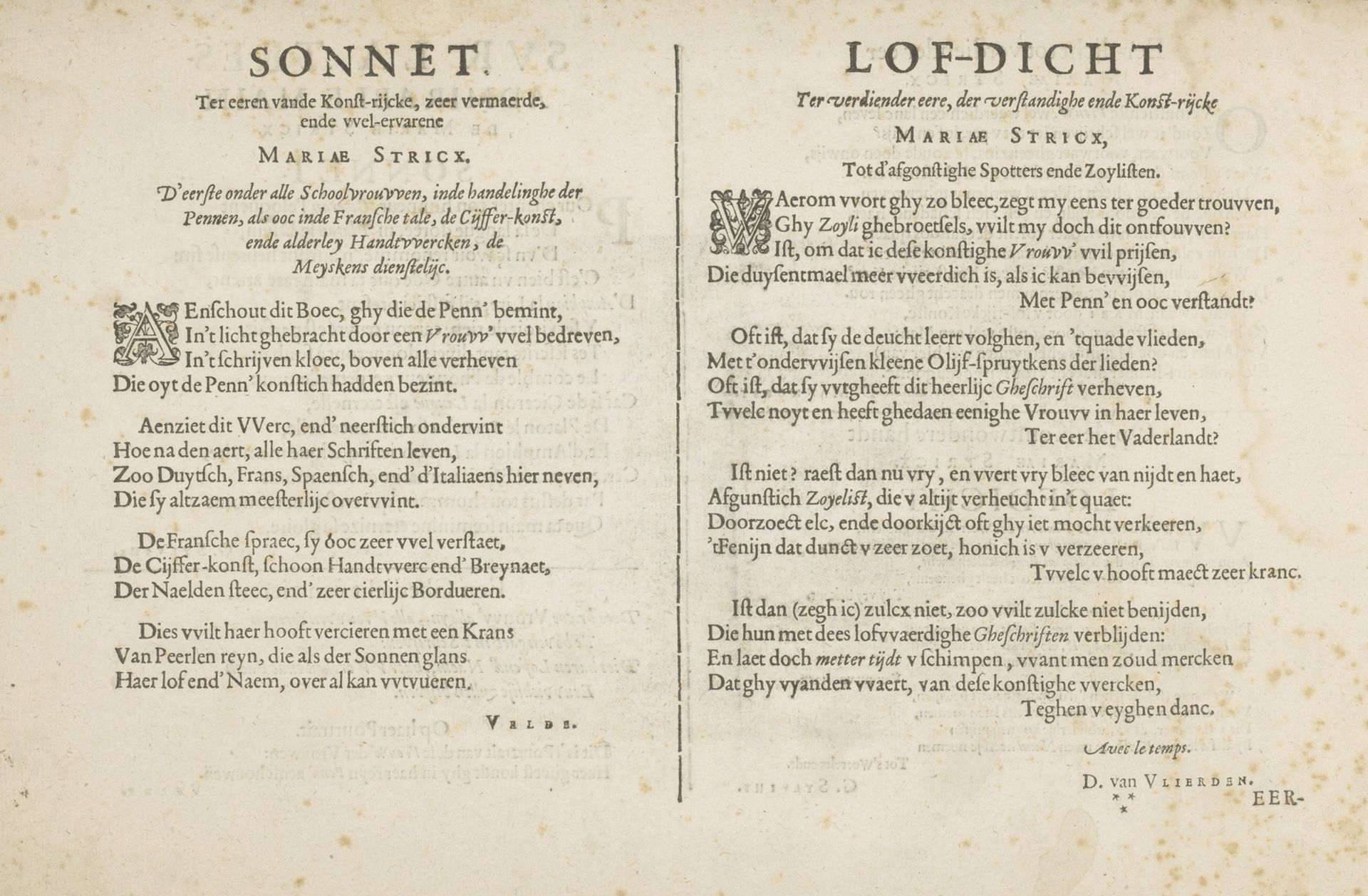
1618
Twee drempeldichten
Jan van de Velde I
1568 - 1623Location
RijksmuseumListen to curator's interpretation
Curatorial notes
Curator: Let’s take a moment to appreciate this piece from 1618. It’s called "Twee drempeldichten," which translates to "Two Threshold Poems," by Jan van de Velde I. You can find it here in the Rijksmuseum, and it’s a stunning example of early typographic art. What’s your initial reaction to it? Editor: My first impression is... intense. The text feels so dense and imposing, like an incantation. There's a gravity here, almost forbidding. It’s quite a contrast to the playful, intricate borders that were popular then. Curator: Precisely. It’s more than just text, isn’t it? The poems here, a sonnet and a eulogy, celebrate Maria Strick, a skilled woman accomplished in arts like needlework and ciphering. The lettering itself mimics fine craft; each carefully constructed line honors her artistry. Notice how the decorative initial letters act like miniature emblems? Editor: Yes, those ornate initials create this visual anchoring, pulling me into the labyrinth of words. There's a real tension between the rigid structure of the text and those little flourishes—like finding flowers pressed between the pages of a very serious book. Curator: Exactly! The choice of font, that tightly packed letterpress, emphasizes the intellectual rigor the poem is celebrating. Remember, back then, acknowledging a woman’s intellect was… politically charged. Printing was relatively new and carefully crafted poems such as this served to challenge patriarchal thought. Editor: It's incredible to see how van de Velde has essentially woven together visual and textual praise. Each word seems meticulously chosen, adding to the collective celebration of Maria Strick’s artistic prowess and mind. The fact it calls out “scornful critics” speaks volumes, doesn't it? Curator: It absolutely does! This piece isn’t just a tribute; it's a defense, a bold assertion of a woman’s right to be recognized for her talents in a world that often tried to silence them. Van de Velde champions Maria using ink, image, and intent. Editor: Knowing that adds so much depth. What seemed imposing now reads like determined defiance, quietly but firmly carving out space. It reminds me that sometimes the most revolutionary acts are found not in grand gestures, but in carefully chosen words, rendered beautiful. Curator: Indeed. The piece serves as a subtle, but resounding claim to recognition and power. A quiet poem made powerfully apparent with its construction.