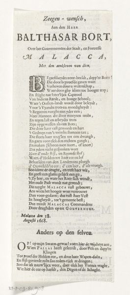
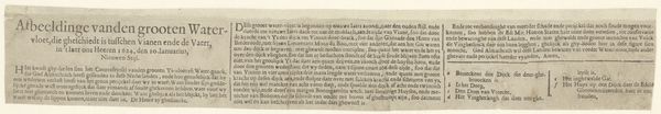
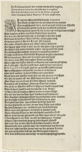
Tekstblad bij de prent met het Rad van Fortuin met de dood van de Zweedse koning Karel X Gustaaf, 1660 1660
0:00
0:00
graphic-art, print, textile, typography, engraving
#
graphic-art
#
type repetition
#
sand serif
#
aged paper
#
script typography
#
hand-lettering
#
baroque
# print
#
hand drawn type
#
hand lettering
#
textile
#
typography
#
fading type
#
stylized text
#
thick font
#
engraving
Dimensions: height 120 mm, width 506 mm
Copyright: Rijks Museum: Open Domain
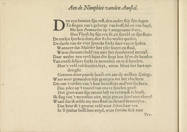
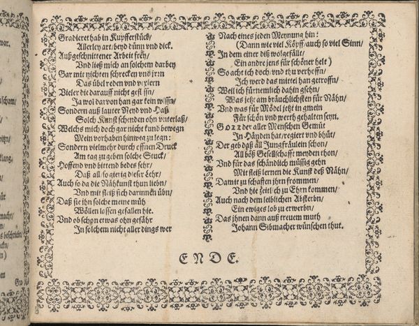
This 1660 broadside, by Jan Bara, employs the stark contrast of black ink on a pale ground, a common technique for printed matter of the period. It yields an immediate sense of sobriety. The overall rectangular structure, divided into neat columns of text, creates a visual rhythm that mimics the cyclical nature of the "Rad van Fortuin" or Wheel of Fortune, as it's known. The dense typography, closely packed lines of text, and the elaborate initial capital "D" all serve to create a textual landscape. This could be interpreted through the lens of semiotics, where words and letters become signs within a larger cultural code reflecting baroque sensibilities. The poem itself functions as a discourse on fate, power, and the ephemeral nature of earthly glory. The wheel becomes a metaphor for historical and personal destiny. The visual and textual composition invites us to consider how Bara's work destabilizes the traditional representation of power, challenging fixed meanings, or engaging with new ways of thinking about historical figures and the events that shape human destiny.
Comments
No comments
Be the first to comment and join the conversation on the ultimate creative platform.
More like this