Omslag voor de catalogus bij de tentoonstelling '1881-1906 jubileumstentoonstelling der beide museumscholen' 1906
0:00
0:00
graphic-art, poster
#
graphic-art
#
art-nouveau
#
decorative element
#
pastel soft colours
#
retro 'vintage design
#
feminine colour palette
#
pattern background
#
repetition of pattern
#
vertical pattern
#
pattern repetition
#
textile design
#
decorative-art
#
layered pattern
#
poster
Dimensions: height 219 mm, width 288 mm
Copyright: Rijks Museum: Open Domain
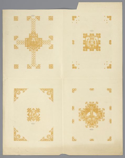
Harm Ellens made this catalogue cover for a museum school exhibition around 1906, using pen and ink. The design's so orderly, almost obsessive, with the way the brown paper is meticulously adorned with geometric shapes and borders. The restrained palette of brown, blue, red and white adds to its charm. Look at the way Ellens uses the simple shapes to create a sense of depth and texture. The repetitive dots and dashes are not just decoration; they give the surface a tactile quality, like raised embroidery. Then there's the bull emblem on the right-hand side, rendered with such detail and precision, it anchors the whole composition. Each line seems deliberate, each shape carefully considered. I'm reminded of Hilma af Klint, who was working around the same time. Although their styles are very different, there's a similar interest in pattern and symbolism. Both artists push us to see the world through the lens of art, recognizing that there is no single or correct interpretation, and revelling in ambiguity.
Comments
No comments
Be the first to comment and join the conversation on the ultimate creative platform.
More like this