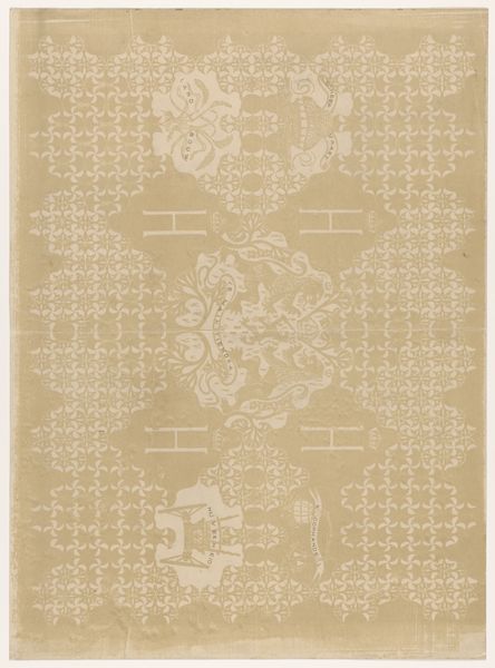
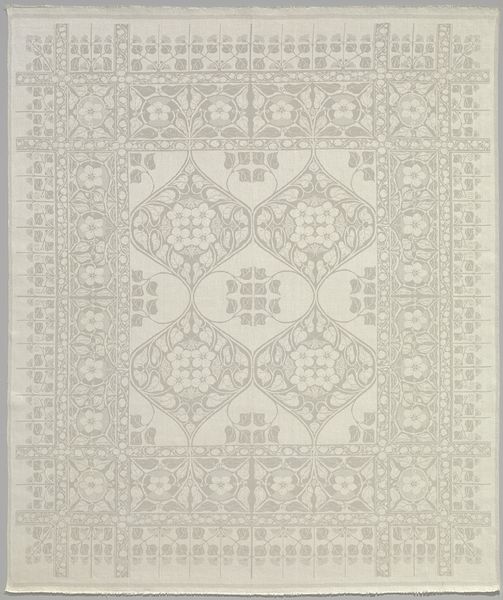
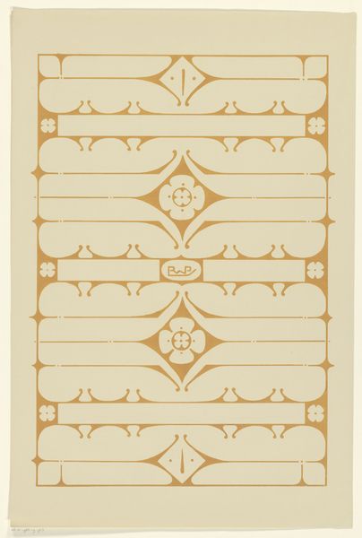
Schutblad voor het boek Naamloze Vennootschap Philips' Gloeilampenfabrieken 1891-1916 1916
0:00
0:00
theonieuwenhuis
Rijksmuseum
#
natural stone pattern
#
naturalistic pattern
#
pattern background
#
pattern design
#
ethnic pattern
#
organic pattern
#
vertical pattern
#
pattern repetition
#
textile design
#
layered pattern
Dimensions: height 277 mm, width 378 mm
Copyright: Rijks Museum: Open Domain
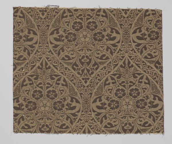
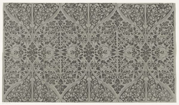
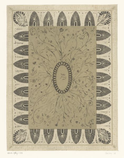
This book cover for Philips, made by Theo Nieuwenhuis, feels so light and airy, like a memory. It’s all flowing lines and the palest tan. I’m drawn to that central lozenge of dense floral patterning, like a little world held within the larger grid. Looking closely, the surface seems almost textile, like a linen napkin, and that single colour, deployed in layers, gives it depth. It has the feel of something printed, probably from a block, with small variations and imperfections in the lines and shapes. These variations give it life. They are a trace of the artist’s hand. It reminds me of some of William Morris’s wallpaper designs, though more restrained, less imposing. Both artists seem to share a belief that even the most functional objects could be made beautiful, but Nieuwenhuis is interested in repetition. The floral motif, repeated over and over, creates a rhythm that is both soothing and slightly hypnotic. Like art, this design shows that functionality and beauty are not mutually exclusive. They can live together.
Comments
No comments
Be the first to comment and join the conversation on the ultimate creative platform.
More like this