About this artwork
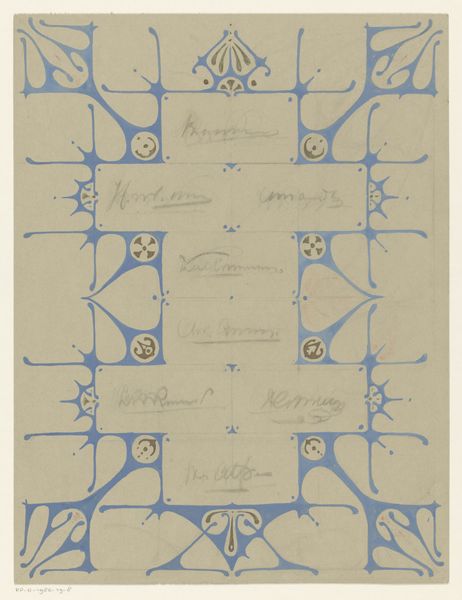
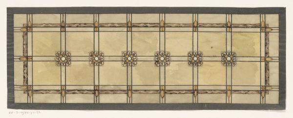
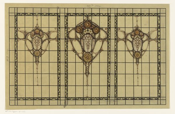
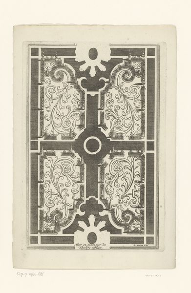
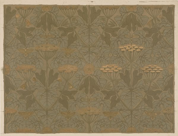
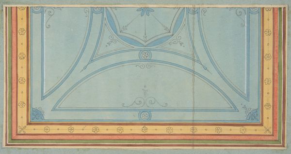
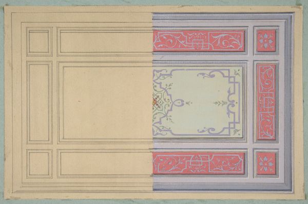
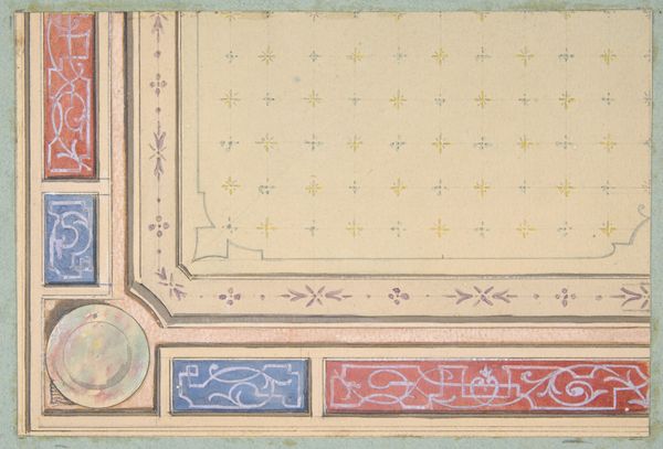
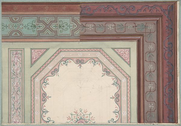
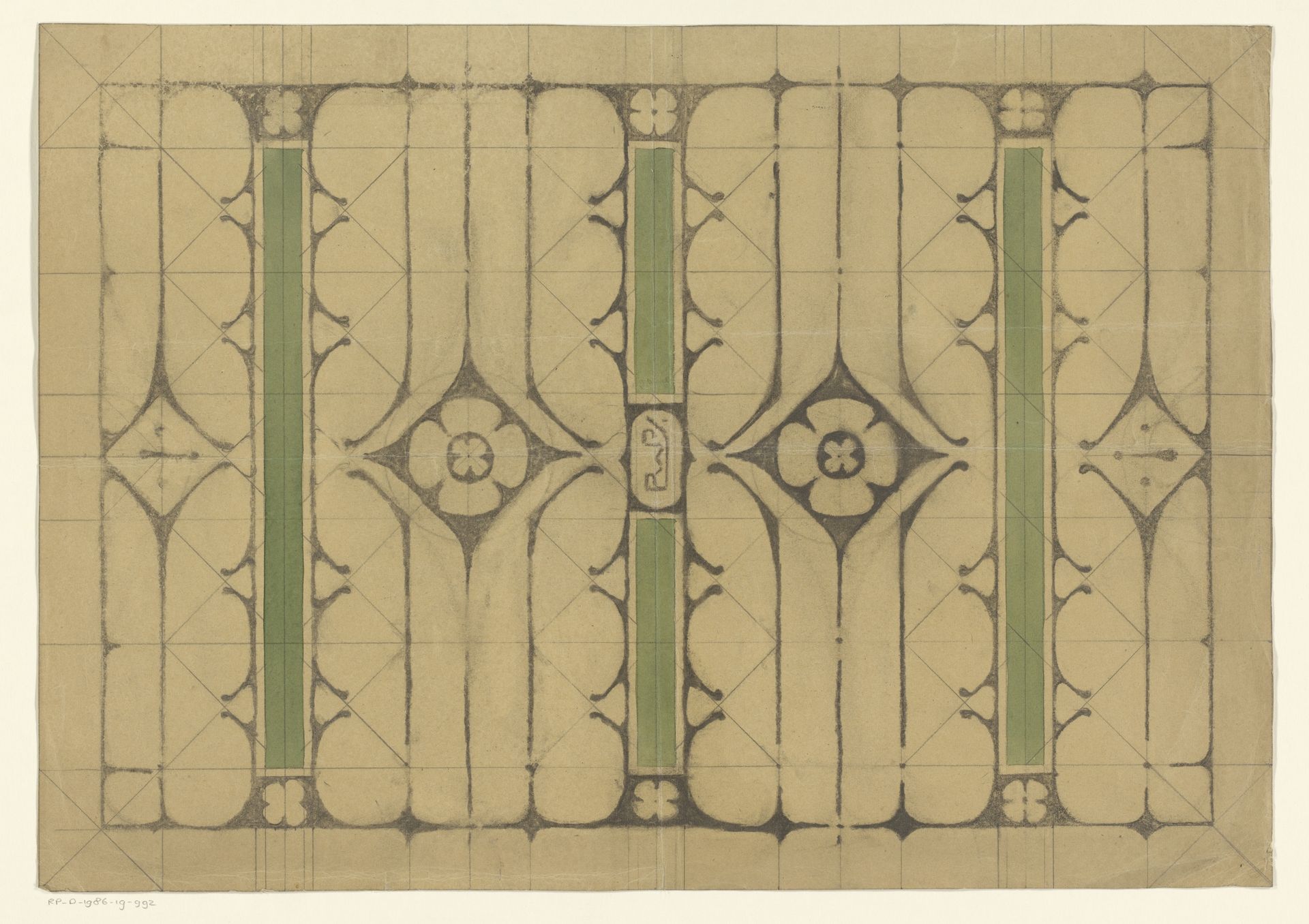
This design for a portfolio cover was made by Reinier Willem Petrus de Vries, likely on paper, sometime in the early 20th century. Look at the way the black lines are so deliberate, creating this almost architectural structure, but softened with these curving, organic shapes. It's like a dance between order and whimsy. See how the green columns act as anchors, but the flowers want to break free, to move around. The grid that sits beneath is a framework, not a cage. It’s like the artist is thinking through the structure, making decisions as they go, but not afraid to let things get a little messy. For me, this piece speaks to the beauty of the unexpected, the messy, the imperfect – that sweet spot where art truly sings. It reminds me a little of Hilma af Klint, who also used geometric forms and botanical shapes, although de Vries is more restrained. Art isn't about perfection, it's about the conversation.
Ontwerp voor de schutbladen van een portefeuille 1884 - 1952
Artwork details
- Medium
- drawing, paper, pencil
- Dimensions
- height 350 mm, width 497 mm
- Copyright
- Rijks Museum: Open Domain
Tags
drawing
natural stone pattern
rippled sketch texture
toned paper
art-nouveau
pattern
paper
repetitive shape and pattern
organic pattern
geometric
pencil
repetition of pattern
vertical pattern
pattern repetition
imprinted textile
layered pattern
Comments
No comments
About this artwork
This design for a portfolio cover was made by Reinier Willem Petrus de Vries, likely on paper, sometime in the early 20th century. Look at the way the black lines are so deliberate, creating this almost architectural structure, but softened with these curving, organic shapes. It's like a dance between order and whimsy. See how the green columns act as anchors, but the flowers want to break free, to move around. The grid that sits beneath is a framework, not a cage. It’s like the artist is thinking through the structure, making decisions as they go, but not afraid to let things get a little messy. For me, this piece speaks to the beauty of the unexpected, the messy, the imperfect – that sweet spot where art truly sings. It reminds me a little of Hilma af Klint, who also used geometric forms and botanical shapes, although de Vries is more restrained. Art isn't about perfection, it's about the conversation.
Comments
No comments
