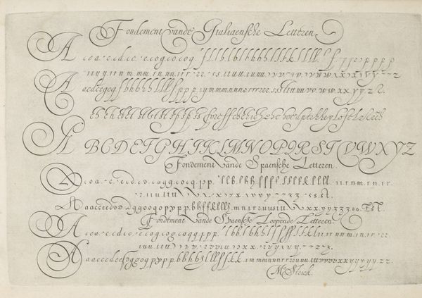
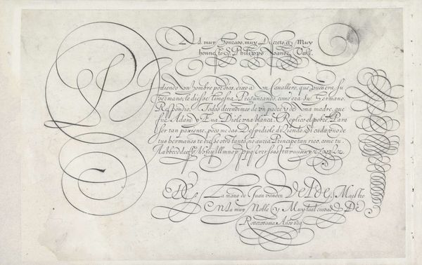
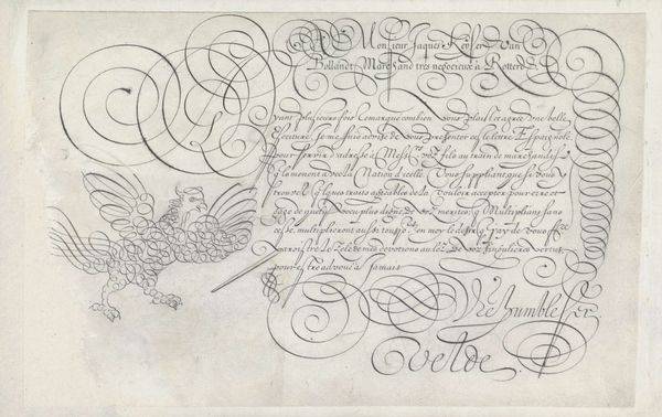
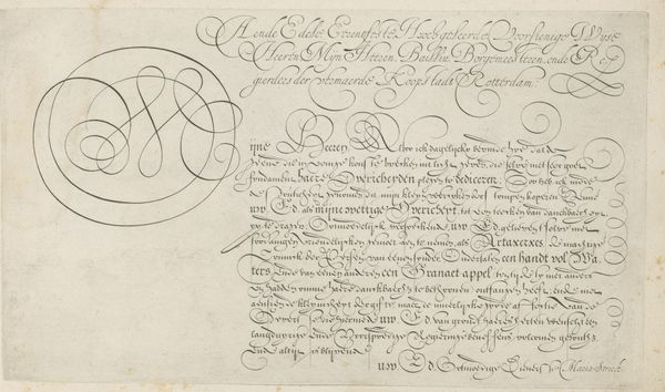
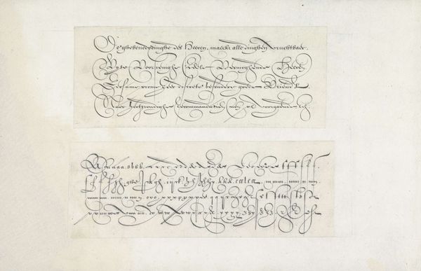
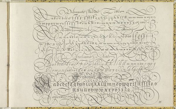
Voorbeelden van de Nederlandse kapitalen, de staande letter en cursieve hand 1618
0:00
0:00
hansstrick
Rijksmuseum
drawing, graphic-art, paper, typography, ink
#
portrait
#
drawing
#
graphic-art
#
script typography
#
hand-lettering
#
lettering
#
hand drawn type
#
hand lettering
#
paper
#
typography
#
ink
#
hand-drawn typeface
#
stylized text
#
thick font
#
handwritten font
#
calligraphy
#
small lettering
Dimensions: height 202 mm, width 304 mm
Copyright: Rijks Museum: Open Domain
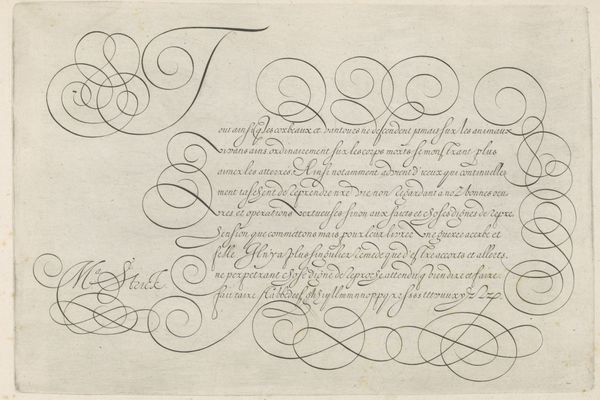
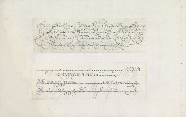
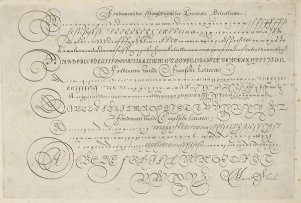
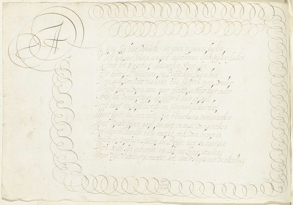
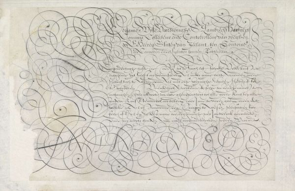
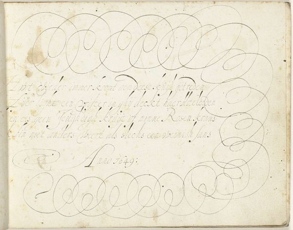
Curator: This delicate work, created in 1618, is titled "Voorbeelden van de Nederlandse kapitalen, de staande letter en cursieve hand"—"Examples of Dutch Capitals, Upright Letter, and Cursive Hand." It’s attributed to Hans Strick and crafted with ink on paper. What strikes you immediately about it? Editor: It’s incredibly meticulous, almost obsessive in its dedication to form. The lines flow and curl, a choreography of ink across the page. I feel an almost spiritual devotion to language and its visual representation. Curator: The creation of such detailed calligraphic guides reflects a broader social and political context. The rise of print culture in the 17th century demanded standardized yet beautiful letterforms. Calligraphers, therefore, held significant power in shaping public discourse. How do you see that power expressed here? Editor: Precisely. Think about access to knowledge. Standardized writing wasn't just about aesthetics; it was about democratizing information, to some extent, and shaping cultural identity through a shared visual language. Before mass printing, these letterforms influenced the visual landscape and signaled societal shifts towards broader literacy. It becomes part of understanding the means of circulating information, the ways of teaching and standardization of letter forms as technologies of their time. Curator: Indeed. And considering Hans Strick himself, we must ask whose stories, or whose aesthetic styles were getting privileged. Manuals such as this solidified certain notions of “good” script or "proper" penmanship— norms we’ve inherited even today. There's a gendered component to it, too, with women's literacy often connected to skills like needlework, but this clearly speaks to an educational structure intended to establish certain standards. Editor: Absolutely. It's not simply a neutral presentation of letterforms. The choice of particular styles and their arrangement on the page represent very particular forms of cultural power, which has deep impact, defining standards to reflect certain ideals. It makes you consider our world today where certain fonts have attained a higher pedigree and perceived power, too! Curator: A beautiful point, indeed! A reminder that what seems merely ornamental can, in fact, carry significant cultural weight. Editor: So true. Thanks for guiding me through this interesting reflection on this page’s political voice.
Comments
No comments
Be the first to comment and join the conversation on the ultimate creative platform.
More like this