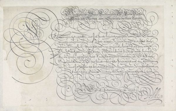
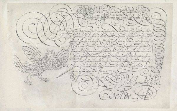
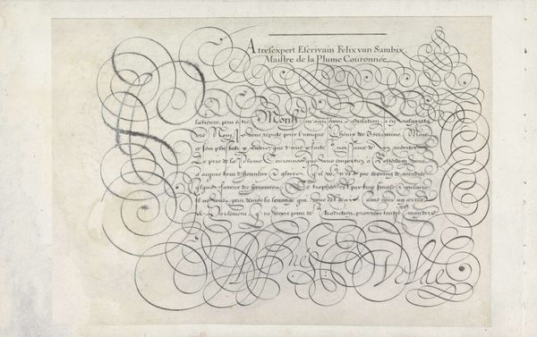
Ontwerp van een schrijfvoorbeeld: Eersame wyse voorsienighe (...) 1605
0:00
0:00
janvandeveldei
Rijksmuseum
drawing, print, ink
#
drawing
#
script typography
#
hand-lettering
#
baroque
# print
#
lettering
#
hand drawn type
#
hand lettering
#
word art
#
ink
#
hand-drawn typeface
#
fading type
#
geometric
#
calligraphic
#
calligraphy
#
small lettering
Dimensions: height 194 mm, width 299 mm
Copyright: Rijks Museum: Open Domain
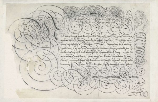
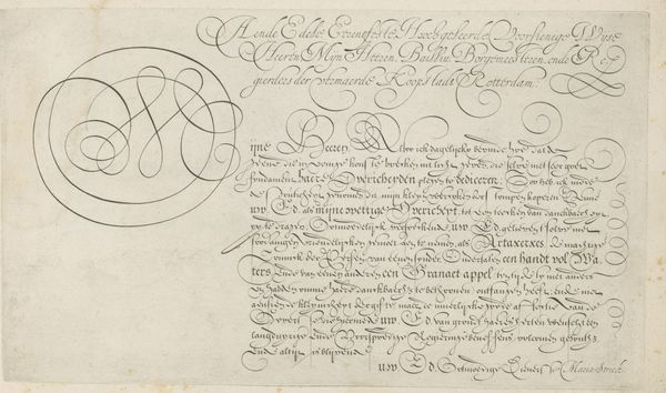
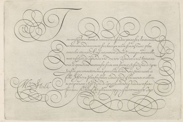
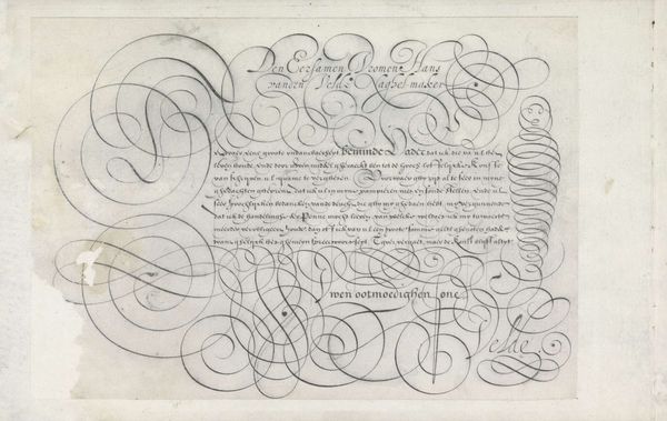
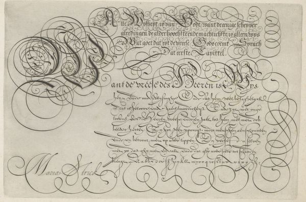
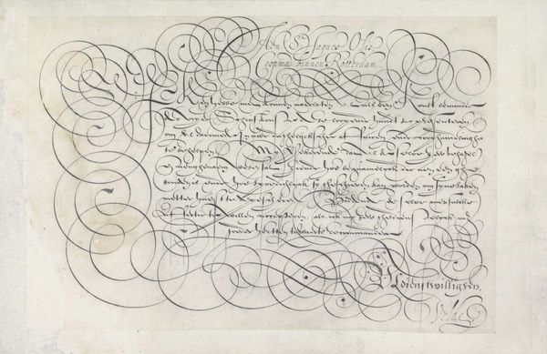
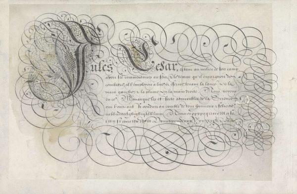
Curator: The meticulousness of Jan van de Velde I is on display in this ink drawing from 1605, currently held at the Rijksmuseum. The work, entitled "Ontwerp van een schrijfvoorbeeld: Eersame wyse voorsienighe (...)," presents an elaborate script design. Editor: It feels…almost overwhelmingly decorative at first glance. The tightly interwoven swirls dominate the surface, blurring the lines between text and pure ornamentation. I wonder how functional it really was as a writing example. Curator: Its function goes beyond mere legibility. The baroque style embraces elaborate embellishment, imbuing text with symbolic weight and cultural value. Notice how letterforms themselves embody notions of grace, refinement, and perhaps even a kind of aspirational social identity tied to literacy and proper education in the period. Editor: So, you’re seeing the act of writing, the very alphabet itself, as imbued with meaning, acting as symbols of status and cultivation within society? Curator: Precisely. The elaborate swirls around the words, even their slight illegibility to our modern eye, reflect how the control and artistry over writing would be perceived, embedding the intended meanings with sophistication, tradition, and cultural memory. Editor: From a design perspective, I’m drawn to the repetition and variation within the looping forms. Semiotically, these could represent the never-ending cycles of commerce and administration inherent in this era of Dutch history and colonial development. Each loop mirrors another, but never perfectly—a suggestion of inevitable deviations. Curator: That interpretation layers further meaning onto the image! I perceive echoes of religious and secular life intertwining, much like in illuminated manuscripts from earlier eras. The text presented, ostensibly about governance and finance, receives an elevated, almost devotional quality via these swirling calligraphic devotions. Editor: It speaks to a cultural moment where artistry wasn't just confined to paintings and sculptures, but infused every aspect of visual communication. Curator: Absolutely, offering us a deeper appreciation of what "writing" as an aesthetic practice once represented in this rich Baroque period. Editor: Looking closer helps us appreciate how such everyday forms might be used for ideological expressions.
Comments
No comments
Be the first to comment and join the conversation on the ultimate creative platform.
More like this