drawing, paper, ink
#
portrait
#
drawing
#
script typography
#
hand-lettering
#
hand drawn type
#
feminine typography
#
hand lettering
#
paper
#
ink
#
hand-drawn typeface
#
thick font
#
typography style
#
handwritten font
#
calligraphy
#
small lettering
Copyright: Rijks Museum: Open Domain
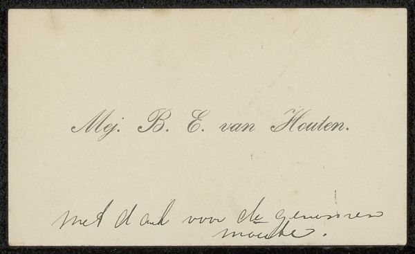
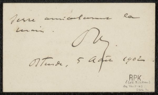
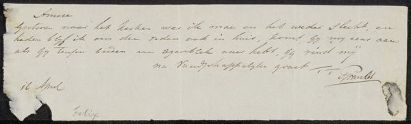
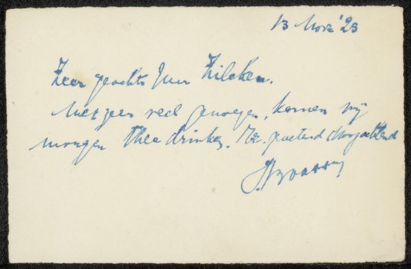
This is Barbara Elisabeth van Houten's calling card to Philip Zilcken, crafted with ink on cardstock. At first glance, the eye is drawn to the elegant script, a dance of thin and thick strokes that fill the upper half of the card. The contrast of the dark ink against the light cardstock creates a stark, immediate visual impact. Consider the semiotics at play here. Beyond its literal message of gratitude, the card operates within a structured system of social exchange. Van Houten uses the formal qualities of handwriting to convey her message. The flourishes and curves of the script are not merely functional; they communicate refinement and attention to detail. The card's structure is also intriguing. The text is deliberately placed, leaving a generous empty space below. This compositional choice subtly reinforces the card's function as a gesture, an acknowledgement that seeks to build a connection. The blank space invites a response, an unspoken dialogue. Ultimately, the artwork offers us a glimpse into a world where communication was carefully mediated through materiality and form. The act of writing and the visual qualities of the script combine to create a message that resonates beyond its literal meaning.
Comments
No comments
Be the first to comment and join the conversation on the ultimate creative platform.
More like this