graphic-art, print, typography
#
graphic-art
# print
#
typography
#
image and text
Dimensions: height 290 mm, width 171 mm
Copyright: Rijks Museum: Open Domain
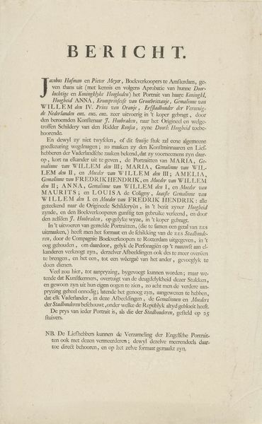
Curator: Ah, yes. Here we have "Beschrijving van het Burgerweeshuis te Amsterdam," a print from 1726 by Caspar Commelin. An early example of image and text! Editor: It feels very formal. Very architectural, like a blueprint almost, or an official document. What do you see in this piece? Curator: Well, first, notice the prominence of typography. The bold lettering and varied fonts are striking, especially given its purpose of describing the orphanage. This typographic treatment acts as a visual announcement, a statement of importance. Editor: That makes sense, the Burgerweeshuis was obviously an important establishment. So the *way* it's presented says as much as what it literally says. Curator: Precisely. Now, observe the relationship between the image and the text. The text, in a dense, block-like form, seems to frame the image, containing it almost. This structure creates a sense of order and control, mirroring, perhaps, the institution's aim to bring structure to the lives of orphaned children. The architecture, the building itself, functions almost as a container, its meaning created through contrast with emptiness, lack, the absence of family. Editor: So it's about more than just documenting the orphanage; it's about visually communicating the values and goals of the institution itself. Curator: Exactly. By examining its formal qualities, we unlock the work’s layers of cultural meaning. The contrast between image and text offers some nuance and provides a compelling interpretation of its role within Amsterdam society at the time. Editor: It is amazing how much is communicated with type alone! Thank you.
Comments
No comments
Be the first to comment and join the conversation on the ultimate creative platform.
More like this