print, paper, typography
#
newspaper
#
dutch-golden-age
# print
#
landscape
#
paper
#
typography
#
newspaper layout
#
magazine layout
Dimensions: height 285 mm, width 169 mm
Copyright: Rijks Museum: Open Domain
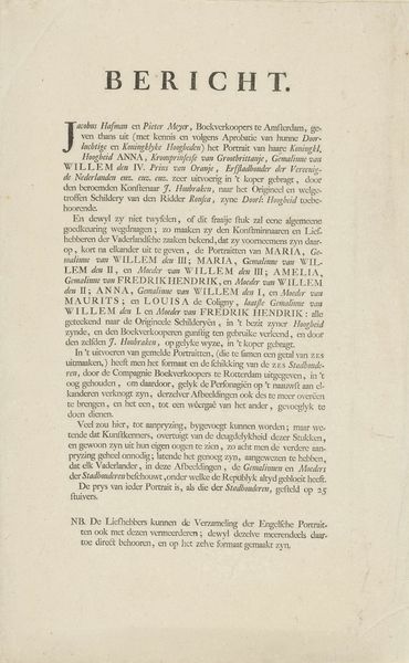
Editor: Okay, so this print is titled "Beschrijving van het Karthuizerhof te Amsterdam," dating back to 1693, by Caspar Commelin. It's primarily typography on paper. It strikes me as incredibly dense, almost overwhelming to look at initially. What do you see in this piece, beyond just a block of text? Curator: What I see here is a deliberate construction, less a straightforward record and more an instrument of power and control. This isn’t merely an informative document. The typography itself demands scrutiny. Editor: How so? Curator: Well, consider the intended audience. Who was this for? Was it aimed at the residents of the Karthuizerhof, or perhaps potential benefactors? The carefully laid-out text speaks to a desire to impose a certain order. And it evokes a very strong impression about 17th-century, specifically Dutch, society and the relationships that existed among various social strata. Do you perceive an implicit power dynamic embedded within its design? Editor: I suppose I do now that you mention it. The density of the text, the formality...it feels less about providing information and more about asserting authority. But were prints like this common? Was there a large readership for this type of publication? Curator: Absolutely. The Dutch Golden Age saw a blossoming of print culture. Examining who controlled the printing presses, who had access to literacy, and what messages were being circulated provides vital clues about the social and political climate. Editor: It’s fascinating to think of this as not just text but a form of social control and commentary. Curator: Exactly. These documents shaped public opinion, influenced social norms, and contributed to the construction of Dutch identity during a pivotal period. This reframes what seems to be simple, descriptive, typography as something that actively informed its culture.
Comments
No comments
Be the first to comment and join the conversation on the ultimate creative platform.
More like this