print, paper, typography, engraving
#
dutch-golden-age
# print
#
typographical layout
#
paper
#
typography
#
newspaper layout
#
engraving
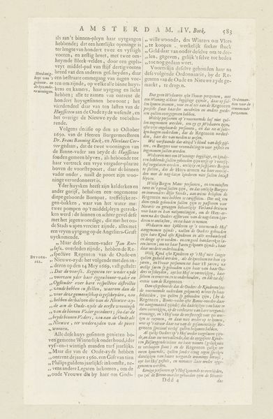
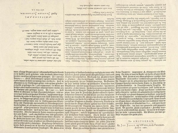
Dimensions: height 290 mm, width 170 mm
Copyright: Rijks Museum: Open Domain
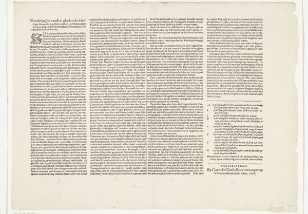
Curator: Let's discuss this intricate print titled "Beschrijving van het Burgerweeshuis te Amsterdam," made in 1726, associated with Caspar Commelin. Editor: It looks overwhelmingly textual! An absolute wall of tightly packed words, almost resembling architectural plans in its density. Curator: Indeed, the typographical layout is significant. As a historian, I see this as more than just a description; it's a statement about civic pride and the institution itself. The Dutch Golden Age was intensely proud of its charitable organizations. This engraving essentially publicizes the Burgerweeshuis, the Amsterdam orphanage. Editor: Symbolically, text itself represents order and structure, fitting for an institution focused on organizing young lives. I wonder if the choice of typography or certain phrases within the text was intended to evoke particular emotions or underline the orphanage's values. Curator: Precisely. Consider the socio-political context. Orphanages were a response to widespread poverty, war, and disease. Prints like this helped legitimize their existence by showcasing their efficiency and moral virtue in rescuing abandoned children, turning them into productive citizens. Editor: There are a couple visual elements among this sea of words—sections separated out, with differing font sizes—offering some contrast and hinting at a narrative hierarchy. Does it guide a reader through the orphanage's functions? Or perhaps, celebrate benefactors? Curator: Both, likely. Commelin documents not just the building’s architecture but also the social organization within. Notice the attention paid to the children’s education, moral instruction, and preparation for future employment. These prints were as much about managing public image as they were about disseminating information. Editor: The weight given to text really tells us about the period, with different cultural priorities compared to a contemporary approach. We are used to powerful and immediate visuals! How this image relies instead on exhaustive description and ordered prose speaks of the era's emphasis on reason and written accounts. Curator: I agree. It invites the public into the orphanage, through the written word. Today’s media might focus on individual stories. Here, we see the weight placed on the institution. It shows how communities defined and controlled the narrative around social welfare. Editor: Looking closely has made me appreciate this—it transforms a seemingly monotonous page into something quite complex! I see the density reflecting the densely populated city of Amsterdam. Curator: For me, the document underscores the Dutch Republic’s self-image. An exercise of civic duty enshrined in print—intended for posterity and demonstrating care.
Comments
No comments
Be the first to comment and join the conversation on the ultimate creative platform.
More like this