print, typography
newspaper
dutch-golden-age
typographical layout
typography
newspaper layout
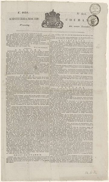
Dimensions: height 285 mm, width 169 mm
Copyright: Rijks Museum: Open Domain
Editor: So, here we have "Beschrijving van het Karthuizerhof te Amsterdam," a print from 1693 by Caspar Commelin. Looking at this dense typography, I can't help but wonder, what exactly were people reading in the late 17th century? How do you approach something like this? Curator: This is a fascinating example of early journalistic practices, presented as a typographical layout. Look at the arrangement. It mimics a newspaper format, doesn't it? Consider the labour involved. Each letter, each word meticulously placed, a physical, demanding craft. Editor: Right, it's not just about the information but the whole *process* of getting that information out there. So, who was this information *for*? Curator: Think about Amsterdam at this time: a major centre of trade, increasingly literate. Print like this democratised knowledge, or at least, it made it accessible to a growing middle class. The description of the Karthuizerhof would inform people about its function and purpose within the city's infrastructure. Were they investors, perhaps, or future residents? Editor: Hmm, so less 'high art' and more of a practical tool then. Almost like an early advertisement or public record? Curator: Precisely! It challenges that high/low art dichotomy. And consider the material: paper, ink. Mass produced commodities fueling a thirst for information. Even the act of reading this becomes a form of consumption, a participation in the burgeoning public sphere. What is this text *selling*? Editor: It makes you rethink the value, doesn't it? It's not just about aesthetics. Curator: Exactly! It encourages us to examine art within the broader context of production, consumption, and the material conditions that shape our understanding of the world. So, it’s about understanding the materials that comprise this cultural product and how those material conditions determined its meaning. What are your takeaways? Editor: I hadn't considered how much the act of simply making this determined the reading experience and therefore the artwork’s lasting appeal. The raw materiality as part of the overall statement— fascinating.
Comments
No comments
Be the first to comment and join the conversation on the ultimate creative platform.