print, paper, typography
#
portrait
#
aged paper
#
toned paper
#
aged
#
muted colour palette
# print
#
paper
#
tea stained
#
typography
#
watercolor
#
historical font
Copyright: Rijks Museum: Open Domain
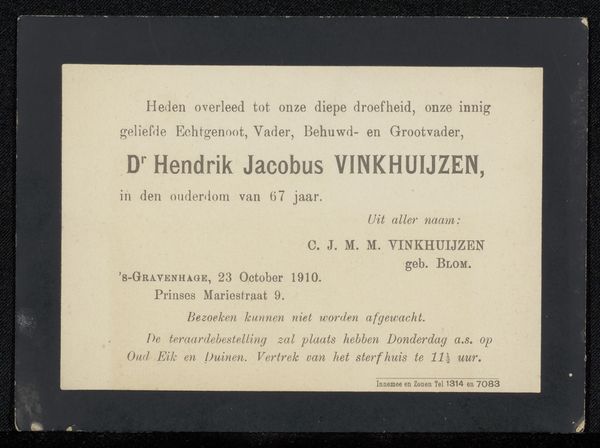
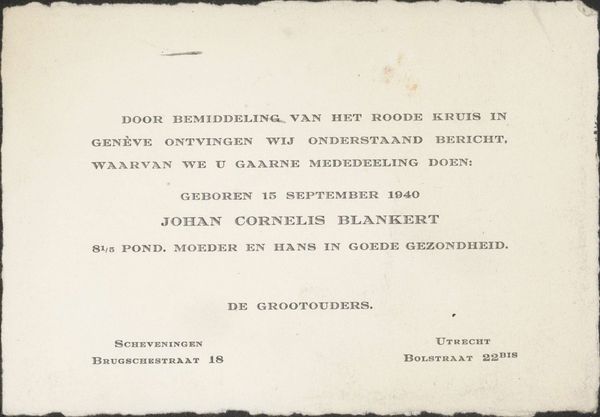
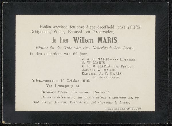
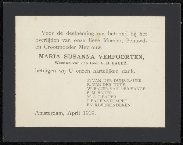
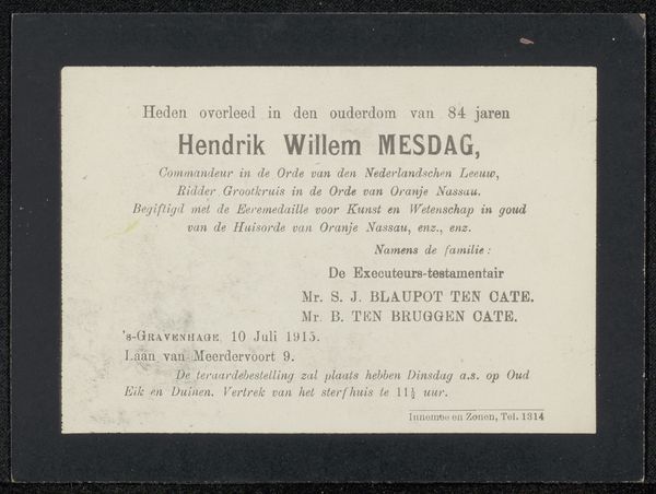
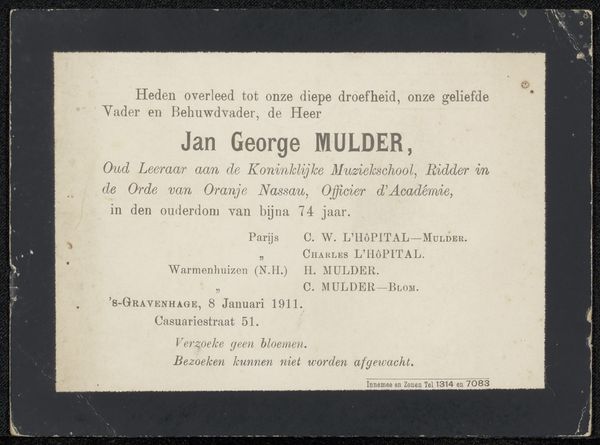
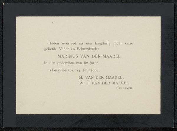
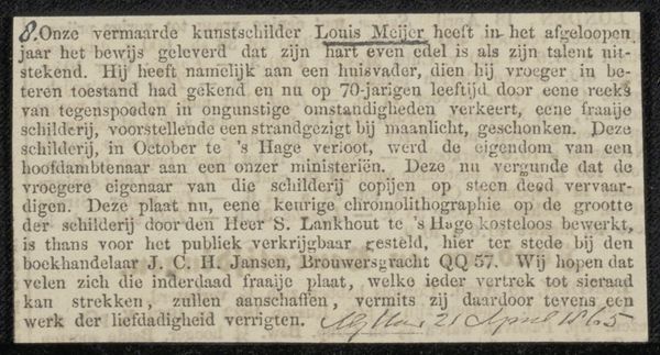
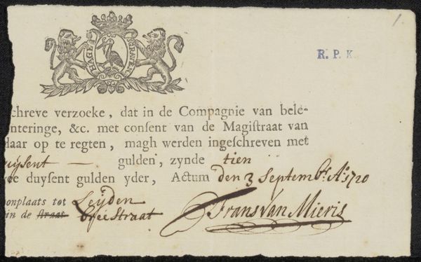
This anonymous memorial card from 1917, printed on paper, captures a moment of somber reflection. The stark contrast between the black border and the cream-colored paper immediately sets a tone of mourning. This visual structure uses the semiotic codes of typography and layout to communicate loss, typical of such announcements. The careful arrangement of text creates a formal composition, where font sizes and line spacing guide the eye through the announcement—from the declaration of death to the details of the funeral. The typography—the typeface, size, and spacing of the letters—serves not merely to convey information but also to evoke a sense of solemnity and respect. Note how the design destabilizes fixed meanings by merging public announcement with personal grief. Its aesthetic form serves as a social act that embodies cultural values and practices concerning death and remembrance, thereby challenging traditional representations by embedding personal loss within public life.
Comments
No comments
Be the first to comment and join the conversation on the ultimate creative platform.
