mixed-media, print, paper, typography
#
aged paper
#
mixed-media
#
muted colour palette
# print
#
paper
#
text
#
typography
Copyright: Rijks Museum: Open Domain
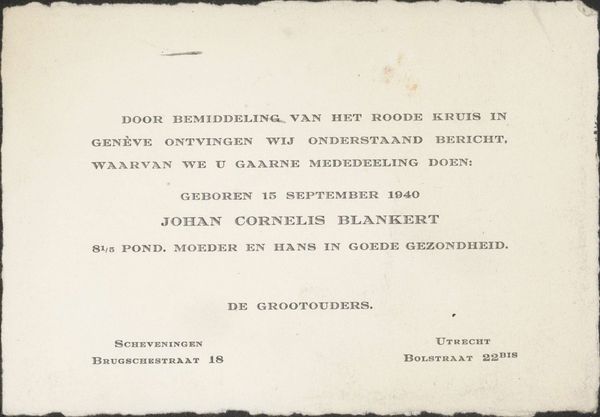
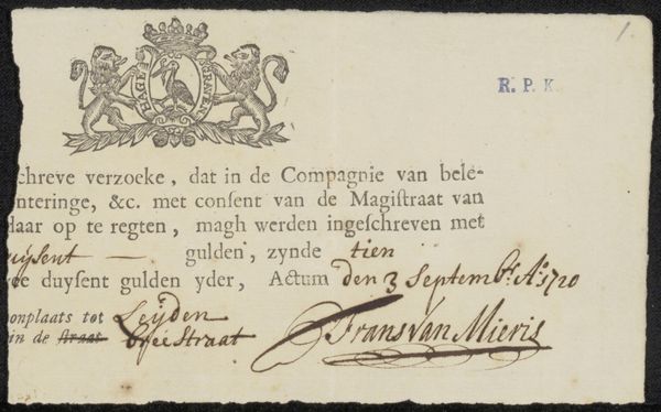
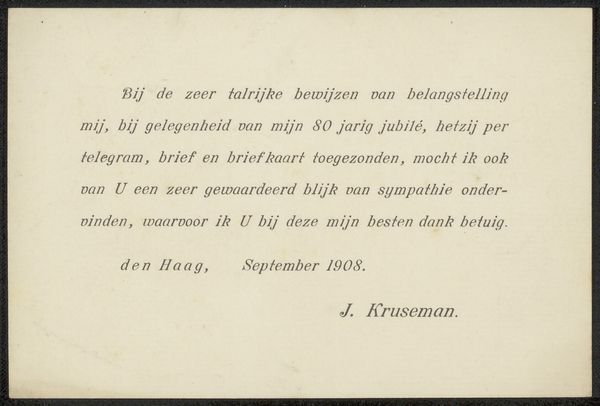
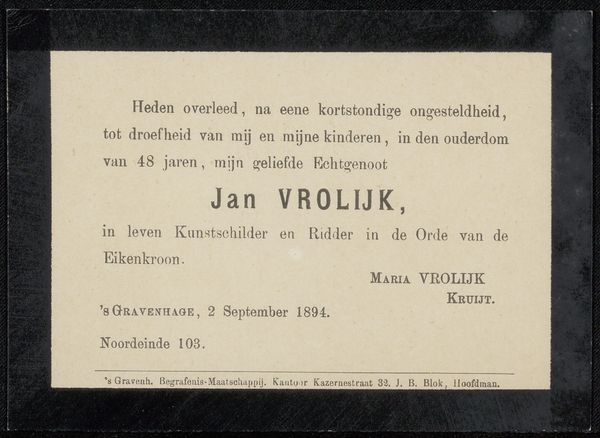
This thank you note, from April 1919, is printed on card. It's a monochrome palette, restricted to the black ink of the letterpress on a white card. It thanks Philip Zilcken for his condolences after the death of Maria Susanna Verpoorten. The texture of the card looks smooth, but probably has some give in it. I am interested in the way the information has been arranged on the card. It’s all been very carefully spaced out so that no name stands out more than any other. The rhythm of the type is steady, almost like a heartbeat. I think of Jasper Johns' lithographs, where the texture and materiality of the print become as important as the image itself. The restraint in this piece reminds us that sometimes, the most powerful expression comes from the quietest gestures. In art, as in life, it's often what we leave unsaid that resonates the most.
Comments
No comments
Be the first to comment and join the conversation on the ultimate creative platform.
More like this