graphic-art, print, paper, typography
#
portrait
#
graphic-art
#
dutch-golden-age
# print
#
paper
#
typography
Copyright: Rijks Museum: Open Domain
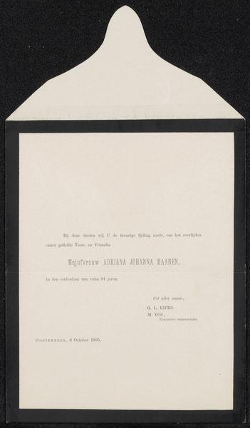
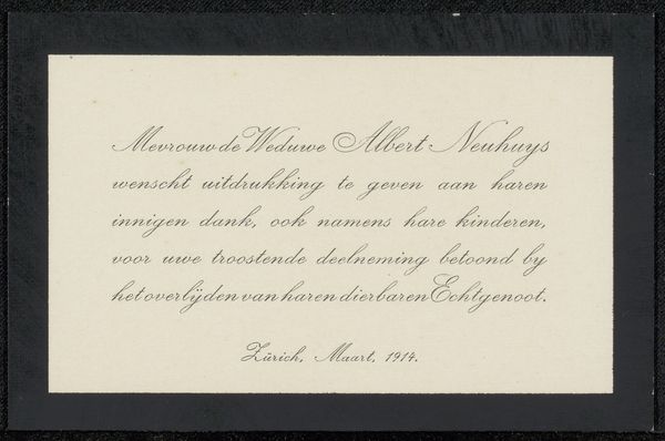
This death announcement, made in 1902, is for Philip Zilcken. It has a quiet color palette. The choice to use a plain background and simple serif typeface speaks to the artist's understanding of artmaking as a process of reduction, stripping away the unnecessary to reveal the core essence of the message. The texture of the card is smooth, almost like vellum, which gives it a tactile quality, like holding a piece of history in your hands. The black border provides a frame, which focuses the eye on the text itself. The layout is quite lovely. It is balanced on either side in terms of its weight and shape, with the name of the deceased in slightly larger font. The artist here seems to understand that art is an ongoing conversation. I think of painters like Agnes Martin, who also knew how to embrace ambiguity and multiple interpretations, using a similar kind of quiet restraint to achieve a powerful effect.
Comments
No comments
Be the first to comment and join the conversation on the ultimate creative platform.
More like this