graphic-art, print, typography, engraving
#
graphic-art
#
16_19th-century
# print
#
typography
#
engraving
Dimensions: height 325 mm, width 460 mm
Copyright: Rijks Museum: Open Domain
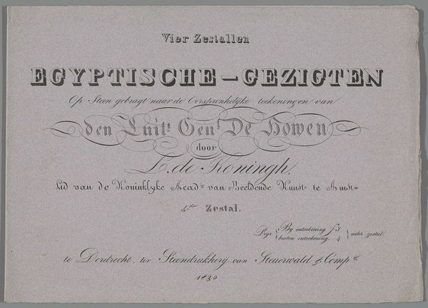
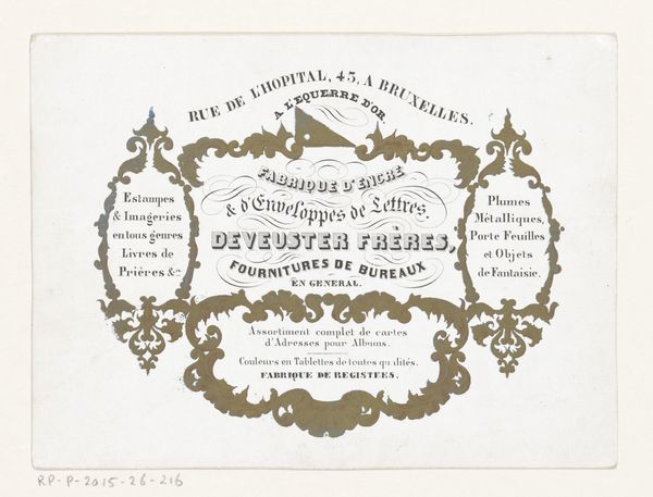
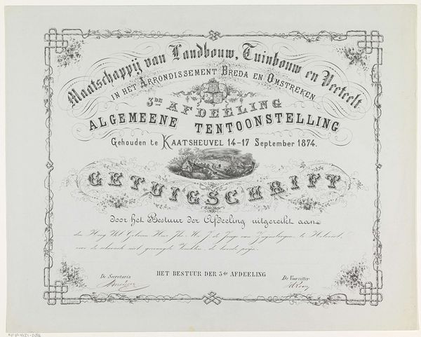
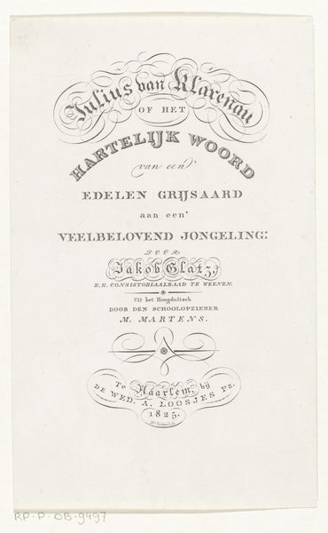
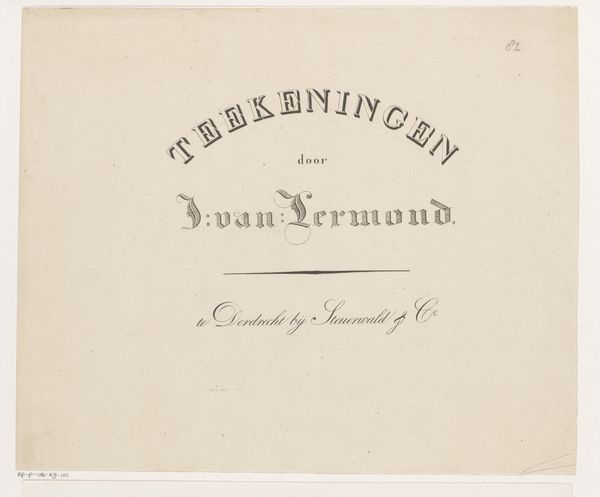
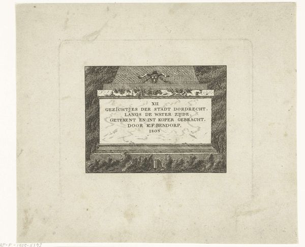
Leendert de Koningh created this title page for "Drawings of Animals" in 1826, using lithography. Notice how the title, artist's name, and publication details are all carefully arranged within an oval frame. The text itself acts as a powerful symbol. Words, like images, carry cultural weight. The choice of lettering, the elegant curves and serifs, evokes a sense of classical knowledge. The font itself recalls ancient Roman inscriptions, a subtle nod to the authority and enduring nature of classical learning. Think back to medieval illuminated manuscripts, where text was interwoven with intricate illustrations, transforming the written word into a visual spectacle. The very act of writing becomes a potent symbol, a way to transmit knowledge and connect with the past. It becomes clear that symbols are never fixed; they are constantly evolving, shaped by the collective memory and subconscious desires of each generation.
Comments
No comments
Be the first to comment and join the conversation on the ultimate creative platform.
