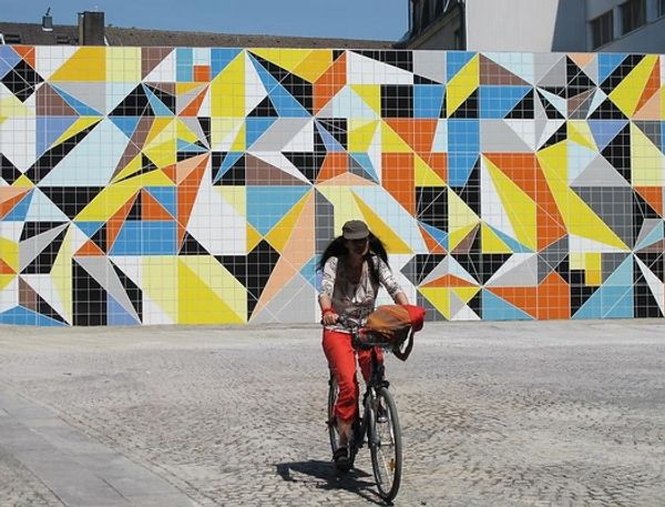
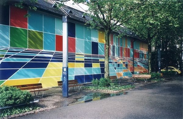
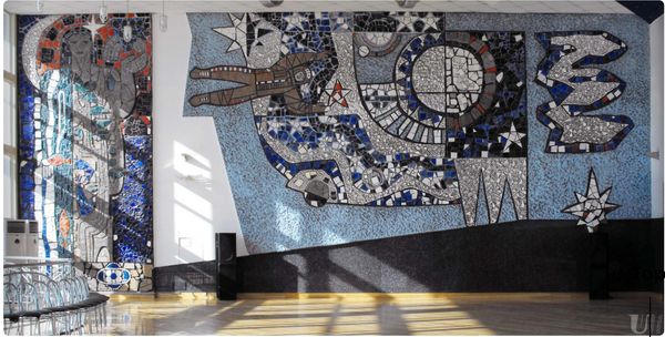
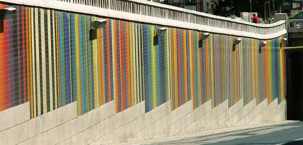
mosaic, painting, ceramic, public-art, site-specific, mural
mosaic
painting
graffiti art
street art
ceramic
public-art
geometric
urban art
site-specific
cityscape
mural
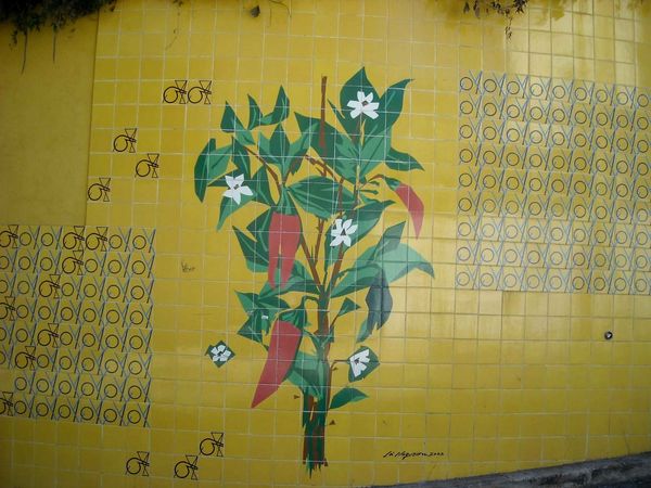
Copyright: Carlos Botelho,Fair Use
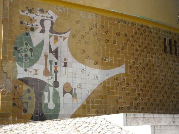
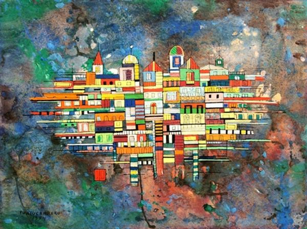
Editor: So this is a ceramic tile panel called "Azulejos" by Carlos Botelho, made in Lisbon in 1957. It's so vibrant! It definitely brightens up the urban landscape. What's your interpretation of it? Curator: Well, placing this artwork in its historical context, post-war Lisbon was undergoing rapid modernization, but under a dictatorship. These azulejos, a very traditional Portuguese craft, served as a kind of public art, often commissioned to uplift public spaces. The use of geometric, almost childlike depictions of city buildings...do you think it hides a purpose? Editor: Possibly? I mean it's very stylized, not realistic at all. Is that intentional in its critique of modernization, or does it fully embrace a sense of utopian possibility? Curator: That's a brilliant point! It’s a fine line, isn’t it? On the one hand, the bright colours and simplified forms could represent a forward-looking optimism, aligning with the regime's public image campaign. On the other, it subtly disrupts the visual language of the Estado Novo, the Portuguese authoritarian government at that time. These murals democratized art, shifting it from galleries to public view. Notice that despite some recognizable buildings, the structures look like flattened building blocks... why is that? Editor: Maybe the abstraction softens any overtly political message and helps with the integration with the buildings? Now that you mention it, it does soften the surroundings through a more decorative and less 'real' take. Curator: Exactly. Think about the dialogue it creates with the street art seen nearby too... How is it used by society in terms of messages? Editor: Good question. Well, I never considered the history or urban function of it... very interesting. Thanks. Curator: My pleasure. I'll definitely keep my eye out to reflect on these aspects of meaning in other murals too.
Comments
No comments
Be the first to comment and join the conversation on the ultimate creative platform.