public-art, site-specific, mural
contemporary
street-art
street art
public-art
geometric
urban art
site-specific
street photography
abstraction
line
digital-art
mural
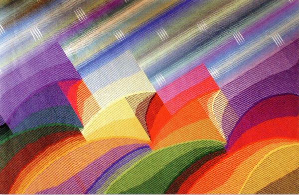
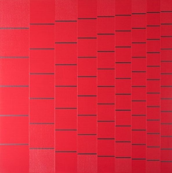
Copyright: Eduardo Nery,Fair Use
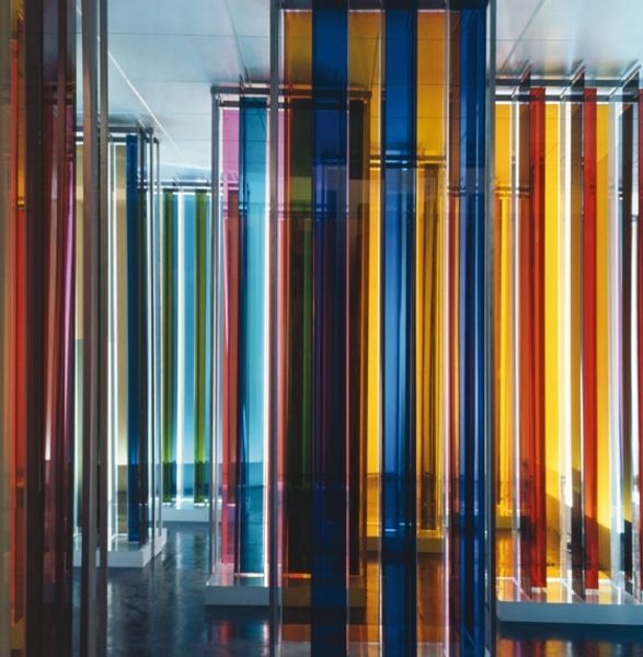
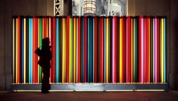
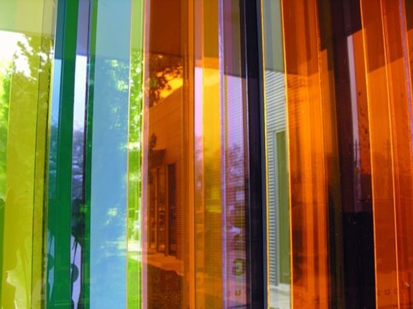
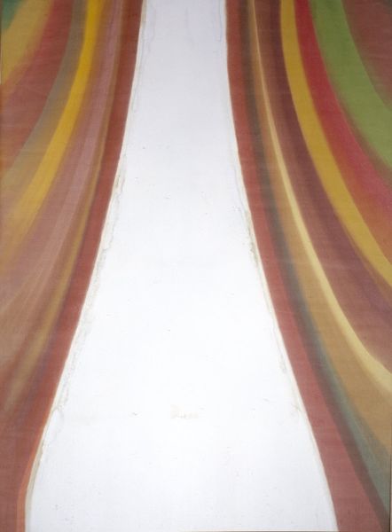
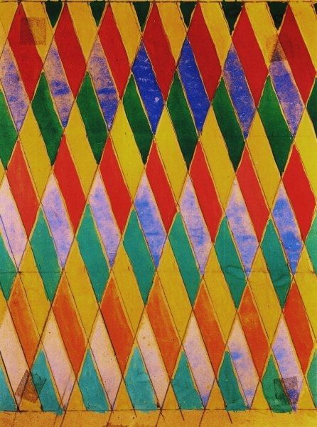
Eduardo Nery made this Viaduto da Av. Infante Santo using, what looks like, ceramic tiles, with a very particular sense of colour. There’s an energy here, a sense of play, maybe because it’s a public work, and Nery knew it was going to be stumbled upon, experienced in passing. The colours are so vibrant, really singing against the utilitarian concrete that frames the mural. I'm really intrigued by the way the vertical lines of colour meet the horizontal rows of tile, setting up this grid where the colours get to do their thing. Look at the lower section where the tiles are cut away, exposing the blocky, structural underbelly. There’s something about the tension between the pure colours and the raw, structural elements that makes the whole thing feel so alive. Nery’s practice across different media and scales, from painting to public art installations, reminds me a lot of Bridget Riley and her use of colour and Op Art. What I love about art is that there's always room for multiple interpretations, a real invitation to look, think, and feel.
Comments
No comments
Be the first to comment and join the conversation on the ultimate creative platform.