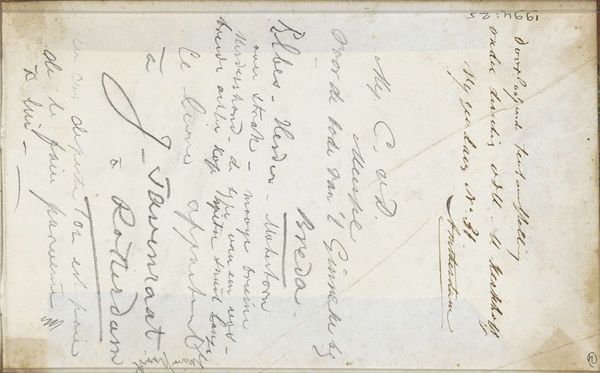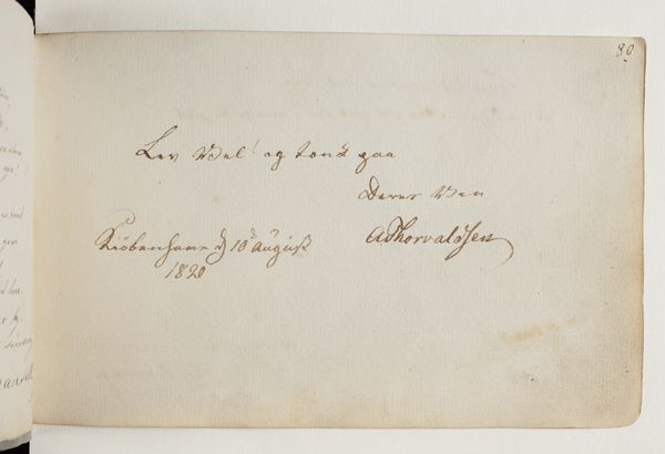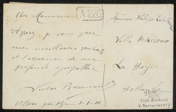
before 1907
Brief aan Philip Zilcken
Listen to curator's interpretation
Curatorial notes
Editor: This is a drawing from before 1907, "Brief aan Philip Zilcken" by Eugénie Clapier-Houchart, made with pen and ink on paper. The script gives this a formal yet intimate feel; it seems very personal. What catches your eye in this work? Curator: Certainly, the hand-lettering itself functions as the primary subject matter. Consider the line quality; observe how the varying pressure of the pen creates a calligraphic rhythm across the surface. Do you notice any particular instances where the forms achieve a certain elegance or perhaps reflect the emotional tone of the message itself? Editor: The flourish at the top and the varying weight of the strokes are indeed elegant. It gives rhythm to the whole text as if handwriting has morphed into a form of free-hand drawing, I love how the information is integrated into one, to me that makes the work have two separate dimensions that overlap perfectly! Curator: Precisely. The script occupies a space between communication and pure visual form. Notice, also, how the placement of the words creates distinct compositional areas within the confined space. The drawing employs the letter as both signifier and artistic element, blurring that very distinction. Editor: So, by focusing on line and form rather than just content, we understand how even functional objects can have visual interest. This helps me think more deeply about what defines "art." Thank you. Curator: An astute observation, indeed! Paying attention to those visual characteristics opens exciting avenues for further inquiry, particularly regarding language and visual representation.