graphic-art, print, textile
#
graphic-art
# print
#
textile
Dimensions: height 140 mm, width 190 mm
Copyright: Rijks Museum: Open Domain
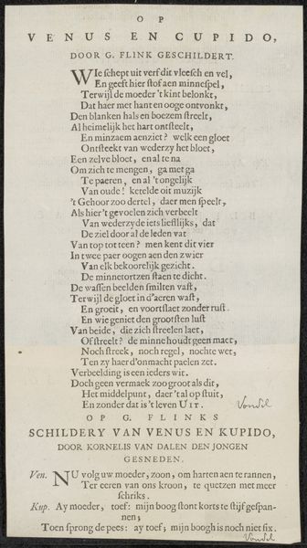
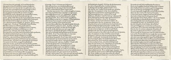
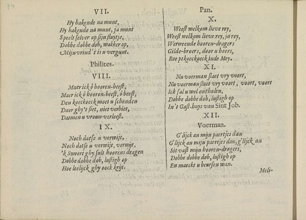
This is a page from 'Vertelling van de herder Melibaeus', made by Crispijn van de (II) Passe around the mid-17th century. Notice how the text is structured. Two columns of dense lettering fill the majority of the page, an aesthetic choice which immediately pulls you into the detailed world of the story. The arrangement uses a formal structure to create meaning. The uniformity in the size and style of the typeface shows order, while the use of decorative initial capitals creates a visual break and indicates new paragraphs. The letters function as signs, inviting us to decode the text in terms of cultural and philosophical concerns of the 17th century. Consider how the rigid structure contrasts with the fluid narrative of pastoral life. This contrast destabilizes our ideas of simplicity and artifice, reflecting a broader tension present in the art and philosophy of the time. This tension is part of an ongoing process where the meaning of art evolves with each interpretation.
Comments
No comments
Be the first to comment and join the conversation on the ultimate creative platform.
More like this