drawing, paper, ink, pencil
#
drawing
#
script typography
#
hand-lettering
#
hand drawn type
#
hand lettering
#
paper
#
personal sketchbook
#
ink
#
hand-drawn typeface
#
fading type
#
pencil
#
sketchbook drawing
#
history-painting
#
sketchbook art
#
miniature
#
calligraphy
#
small lettering
Copyright: Rijks Museum: Open Domain
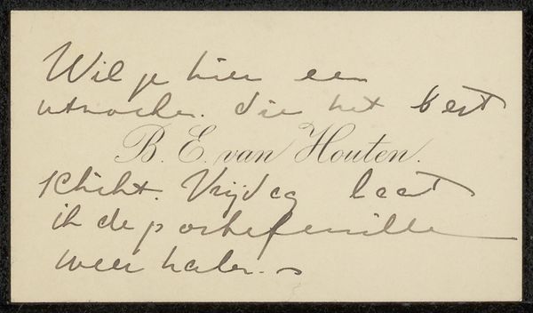
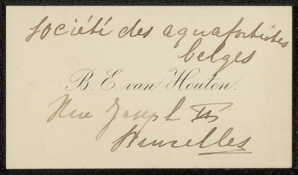
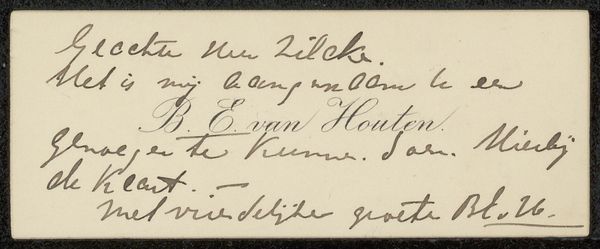
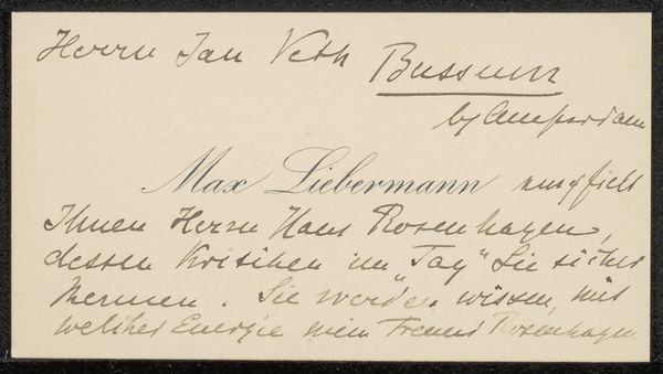
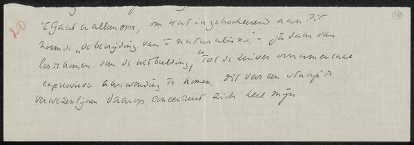
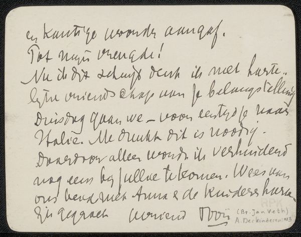
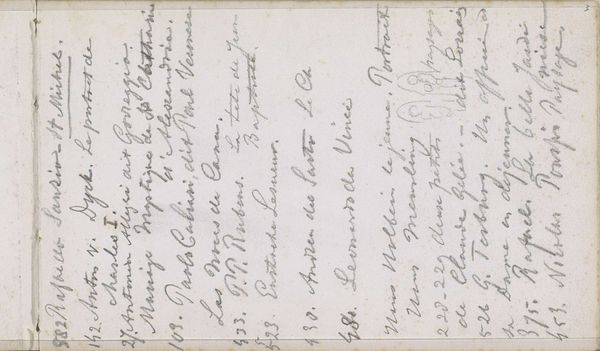
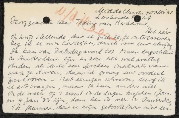
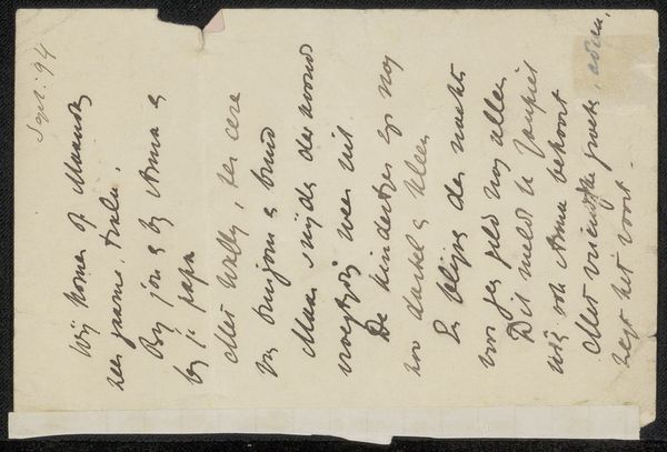
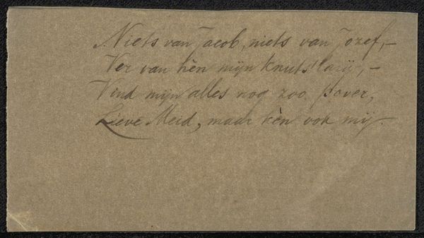
Curator: This unassuming piece, "Aantekening over Gerard van Honthorst," resides here at the Rijksmuseum. We believe this pencil, ink, and paper drawing, with script typography and hand-lettering, dates to before 2017. Editor: At first glance, the piece appears quite understated, almost like a fleeting thought captured on a scrap of paper. The narrow format and subdued tonal range give it a feeling of intimacy. Curator: Indeed. Think of it as a cultural artifact bearing silent testimony to its creator’s interests. Note the hand-drawn typeface and the style. Don’t you see a blending of functional notation with calligraphy’s refined expression, creating a beautiful intersection? Editor: Yes, there's a rhythmic quality in the lettering and the lines—almost musical. However, I'm drawn to the fading type which suggests something lost or forgotten, adding an almost melancholic quality to the work. It makes me wonder, what exactly did they want to remember? Curator: It suggests the history and evolution of typography itself. The art here connects the artist's era to the rich cultural history of written language and artistic expression across different epochs. Every choice of letter form echoes memories, cultural touchstones, or individual expression. The “sketchbook drawing" implies the immediacy and importance of that reference. Editor: So this sketch book art gives visual form to history painting; but, I find the focus primarily resting on form. The way the artist distributes visual weight is captivating. Also note the small lettering of script across the plane and the miniature, making the viewer come up close. What could they be suggesting through such compositional decisions? Curator: Such choices are a testament to both human fallibility and continuity in artistic expression, implying our need to both record history and grapple with the knowledge that time, memory, and symbols keep developing and fading through new meanings and interpretations. Editor: This detailed work reveals an appreciation for formal nuances, reminding us how essential close examination is. Curator: And for understanding how such handwritten inscriptions both form the architecture of our knowledge and echo in the corridors of cultural memory.
Comments
No comments
Be the first to comment and join the conversation on the ultimate creative platform.
More like this