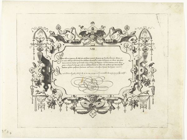
Titelprent voor de fabel van de vader, de zoon en de ezel 1570 - 1612
0:00
0:00
karelvanmallery
Rijksmuseum
drawing, graphic-art, print, ink, engraving
#
drawing
#
graphic-art
# print
#
form
#
11_renaissance
#
ink
#
line
#
northern-renaissance
#
engraving
Dimensions: height 188 mm, width 245 mm
Copyright: Rijks Museum: Open Domain
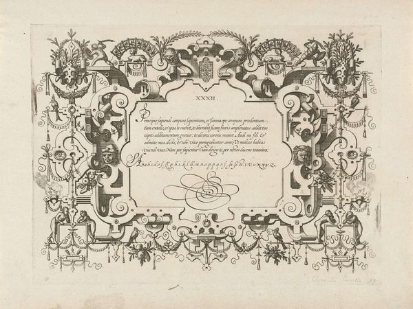
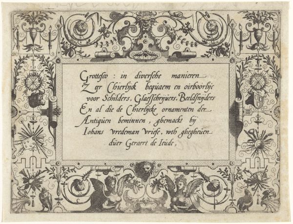
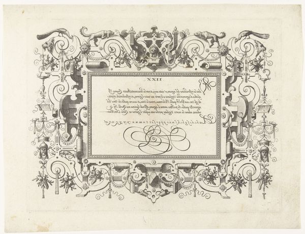
This title page for the fable of the father, the son, and the donkey was made by Karel van Mallery around the turn of the 17th century. It’s an engraving, meaning that the image was incised into a copper plate, inked, and then printed onto paper. Look closely, and you can see the linear quality, and the crispness that results from the printing process. The design has an almost industrial quality, befitting the early modern period and the rise of print culture. The act of engraving demands technical skill and an eye for detail, and the inscription is surrounded by an elaborate ornamental border of fruit garlands and grotesque masks. Note how the typography and design elements complement each other, creating a harmonious, unified composition. The prints like this one were crucial for disseminating knowledge and culture, but also existed within a system of patronage and commerce. The fable itself – about the impossibility of pleasing everyone – takes on a new meaning when you consider the labor, artistry, and social context involved in its production.
Comments
No comments
Be the first to comment and join the conversation on the ultimate creative platform.
More like this