About this artwork
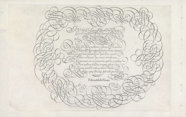
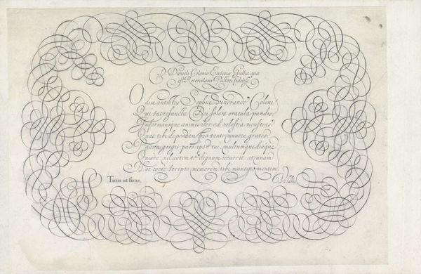
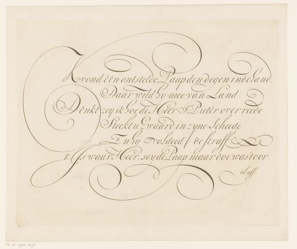
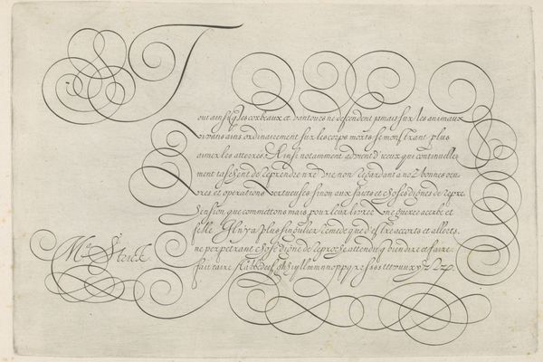
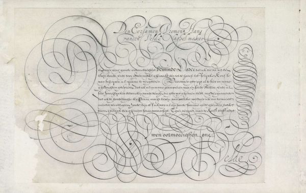
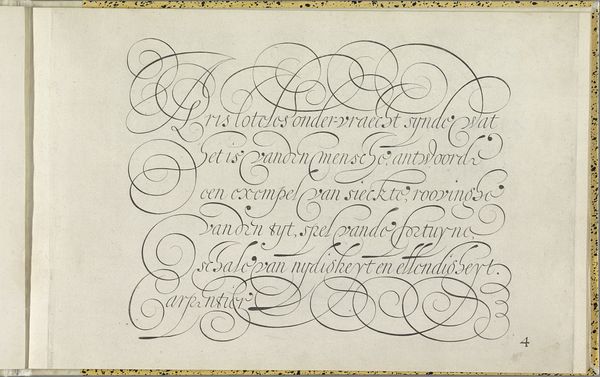
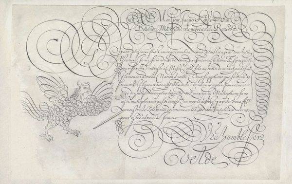
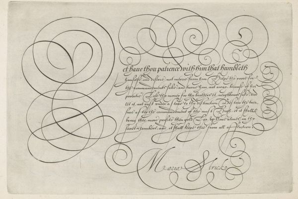
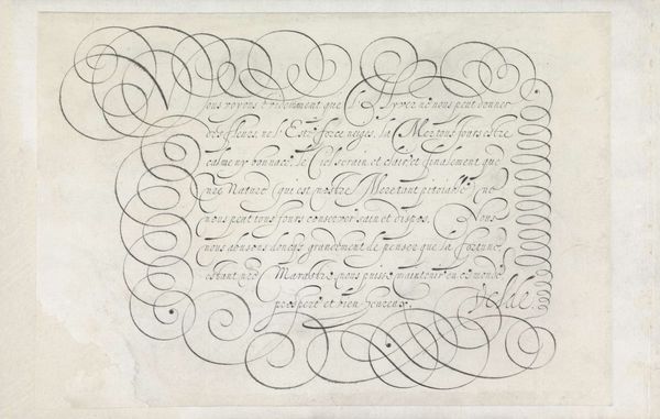
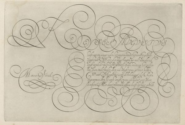
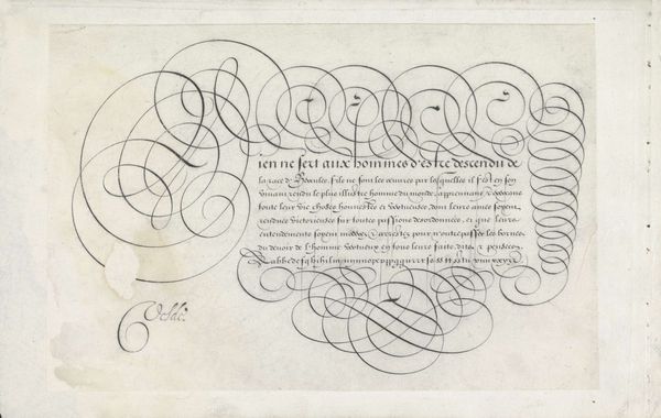
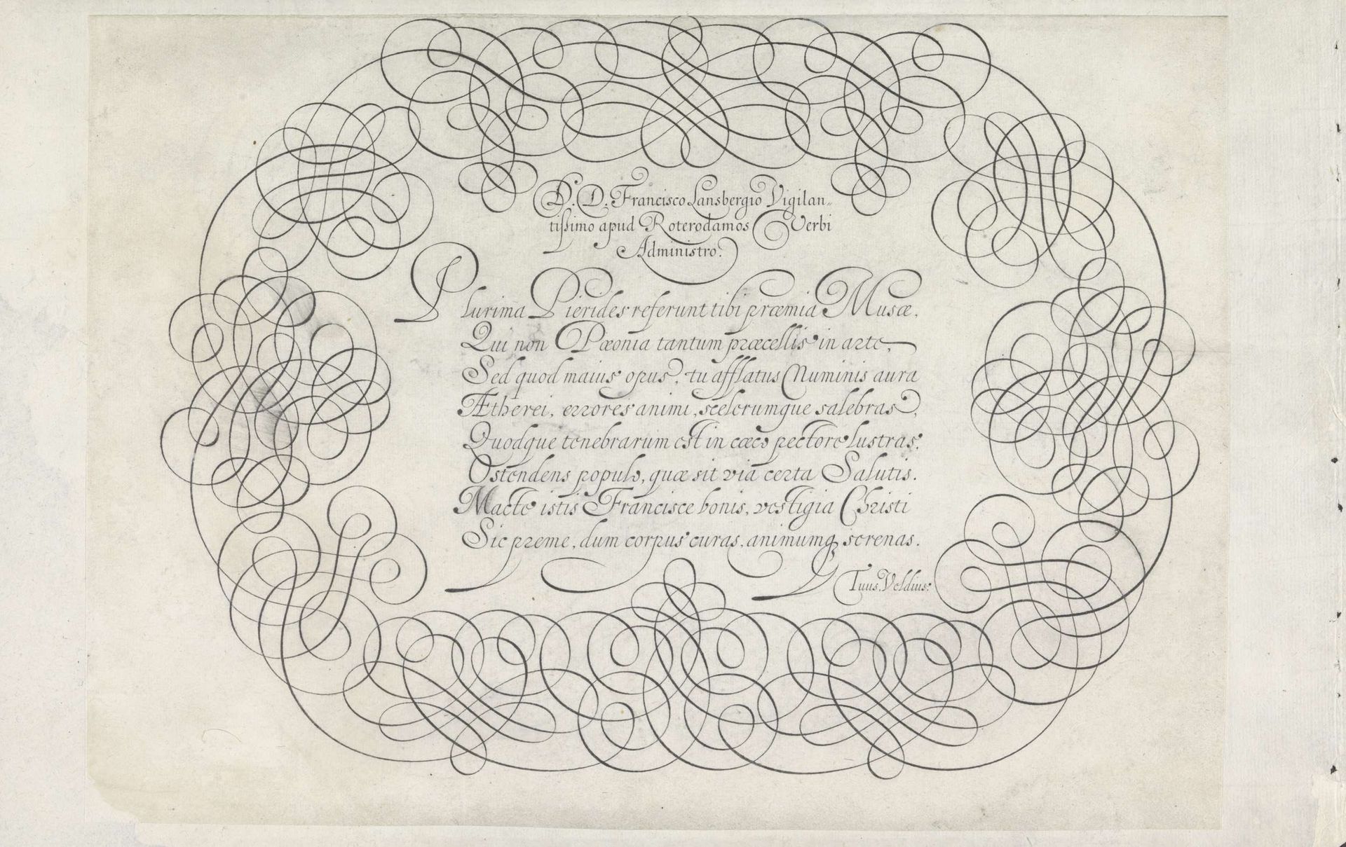
This is a calligraphic design, made by Jan van de Velde I, sometime around the turn of the 17th century. It’s made with ink on paper, a common enough combination, but here the skillful application is really the point. The work’s material qualities are crucial to its effect, with the thin lines of the ink, the contrast to the white of the paper, all contributing to a sense of refinement and control. But it’s really the skilled hand that makes this work so special. This kind of penmanship was a highly valued skill, especially in a society where handwriting was a primary form of communication. The ability to create such intricate, decorative script was not just about legibility, but also about social status and artistic expression. Ultimately, this design bridges a gap between the functional and the beautiful, showing us how even everyday materials can be elevated through the skill of the maker. It challenges us to see beyond the conventional categories of art and craft, and to appreciate the artistry inherent in skilled work.
Ontwerp van een schrijfvoorbeeld: D.D. Francisco Lansbergio (...)
1605
Jan van de Velde I
1568 - 1623Location
RijksmuseumArtwork details
- Medium
- drawing, ink, pen, engraving
- Dimensions
- height 202 mm, width 283 mm
- Location
- Rijksmuseum
- Copyright
- Rijks Museum: Open Domain
Tags
Comments
Share your thoughts
About this artwork
This is a calligraphic design, made by Jan van de Velde I, sometime around the turn of the 17th century. It’s made with ink on paper, a common enough combination, but here the skillful application is really the point. The work’s material qualities are crucial to its effect, with the thin lines of the ink, the contrast to the white of the paper, all contributing to a sense of refinement and control. But it’s really the skilled hand that makes this work so special. This kind of penmanship was a highly valued skill, especially in a society where handwriting was a primary form of communication. The ability to create such intricate, decorative script was not just about legibility, but also about social status and artistic expression. Ultimately, this design bridges a gap between the functional and the beautiful, showing us how even everyday materials can be elevated through the skill of the maker. It challenges us to see beyond the conventional categories of art and craft, and to appreciate the artistry inherent in skilled work.
Comments
Share your thoughts